Taking a break from my busy schedule, I’ve been looking at a lot of cool effects recently. There are many plug-ins based onjquerynow, but the compatibility of many plug-ins is not very good, so native ones are the way to go. In daily life, frosted glass is no longer common. It was a thing from a long time ago. No, the following is the frosted glass:

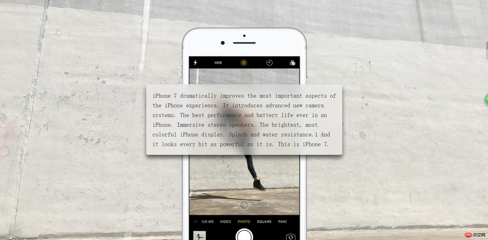
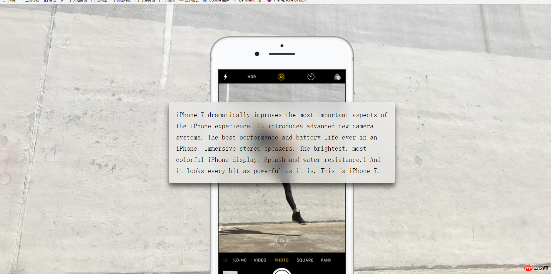
Haha, let’s stop chatting, let’s get to the point. Let’s take a look at the final effect first:

Well, okay, let’s start our steps:
Step 1: Basic construction of the page:
I set a large background image on the body , and then the middle part is a p, the html code is as follows:
iPhone 7 dramatically improves the most important aspects of the iPhone experience. It introduces advanced new camera systems. The best performance and battery life ever in an iPhone. Immersive stereo speakers. The brightest, most colorful iPhone display. Splash and water resistance.1 And it looks every bit as powerful as it is. This is iPhone 7.
Most of the text is to expand the p to make the effect more obvious
The css code is as follows:
body { min-height: 100vh; box-sizing: border-box; margin: 0; padding-top: calc(50vh - 6em); font: 150%/1.6 serif; background: url("http://www.jackzxl.net/wp-content/MyFile/2016/09/iphone.jpg") fixed 0 center; background-size: cover; } p { margin: 0 auto; padding: 1em; max-width: 30em; border-radius: 0.3em; box-shadow: 0 0 0 1px hsla(0,0%,100%,.3) inset, 0 .5em 1em rgba(0, 0, 0, 0.6); text-shadow: 0 1px 1px hsla(0,0%,100%,.3); background: hsla(0,0%,100%,.3); }
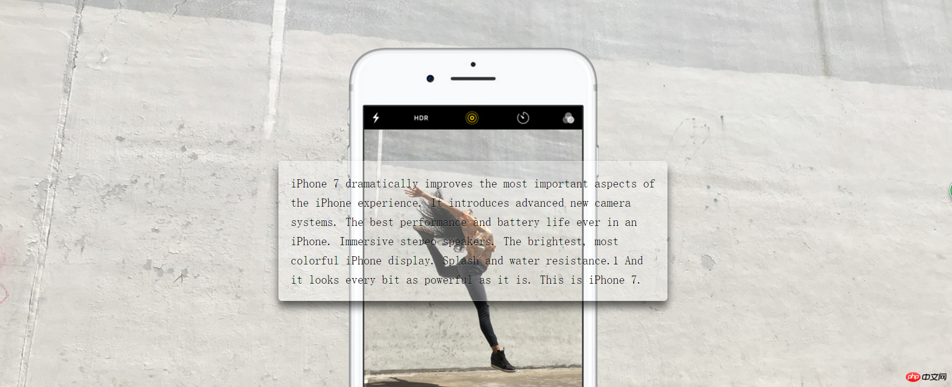
Look In the above style code, in the body, vh is the viewport size, 100 is 100%, and the background is set to a fixed position, covering the entire element; in p, set the background color in the center and then set its box style; then it looks like this :

The bright small transparent glass just came out, so let’s start our frosted glass processing
Step 2: Background blurred frosted glass settings
In CSS, there is the same blur setting, which is
filter: blur(20px);
The value after
is the size of the blur. The larger the value, the blurrier it is. Ah, but currently only px is supported, not percentage;It is not possible to directly add this style to p, because this will make even the sub-object blurry. At this time, we can use pseudo elements, that is:
:before;Before we use pseudo elements, we need to add a relative positioning to p. Since the blur of pseudo elements will overflow the entire p box, in order to be beautiful and classy, we need Add
overflow:hidden to p; that is:
overflow: hidden; position: relative;
Pseudo element of p:
p::before{ content: ''; position: absolute; top: 0; right: 0; bottom: 0; left: 0; z-index: -1; filter: blur(20px); margin: -20px; background: url("http://www.jackzxl.net/wp-content/MyFile/2016/09/iphone.jpg") fixed 0 center; background-size: cover; }
In the above css code we It can be seen that the set blur overlaps with p, and the background image is the same as the body. The final effect is as follows:

The above is the detailed content of Detailed explanation of sample code for creating frosted glass effect with css3. For more information, please follow other related articles on the PHP Chinese website!


