This tutorial teaches PS enthusiasts from Script House how to use Photoshop to design the homepage of a super cool Brawl scene game website. There are many forms of sharing on the market, and there are various ways to create them. However, there is no such detailed tutorial on creating the scene atmosphere of the game. If you are interested, let’s take a look.
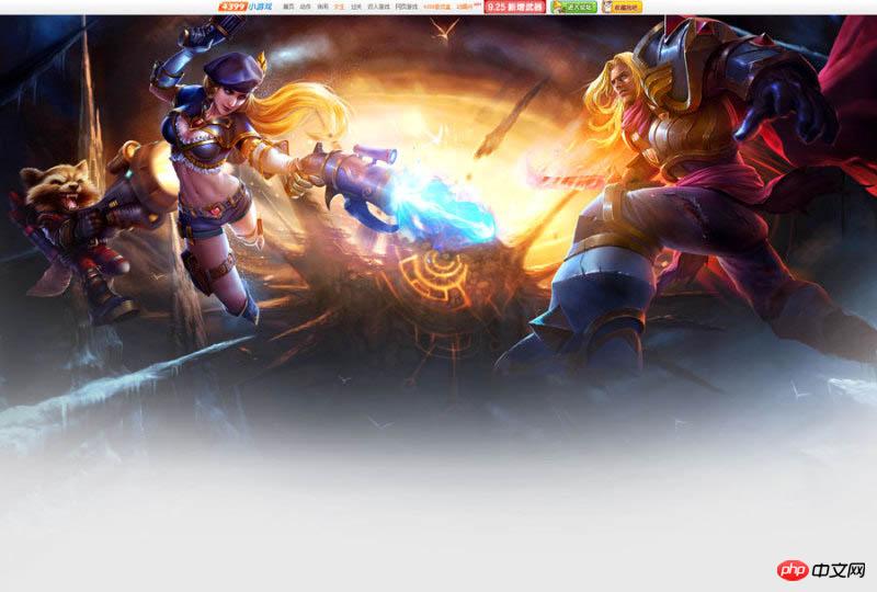
Final effect:

Main process:
1. Find materials.

#2. According to the visual reference, the Brawl is a picture that radiates from the center to the surroundings, so the scene selection is also symmetrical and divergent graphics.


#3. In order to ensure the balance of the picture, it is a relatively safe method to keep the movements of the surrounding characters basically symmetrical, so I chose this 3 characters are designed based on their actions. The two characters of the female gun and the raccoon are used on the left because they are relatively thin and small, in order to maintain a balance with the strong male knight on the right.

#4. Fixed light source (the light source is divided into two types: 1. Warm light source 2. Cold light source).

5. The main purpose here is to set the light source for the scene (brighten the middle and darken the surroundings). Use the warm yellow main light source to brighten the middle, and use blue cold light for contrast on the sides. , the reason why this is done is to make the central theme picture more prominent.

#6. Duplicate the scene and apply Gaussian blur to the original painting on the new layer. Select Filter ColorAttribute for the layer, add a filter mask to the blurred layer to erase it, and use a brush to erase the areas that don’t need to be blurred. This method can increase the depth of field effect in the scene.

#7. Use "Levels" (shortcut key Ctrl+L) to deepen the dark parts of the scene, raise the bright parts, and enhance the contrast.

#8. The atmosphere of the scene is now in place, as shown below.

#9. Use the "color levels" adjustment (shortcut key Ctrl+L) to make the character's light and dark contrast and texture stronger. Use "Burn and Dodge" to brighten the light-receiving side of the character and darken the backlit side of the character. Strengthen the lighting effect of the light source, making the characters more three-dimensional and the picture more spacious.

#10. According to the light source, add a shape selection to the character and fill it with black.

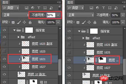
#11. Adjust the layer transparency so that the lightness and darkness of the characters and the background are in the same environment level. Add a mask layer and erase the highlights according to the direction of the light source.

#12. Other heroes are processed in the same way to get the final picture.

13. Color search is an adjustment layer, its location is as shown below. After adding the color search, find the 3DLUT file in the color search panel. Pull down and you can see many styles with built-in special effects, including cold, warm, heavy, and fresh. You can try them one by one and use them directly if you find one that suits you. Not much to say here.

#14. Create a new layer and use soft light or overlay layer blending mode. Use the brush to absorb the warm yellow, and then use the brush to add a warm light source to the main light source.


15. Use "Color Balance", "Hue Saturation", "Levels", etc. to adjust the layers! Very useful You can quickly get the atmosphere and tone of the picture you want.


16. Create a new layer and set the soft light layer blending mode. Use a black brush to darken the surrounding areas of the image and highlight the center image again.

#17. Create a new layer, fill it with gray, and use it as the background of the content module to create a gradient effect with the scene.

18. Font design.

19. Floating objects can appear in many forms. Adding floating snowflakes, star light effects, etc. according to the needs of the picture will make the picture very detailed and improve the texture of the picture. .

20. Add some splashing gravel under the feet of the characters in the picture to enhance the power of the picture and make the picture instantly shocking! Reasonable addition of floating objects can add atmosphere to the picture, and Creating a sense of space is an epic tool for showing off.

#21. The screen is almost created. Next, design the interface design of the header login registration box.

final effect:

The above is the detailed content of Tutorial on how to design a super cool battle scene game website homepage using Photoshop. For more information, please follow other related articles on the PHP Chinese website!


