


CSS3 provides us with a scalable and flexible webpage layoutmethod-flexbox layout. It has very powerful functions and can easily implement many complex layouts. Before it appeared, we The commonly used layout method isfloatingor fixed width + percentage for layout, which requires a large amount of code and is difficult to understand.
In order to better understand the flexbox layout, here are a few concepts to be introduced first:
If shown:
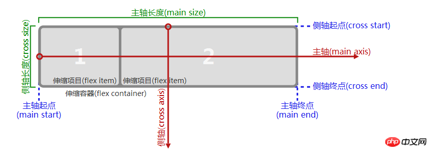
(1) Spindle (Side axis), in the flexbox layout, a scalable container is divided into the main axis or the side axis according to the horizontal and vertical directions. If you want the scalable items in this container to be scalable in the horizontal direction, then the horizontal direction is the main axis. , the vertical direction is the side axis, and vice versa;
(2) The length of the main axis (side axis), after determining which is the main axis and which is the side axis, the size of the scalable container in the direction of the main axis ( width or height) is called the main axis length, and the container size (width or height) in the side axis direction is called the side axis length;
(3) The starting point of the main axis (side axis), the main axis (side axis) axis) end point, for example, the main axis direction is horizontal, and usually the web page layout is from left to right in the horizontal direction, then the left border of the scalable container is the starting point of the main axis, the right border is the end point of the main axis, and the side border is the end point of the main axis. The axis is in the vertical direction, usually from top to bottom, so the upper border is the starting point of the side axis, and the lower border is the end point of the side axis;(4) Telescopic container: If you want to build a scalable box, These scalable items must be wrapped by a
display: flex'sattributebox. This box is called a scalable container;(5) scalable items: The elements contained in the flex container that need to be flexibly laid out are called flexbox items;
After clarifying the above concepts, you can build a flexbox layout;
The first step is to build a flexbox container. And place several scalable items in the container, as follows:
css code:
.flex-container{ display:flex; width:600px; height:230px; background-color: #ccc; }.flex-item{ background-color:blue; width: 100px; margin: 5px; }
HTML code:
A
B
A
B
The effect is as follows:
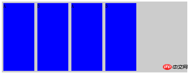 The four scalable items are arranged in a row in the horizontal direction, and the scalable items are aligned to the left;
means that this container is A scalable container can also take the value inline-flex. The difference between the two is that the former renders the container as a block-level element, and the latter renders it as aninline element.There are several default properties here that are not set, but the default values do work. They are:
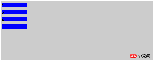
flex-directionproperties , its value is row, column, column-reverse, row-reverse. The default value is row, which means expanding the scalable items in the horizontal direction. If column is used, it means expanding the scalable items in the vertical direction, column-reverse, row-reverse represents the opposite direction. In layman's terms, theflex-direction attribute is used to define the direction of the main axis and side axis.Add flex-direction to the above effect: column effect is as follows:
 ## justify-content
justify-content:space-between
css code:.flex-container{ display:flex; width:600px; height:230px; background-color: #ccc; justify-content: space-between; }.flex-item{ background-color:blue; width: 100px; margin: 5px; }
You can see that it aligns each scalable item at both ends in the main axis direction and divides it equally. The remaining space is removed;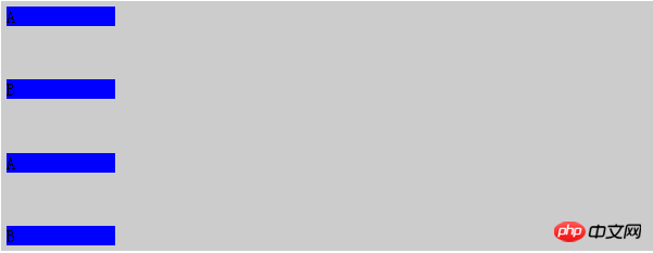
.flex-container{ display:flex; width:600px; height:230px; background-color: #ccc; justify-content: space-around; }.flex-item{ background-color:blue; width: 100px; margin: 5px; }
You can see that this attribute allows the scalable items to be centered along the main axis and evenly divide the remaining space;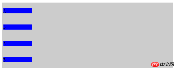
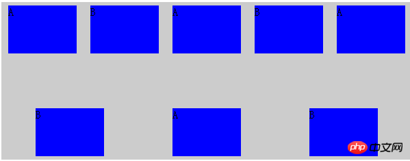
align-items
attribute: This attribute is used to indicate scalability The alignment of items in the cross-axis direction. Possible values are flex-start, flex-end, center, baseline, and stretch. What needs to be explained is the baseline value, which is based on a calculated baseline and then allows these items to move along this Baseline alignment, the calculation of the baseline depends on the size and content of the scalable item, as follows:align-items:baseline;
css code:.flex-container{ display:flex; flex-direction: row; width:600px; height:230px; background-color: #ccc; justify-content: space-around; align-items:baseline; } .flex-item{ background-color:blue; width: 100px; margin: 5px;; } .a{ margin-top: 10px; height: 100px; } .b{ margin-top: 20px; height: 150px; } .c{ margin-top: 30px; height: 80px; }
HTML代码:
A
B
A
B
效果如下:
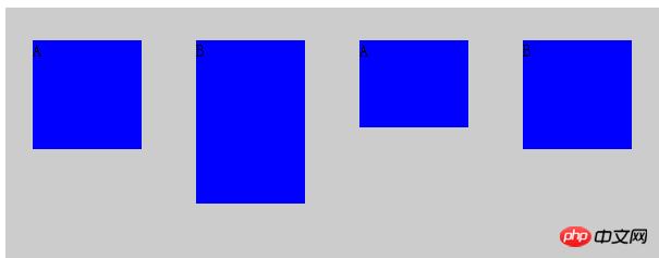
可以看到四个可伸缩项目在侧轴方向上(垂直方向)高度不一,margin不一样,但是最后都按照计算出来的一个基准线对齐;
align-items:stretch;
这个是取值会让可伸缩项目在侧轴方向上进行拉伸,前提是这些项目在侧轴方向上没有设置尺寸,否则会按照你设置的尺寸来渲染。
css代码:
.flex-container{ display:flex; flex-direction: row; width:600px; height:230px; background-color: #ccc; justify-content: space-around; align-items:stretch; } .flex-item{ background-color:blue; width: 100px; /*height: 100px;*/ margin: 5px;; }
HTML代码:
A
B
A
B
效果如下:
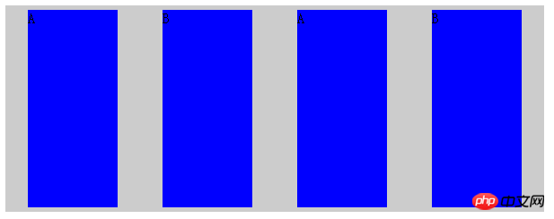
可以看到这些可伸缩项目在侧轴方向上被拉伸了,因为在垂直方向上没有设置高度。
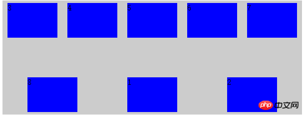
到目前为止,我们所有的伸缩项目都是在一行或者一列上进行的,并没有进行换行和换列,flex-wrap属性表示是否支持换行或者换列,它有nowrap,wrap,wrap-reverse三个取值,nowrap是默认值,表示不换行或者换列,wrap表示换行或者换列,wrap-reverse表示支持换行或者换列,但是会沿着相反方向进行排列(如主轴是垂直方向换行后就按照先下后上的顺序来排列伸缩项)
css代码:
.flex-container{ display:flex; flex-direction: row; width:600px; height:230px; background-color: #ccc; justify-content: space-around; align-items:baseline; flex-wrap: wrap; } .flex-item{ background-color:blue; width: 100px; height: 70px; margin: 5px;; }
HTML代码:
A
B
A
B
A
B
A
B
效果如下:
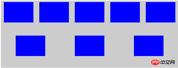
可以看到伸缩项增多之后一行难以放下的时候会接着换行。wrap属性保证换行后按照正常的从上到下顺序排列
align-content属性用来表示换行之后各个伸缩行的对齐方式,它的取值有 stretch,flex-start,flex-end,center,space-between,space-around,意义和align-items属性取值意义相同,上面我们将7个伸缩项目分成了两行来排列,
将css代码添加align-content属性,html代码不变,如下:
CSS代码:
.flex-container{ display:flex; flex-direction: row; width:600px; height:230px; background-color: #ccc; justify-content: space-around; align-items:baseline; flex-wrap: wrap; align-content: space-between; } .flex-item{ background-color:blue; width: 100px; height: 70px; margin: 5px;; }
效果如下:
可以看到两个伸缩行在侧轴(垂直)方向上两端对齐了。
flex-flow属性,该属性是个复属性,它是flex-direction和flex-wrap的复合属性,flex-direction:row;flex-wrap:wrap就等同于flex-flow:row wrap
order属性,该属性用来表示伸缩项目的排列方式,正常情况下伸缩项目会按照主轴起点到主轴终点排列,遇到换行或者换列会按照从侧轴起点到终点进行排列(除非设置了某些 对齐方式的reverse),但是某些情况下这种默认显示顺序不符合要求,可以采用给伸缩项添加order属性来指定排列顺序,默认情况下,每个伸缩项的order都是0,改属性可正可负,越大的值会被排列在越后面。
css代码:
.flex-container{ display:flex; width:600px; height:230px; background-color: #ccc; justify-content: space-around; align-items:baseline; flex-flow: row wrap; align-content: space-between; } .flex-item{ background-color:blue; width: 100px; height: 70px; margin: 5px;; } .order1{ order:1; } .order2{ order:2; }
HTML代码:
1
2
3
4
5
6
7
8
效果如下:
默认情况下,会按照HTML的顺序1-8进行显示,但是由于给p1和2设置了大于0的order,所以他们被放在了最后显示(因为其他没有被设置的p的order默认属性都是0)
margin属性在flexbox布局中有很强大的作用,如果给某个可伸缩项设置某个方向上的margin为auto,那么这个可伸缩项就会在这个方向上占用该方向的剩余空间来作为自己的这个方向上的margin。
css代码:
.flex-container{ display:flex; width:600px; height:230px; background-color: #ccc; justify-content: space-around; align-items:baseline; flex-flow: row wrap; align-content: space-between; } .flex-item{ background-color:blue; width: 100px; height: 70px; margin: 5px;; } .a{ margin-right:auto; }
HTML代码:
1
2
3
效果如下:
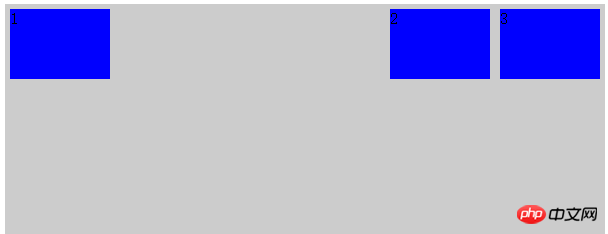
由于给伸缩项1添加了margin-right为auto,所以它独占了本行的剩余空间作为它的right margin值。
利用这个特性,我们在flexbox布局中很容易实现可伸缩元素的垂直水平居中,
css代码;
.flex-container{ display:flex; width:600px; height:230px; background-color: #ccc; justify-content: space-around; align-items:baseline; flex-flow: row wrap; align-content: space-between; } .flex-item{ background-color:blue; width: 100px; height: 70px; margin: 5px;; } .a{ margin:auto; }
HTML代码:
1
效果如下:

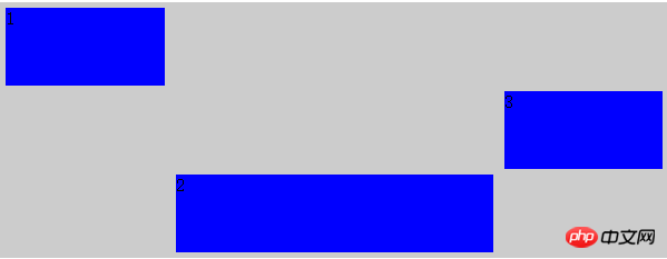
align-self属性,该属性是给各个可伸缩项设置自己的在侧轴上的对齐方式的,之前在容器上设置的align-item属性是作为一个整体设置的,所有的元素对齐方式都一样,align-self属性会覆盖之前的align-item属性,让每个可伸缩项在侧轴上具有不同的对齐方式,取值和align-item相同:
css代码:
.flex-container{ display:flex; flex-direction: row; width:600px; height:230px; background-color: #ccc; justify-content: space-around; align-items:baseline; align-content: space-between; } .flex-item{ background-color:blue; width: 100px; height: 70px; margin: 5px;; } .a{ align-self:flex-start ; } .b{ align-self:flex-end; } .c{ align-self:center; }
html代码:
1
2
3
效果如下:
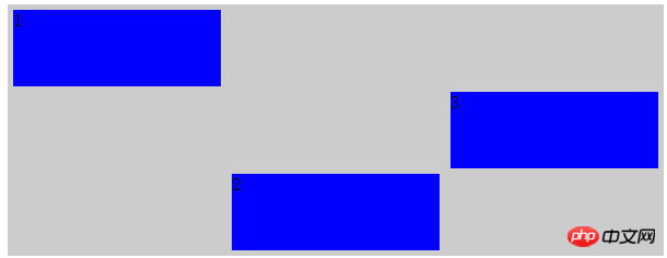
可以看到三个伸缩项在侧轴上被赋予了不同的对齐方式。
flex属性,这个属性是加在伸缩项上面的,它定义了伸缩项如何分配主轴尺寸,通常取值为auto或者数字,auto浏览器会自动均分,数字会按照伸缩项所占的数字比重来分配空间,
这个属性会覆盖伸缩项在主轴上设定的尺寸,当给主轴上伸缩项设定了尺寸(宽或高)和这个属性的时候,事实上还是会按照这个属性来进行空间分配。
css代码:
.flex-container{ display:flex; flex-direction: row; width:600px; height:230px; background-color: #ccc; justify-content: space-around; align-items:baseline; align-content: space-between; } .flex-item{ background-color:blue; width: 100px; height: 70px; margin: 5px;; } .a{ align-self:flex-start ; flex:1; } .b{ align-self:flex-end; flex:2; } .c{ align-self:center; flex:1; }
HTML代码:
1
2
3
效果如下:
可以看到伸缩项尽管设置了宽度,但是最终还是按照我们设置的flex比例对水平空间进行了分割。
The above is the detailed content of Sharing of graphic and text code for Flexbox layout in CSS3. For more information, please follow other related articles on the PHP Chinese website!


![[Web front-end] Node.js quick start](https://img.php.cn/upload/course/000/000/067/662b5d34ba7c0227.png)


