Everyone knows the significance of the viewport tag for responsive design, but you may not know that it also plays a significant role in non-responsive design. If your site is still non-responsive, then in this article you will learn how to use the viewport tag to enhance the display effect of your site on mobile devices.
The Viewport meta tag is generally used in responsive design to design the width and initial-scale of the viewport of mobile devices.
<meta name="viewport" content="width=device-width, initial-scale=1.0">
As we all know, the default viewport width of iPhone is 980px. But your design may not fit within this range. Sometimes it’s wider, sometimes it’s narrower. The following two examples will show you when you can use the viewport tag to enhance the display effect of non-responsive designs on mobile devices.
View the Themify site on iPhone.

The picture on the left side of the screenshot shows the effect of the site when the viewport tag is not used. We can see that the page reaches the edge of the screen. The picture on the right side of the screenshot is the effect after I added the viewport tag. I set the width of the viewport to 1024. At this time, the page and the mobile phone screen will maintain a certain distance on the left and right.
<meta name="viewport" content="width=1024">
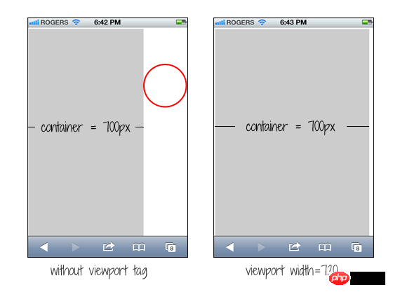
If your design is too narrow, problems will also occur. Assume that your design is non-responsive and the container width is 700px. The effect will be like the picture on the left side of the screenshot, which will create a large gap on the right side of the mobile phone screen.

We can fix this problem by simply adding a viewport with a width of 720px. We haven't made any changes to your design, but iPhone will adjust to accommodate your 720px width.
<meta name="viewport" content="width=720">
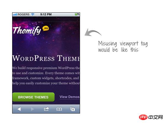
A common mistake is that people will set the initial-scale=1 parameter for non-responsive designs. In this way, the page will be displayed at 100% proportion and the proportion will not be adjusted. This forces people to move the page or perform a zoom-out operation to view the entire page. The worst case scenario is when people use user-scalable=no or maximum-scale=1 together with initial-scale=1. This disables the site's ability to zoom, making it impossible for users to view the entire page this way. So you must remember that if your site is not designed to be responsive, then don’t set it up like this!
<meta name="viewport" content="initial-scale=1, maximum-scale=1, user-scalable=no">

The above is the detailed content of HTML5 practice-an introduction to how to use the ViewPort meta tag in non-responsive design. For more information, please follow other related articles on the PHP Chinese website!


