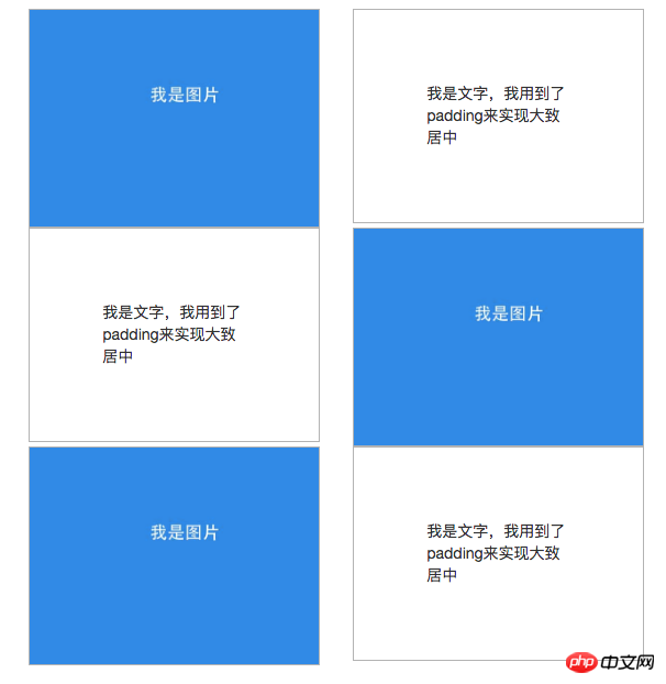
When I was writing a page using wordpress recently, the designer came up with a web page layout pattern that I had never encountered before. Its rendering on a computer (resolution greater than 768px) is as follows:

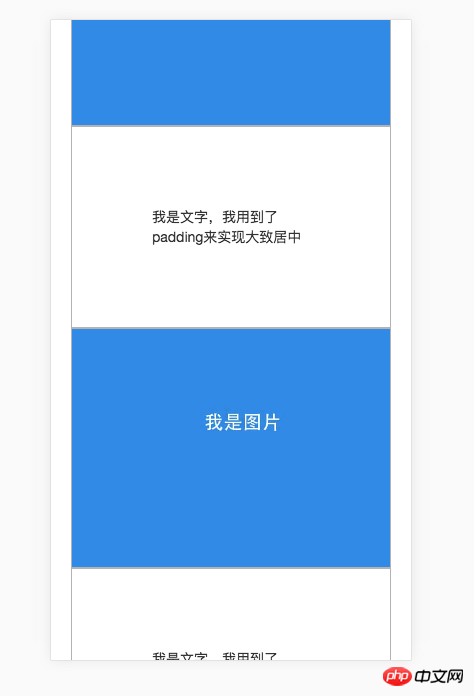
On mobile phones (resolution is less than or equal to 768px), it is required to be arranged like this:

I thought of two methods
The first is to use bootstrap's row and col-md together with col-md-push and col-md-pull to achieve. The code is as follows:
1 nbsp;html> 2 3 4 5 6 7p左右交叉布局--文字和图片交叉 8 9 10 2627
28
29
30
32 3331
34
我是文字,我用到了padding来实现大致居中
35 36 3738
39
40
42 4341
44
我是文字,我用到了padding来实现大致居中
45 46 4748
49
50
52 5351
54
我是文字,我用到了padding来实现大致居中
55 56 57 58 59
Effect on computer:

Effect on mobile phone:

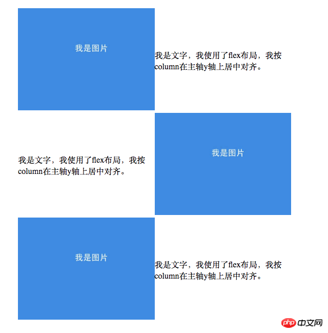
The second method uses flex-direction: row-reverse in flex layout to implement, the code is as follows:
1 nbsp;html> 2 3 4 5 6p左右交叉布局--文字和图片交叉 7 8 9 4142
43
44
我是文字,我使用了flex布局,我按column在主轴y轴上居中对齐。
45 4647
48
我是文字,我使用了flex布局,我按column在主轴y轴上居中对齐。
49 5051
52
我是文字,我使用了flex布局,我按column在主轴y轴上居中对齐。
53 54 55 56


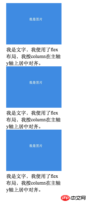
.R:nth-child(even) { flex-direction: row-reverse; }, and then arrange it normally on the mobile phone.R { display: block; width: 100%; }.
I also found that using flex can easily achieve bottom alignment of two ps. The specific code is as follows:.C { display: flex; align-items: flex-end; } .A { background: rgba(255, 0, 0, 0.1); } .A:nth-child(odd) { background: #1a88ea; color: white; font-size: 30px; padding: 10px 15px; }
创新
实验基地
align-items: flex-end;
The effect is as follows:
##Of course, other methods can also be used to achieve this. For example, let C be positioned relatively, let one p in C be positioned absolutely, and then set bottom to 0. The code is as follows, and the effect is the same as above.
创新
实验基地
But obviously, it is easier to implement with flex.
The above is the detailed content of CSS layout flex implements div cross arrangement and bottom alignment method. For more information, please follow other related articles on the PHP Chinese website!


