This article is just to familiarize yourself with the usage of basic attributes and complete the production of each side of a set of dice. In the following content, I will not cover some of the more difficult issues with flexbox, such as old version syntax, vendor prefixes, browser quirks, etc.:
1. First Face
We know that the dice has six sides, and the number of points on each side represents the value of that side. The first side consists of a horizontally and vertically centered point. Let’s look at the specific implementation:
face-01 { display: flex; justify-content: center; align-items: center;
For the usage of justify-content and align-items, please refer to here justify-content, align-items. Using flexbox, you can do it by vertically centering two rows of attributes. It’s very easy!
2. Second Face
.face-02 { display: flex; justify-content: space-between; } .face-02 .dot:nth-of-type(2) { align-self: flex-end; }
We can’t use the align-items attribute here, use it both All points will be affected. Flexbox provides an align-self attribute, which allows us to more conveniently control the flex items to set different layouts along the cross axias direction. For the usage of align-self, please refer to align-self here.
3. Third Face
.face-03 { display: flex; justify-content: space-between; } .face-03 .dot:nth-of-type(2) { align-self: center; } .face-03 .dot:nth-of-type(3) { align-self: flex-end; }
This face uses the same attributes as the second face, no longer explain.
4. Fourth Face
.face-04 { display: flex; justify-content: space-between; flex-direction: column; } .face-04 .column { display: flex; justify-content: space-between; }
In this example, flex-direction is used, literally It can be seen that it is used to control the direction of flex, that is, layout in columns or rows. For more detailed usage of this attribute, please refer to the Fifth Face and Sixth Face behind flex-direction
, according to the previous layout. Thoughts are very easy so I won’t go into details!
Writing this, it should be easy to write a small game of playing dice with JS.
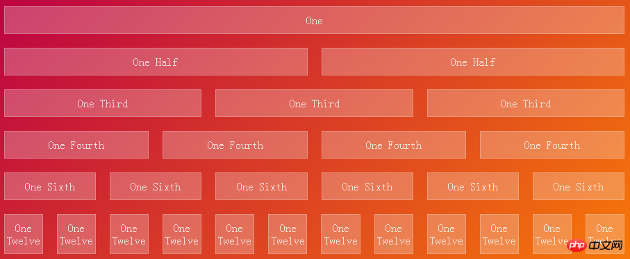
5. Achieve 1,2,3,4,6,12 equal parts
.row { display: flex; box-sizing: border-box; } .column { margin: 10px; flex-grow: 1; flex-shrink: 1; flex-basis: 0; box-sizing: border-box; } One
One Half
One Half
One Third
One Third
One Third
One Fourth
One Fourth
One Fourth
One Fourth
One Sixth
One Sixth
One Sixth
One Sixth
One Sixth
One Sixth
One Twelve
One Twelve
One Twelve
One Twelve
One Twelve
One Twelve
One Twelve
One Twelve
One Twelve
One Twelve
One Twelve
One Twelve

In this example, three attributes, flex-grow, flex-shrink, and flex-basis, are used.
1. flex-grow: Used to define the expansion capabilities of flex items as needed. It accepts a value without units as a ratio. It is mainly used to determine how much space should be expanded proportionally to the remaining space of the scalable container.
If the "flex-grow" of all flex items is set to "1", then each flex item will be set to an equal-sized remaining space. If you set the "flex-grow" value to "2" for one of the flex items, then the remaining space occupied by this flex item is twice the remaining space occupied by the other flex items. Negative values are invalid.
2. flex-shrink: Used to define the ability to shrink flex items as needed. Negative values are also invalid.
3. flex-basis: Used to set the scaling baseline value. The remaining space is scaled according to the ratio. Negative values are not supported. If set to 0, additional space around the content is not taken into account. If set to auto, additional space is allocated based on the flex-grow value.
6. Implement the 2-3-7 layout
row237 .column:first-of-type { flex-grow: 2; flex-basis: 5px; } .row237 .column:nth-of-type(2) { flex-grow: 3; flex-basis: 18px; } .row237 .column:nth-of-type(3) { flex-grow: 7; flex-basis: 70.5px; } One Half
One Third
One Seventh
The above is the detailed content of Implementation of CSS3 Flexbox dice layout and explanation of problem examples. For more information, please follow other related articles on the PHP Chinese website!


