
This article introduces the visual effects of the new features of CSS3, including single-sided shadows, irregular projections, chromosome effects, frosted glass effects, and corner effects. The specific implementation is as follows:
1 , One-sided shadow
1. Application of box-shadow attribute, format: h-shadow v-shadow blur spread color inset attribute value introduction h-sahdow: horizontal shadow position, negative values allowed
①v-shadow: The position of the vertical shadow, negative values are allowed
②blur: Blur distance
③spread: The size of the shadow, expansion distance, can be negative
④color: The color of the shadow
⑤inset/outset: internal or external shadow
2. The expansion distance of the shadow is effective for all four sides and cannot be applied to one side alone.
3. box-shadow supports settings for multiple sets of values to take effect at the same time
Sample code:
.wrap{ width: 200px; height: 120px; background: yellowgreen; box-shadow: 2px 0px 4px -2px black, -2px 0px 4px -2px black; }
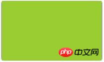
##2. Irregular projection
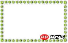
1. Using the shape generated by border-radius, projection is good, but if pseudo elements and translucent decoration are added, The shadow performance is very bad, and there will be problems in the following situations. ① Semi-transparent image, background image, or border-image ②The element sets a dotted, dotted, or translucent border, but has no background (or background-clip is not border-box When) ③The small corners inside the element are generated using pseudo elements ④The shape generated by clip-path Solution: Use svg's drop-shadow to achieve Sample code:.wrap{ width: 200px; height: 120px; border: 6px dotted yellowgreen; --box-shadow: 0px 0px 4px 0px black; -webkit-filter: drop-shadow(2px 0px 2px rgba(0,0,0,1)) }
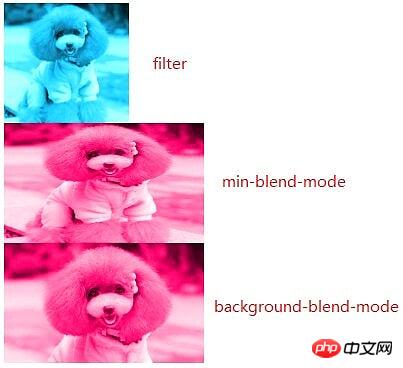
1. Based on filter implementation, apply the relevant values of the filter attribute to adjust the saturation, brightness and other values of the image
2. Based on min-blend-mode implementation, the role is to realize the element content and background and the following The elements are "mixed"
3. Basic background-blend-mode implementation, function: to realize the mixing of background color and background image, background image and image
Sample code for three situations:
.wrap1{ width: 200px; height: 120px; overflow: hidden; } .wrap1 > img{ max-height: 100%; max-width: 100%; -webkit-filter: sepia(1) saturate(4) hue-rotate(150deg); } .wrap2{ width: 200px; height: 120px; background: hsl(335, 100%, 50%); overflow: hidden; } .wrap2 > img{ height: 100%; width: 100%; mix-blend-mode: luminosity; } .wrap3{ width: 200px; height: 120px; background-size: cover; background-color: hsl(335, 100%, 50%); background-image: url("../img/cat.png"); background-blend-mode: luminosity; }
Main implementation principle: content pseudo The element background is the same image as the underlying background; and add filter:blur blur filter. Note that blur cannot be applied to the underlying background, nor can it be applied to the background of an element (this will cause the element itself to be blurred, causing the text to be invisible), and can only be used on pseudo-elements.
The code is as follows:
body{ background: url("../img/cat.png") no-repeat; background-size: cover; } .wrap{ position: relative; width: 500px; margin: 0px auto; padding: 10px; line-height: 1.5; background: hsla(0, 0%, 100%, .3); overflow: hidden; } .wrap::before{ content: ''; background: url("../img/cat.png") 0/cover fixed; position: absolute; top: 0; right: 0; bottom: 0; left: 0; filter: blur(20px); z-index: -1; margin: -30px; }
## Code description: 1. The body and wrap pseudo-elements are applied the same The background image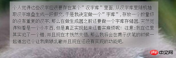
5. Corner effect
Implementation steps
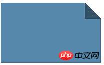
1. First use linear-gradient to achieve the corner effect 2, and then use linear-gradinet to generate it A triangle and set its position, width and height The code is as follows:.wrap{ background: linear-gradient(to left bottom, transparent 50%, rgba(0, 0, 0, .4) 0) no-repeat 100% 0/2em 2em, linear-gradient(-135deg, transparent 1.4em, #58a 0); width: 200px; height: 120px; }
 Note
Note
1. 100% 0/2em 2em is positioning the position, width and height of the background element, especially the width and height of 2em are the normal width of the background element.
2. The 1.4em in the second linear-gradient is measured along the gradient axis, which is the distance from the gradient axis to the top edge of the element. In this example, it is the distance from the gradient axis to the top right edge. 3. to left bottom means that the gradient starts from the lower left corner The above is the entire content of this article. I hope it will be helpful to everyone's learning, and I also hope that everyone will support the PHP Chinese website. For more articles related to the visual effects of new CSS3 features, please pay attention to the PHP Chinese website!


