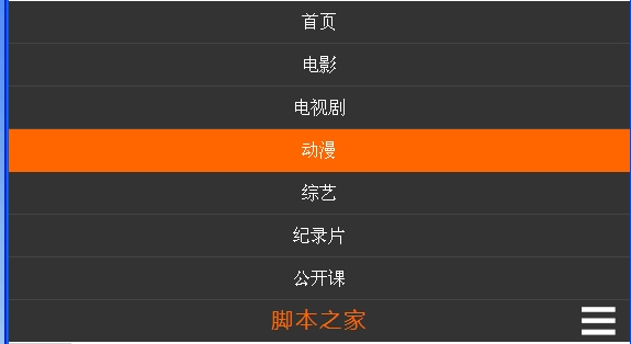
Today I made a responsive navigation bar that can automatically change the style of the navigation bar with different screen resolutions or browser window sizes. The main thing used here is CSS3 Media Query. For details, you can check out the article A Brief Talk on Responsive Layout. I won’t spend a lot of space introducing it here. I mainly look at how to make this navigation bar.
Another thing to mention is that ie6-ie8 does not support CSS3 Media Query, so we need special treatment for ie6-ie8 and let them keep the default style. This must be taken into consideration for layout and style. .
First take a look at the layout. The html code is as follows:
The html part also needs a conditional comment. When the browser is ie6-8, mount a class "ie6-8" to the html tag, which facilitates styling. Processing inside and outside the table:
...
The next step is style control. First, process the overall style and ie6-ie8
* {margin: 0; padding: 0;} body {font: 14px/22px "宋体", arial, serif;} .navBar {margin-top: 80px; width: 100%; height: 38px; background: #333;} .nav {margin: 0 auto; border: 0px solid #ccc;} .nav ul {list-style: none; width: auto;} .nav ul li {height: 38px; text-align: center;} .nav ul li a {display: block; font-size: 16px; color: #fff; text-decoration: none; line-height: 39px;} .ie6-8 .nav {width: 1000px; height: 38px;} .ie6-8 .nav ul li {float: left;} .ie6-8 .nav ul li a {padding: 0 30px 0 30px;} .ie6-8 .nav ul li.current {background: #f60;} .ie6-8 .nav ul li:hover a {color: #f60;} .ie6-8 .nav ul li a:hover {_color: #f60;}/*IE6 Hack*/ .ie6-8 .nav ul li.current:hover a {color: #fff;} .ie6-8 .nav .hot {float: left; margin-left: 20px; padding-top: 8px;} .ie6-8 .nav .hot a {padding: 0 5px 0 5px; font-size: 12px; color: #fff; text-decoration: none;} .ie6-8 .nav .hot a:hover {color: #f60; text-decoration: underline;} .ie6-8 .nav .title {display: none;}
ok. Next, use Media Query.
When the screen width is greater than 1000px:
@media screen and (min-width: 1000px) { .nav {width: 1000px; height: 38px;} .nav ul li {float: left; width: auto;} .nav ul li a {padding: 0 30px 0 30px;} .nav ul li.current {background: #f60;} .nav ul li:hover a {color: #f60;} .nav ul li.current:hover a {color: #fff;} .nav .hot {margin-left: 20px; padding-top: 8px;} .nav .hot a {padding: 0 5px 0 5px; font-size: 12px; color: #fff; text-decoration: none;} .nav .hot a:hover {color: #f60; text-decoration: underline;} .nav .title {display: none;} }
When the screen width is between 640px and 1000px:
@media screen and (min-width: 640px) and (max-width: 1000px) { .nav {width: auto; height: 38px;} .nav ul li {float: left; width: 14%; min-width: 50px;} .nav ul li.current {background: #f60;} .nav ul li:hover a {color: #f60;} .nav ul li.current:hover a {color: #fff;} .nav .hot {display:none;} .nav .title {display: none;} }
When the screen width is less than 640px:
@media screen and (max-width: 640px) { .navBar {margin-top: 0; height: auto; background: #444;} .nav {width: auto; height: auto;} .nav ul li {margin-top: 1px; width: 100%; min-width: 100px;background: #333;} .nav ul li a:active {background: #f60;} .nav .hot {display:none;} .nav .title {position: relative; width: 100%; height: 38px; border-top: 1px solid #444; background: #333; text-align: center; font:normal 20px/35px "Microsoft YaHei", arial, serif; letter-spacing: 2px;} .nav .title a {color: #f60; text-decoration: none;} .nav .title .btn {position: absolute; right: 10px; top: 0; width: 34px; height: 34px; padding: 2px; background: url(btn.png) center center no-repeat; cursor: pointer;} }
ok, the layout and style control is completed, and the effect is there , the effects in 3 different states are as follows:


But for the third picture, we also want an effect, that is, the menu can be collapsed when clicking the icon in the lower right corner , so how to do this? This can be achieved with js. When the menu is in the collapsed state, click the picture menu to expand it; when the menu is in the expanded state, click the icon menu to collapse it, and it also needs animation effects. ok, let’s take a look at js, but I won’t go into details about js. Let’s post the core code:
This part of the code is used to produce animation effects:
var move = function (obj, target) { var timer; clearInterval(timer); timer = setInterval(function () { var speed = (target - obj.offsetTop)/3; speed = speed > 0 ? Math.ceil(speed) : Math.floor(speed); if (Math.abs(obj.offsetTop - target) < 4) { clearInterval(timer); obj.style.marginTop = target + "px"; } else { obj.style.marginTop = obj.offsetTop + speed + "px"; } }, 30); }
For more CSS3 Js responsive navigation bar related articles, please pay attention PHP Chinese website!
 The difference between mysql and sql_server
 Windows 10 startup password setting tutorial
 Java environment variable configuration tutorial
 Firefox browser plug-in summary
 C language variable naming
 WeChat Moments, two dashes and one dot
 The difference between drop and delete
 The difference between tcp and udp


