This chapter will explain font icons (Glyphicons) and understand its use through some examples. Bootstrap comes bundled with glyphs in over 200 font formats. First, let us first understand what a font icon is.
First of all, let me introduce to you what a font icon is:
Font Icon is an icon font used in web projects. The font icons are in the fonts folder of the downloaded Bootstrap.
.glyphicon {
 position: relative;
 top: 1px;
 display: inline-block;
 font-family: 'Glyphicons Halflings';
 -webkit-font-smoothing: antialiased;
 font-style: normal;
 font-weight: normal;
 line-height: 1;
 -moz-osx-font-smoothing: grayscale;
}.glyphicon class declares a relative position offset 1px from the top, renders it as inline-block, declares the font, specifies font-style and font-weight as normal, and sets the line height to 1. Otherwise, use -webkit-font-smoothing: antialiased and -moz-osx-font-smoothing: grayscale; for cross-browser consistency.
About -webkit-font-smoothing and -moz-osx-font-smoothing:
-webkit-font-smoothing attribute. This attribute can make the fonts on the page anti-aliased. After using it, the fonts will look clearer and more comfortable.
none Since
subpixel-antialiased ------Default value
antialiased .
auto
Inherit ------ Inherit the parent element
initial
-moz-osx-font-smoothing attribute, where -osx- indicates that this is a rare feature enhancement launched by mozilla for a specific operating system. Due to the lack of documentation, the currently known value is:
grayscale — anti-aliasing is very good
inherit ------ Inheritance
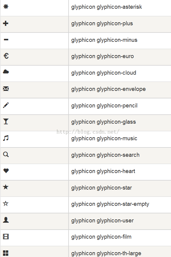
Bootstrap provides 200 font icons, each icon corresponds to a class. When using it, we only need to include the glyphicon and the corresponding class.
Usage:
<!DOCTYPE html>
<html>
<head>
  <meta charset = "utf-8">
  <title>demo</title>
  <link href="bootstrap-3.3.4-dist/css/bootstrap.min.css" rel="stylesheet">
  <style type="text/css">
    body{padding: 20px;}
  </style>
</head>
<body>
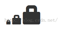
  <span class = "glyphicon glyphicon-lock"></span>
  <span class = "glyphicon glyphicon-lock" style = "font-size:30px;"></span>
  <span class = "glyphicon glyphicon-lock" style = "font-size:60px;"></span>
</body>
</html>

<body>
  <button class="btn btn-default">
    <span class = "glyphicon glyphicon-home"></span>
  </button>
  <button class="btn btn-success">
    <span class = "glyphicon glyphicon-home"></span> Home
  </button>
  <button class="btn btn-info">
    <span class = "glyphicon glyphicon-home"></span> Home
  </button>
  <button class="btn btn-warning">
    <span class = "glyphicon glyphicon-home"></span> Home
  </button>
  <button class="btn btn-warning btn-lg">
    <span class = "glyphicon glyphicon-home"></span> Home
  </button>
  <button class="btn btn-warning btn-sm">
    <span class = "glyphicon glyphicon-home"></span> Home
  </button>
</body>

Customized font icon In the previous example, we have actually customized the size and color of the font icon, which will be further explained here.
You can change the size of the font icon by changing the size of the font or the size of the button.
By setting the color, you can change the color of the font icon, as follows:
<body>
  <button class="btn btn-success">
    <span class = "glyphicon glyphicon-home"></span> Home
  </button>
  <button class="btn btn-success" style="color:#FF0000;">
    <span class = "glyphicon glyphicon-home"></span> Home
  </button>
  <button class="btn btn-success">
    <span class = "glyphicon glyphicon-home" style="color:#FF0000;"></span> Home
  </button>
</body>
 It can be seen that the color of the font icon can be changed by changing the color of its parent element or the span itself.
<body>
  <button class="btn btn-success">
    <span class = "glyphicon glyphicon-home"></span> Home
  </button>
  <button class="btn btn-success btn-lg" style="text-shadow: black 3px 2px 3px;">
    <span class = "glyphicon glyphicon-home"></span> Home
  </button>
  <button class="btn btn-success btn-lg">
    <span class = "glyphicon glyphicon-home" style="text-shadow: black 3px 2px 3px;"></span> Home
  </button>
</body>
 For more information, please view the font icons and bootstrap official documentation:

The above content introduces you to the relevant knowledge of Bootstrap glyphicons font icons. I hope you like it.


