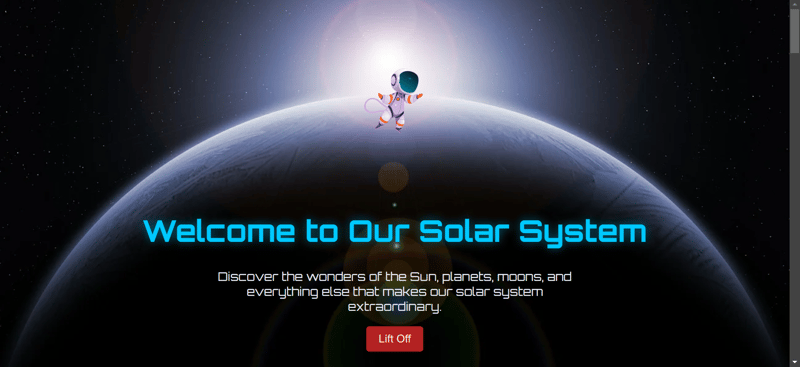
This is a submission for Frontend Challenge v24.09.04, CSS Art: Space.
My inspiration was to check my knowledge and skill in designing a website which i think has showcased in this project.

Demo:https://kannan2004-cre.github.io/devfrontendchallenge/
Github repo:https://github.com/kannan2004-cre/devfrontendchallenge
When I started working on this project, I knew I wanted to create a fun and exciting way to explore the solar system. The topic itself is so vast and exciting, and I wanted to capture that wonder and discovery through art and animation. My first thought was to make the content feel dynamic and alive, as if you were taking a virtual journey through the space.
I started with how people interacted with things on the web and realized that animation would be a great way to grab attention and make the experience more immersive. The idea was to introduce animation as you scrolled down the page, so each new section or fact seemed "seen" in real time. I wanted users to feel hopeful and excited as they navigated each section of the page.
To achieve this, I decided to use fade-in and slide-in animations for the title and content boxes. I thought these images would help create a smooth, flowing experience, as if I were floating in space and encountering each planet or moon along the way I chose to make the subjects fade first, drawing attention to the section topics , then I put the inner boxes in from the side. This way, the animation would be clever and interesting, making the user feel actively engaged in his/her search.
As I worked, I kept asking myself how to balance aesthetics and functionality. I didn’t want the animations to be overwhelming or distracting; The experience needed to be enhanced, not taken away from the content itself. I set out to create images that were simple and contemporary, so they looked natural rather than forced or cluttered.
I also thought a lot about how to structure the content itself. I decided to break it down into different sections—like the planets, moons, and other celestial objects—so each part of the solar system would have its own space to shine. This allowed me to use the animations to highlight the start of each new section, making it clear to the user that they were moving on to something new and exciting.
As I put everything together, I realized that I wanted the animations to not only be visually appealing but also to help guide the user through the content. The idea was to create a sense of continuity and flow, so the user feels naturally drawn from one part of the page to the next. I wanted to keep the user engaged throughout, and I believe the animations played a big role in achieving that.
Overall, I approached the project with the mindset of making it an experience rather than just a webpage. I wanted the user to feel like they were on a journey, discovering new things as they went along. The animations were a key part of creating that sense of discovery and exploration, and I’m really happy with how they turned out.
This was a great oppurtunity for me to showcase my talent and also test my skill.
The above is the detailed content of space frontend challenge. For more information, please follow other related articles on the PHP Chinese website!


