


Welcome back! If you've been following week to week, you may have noticed that this series took a short break! If you've been following along, I'm very sorry!
Some of my work on a personal project took up a significant portion of my attention, plus I just got married, so I'm going to use that as an excuse. If you want to see what I've been working on check out the Build In Public: Roast, series that documents my process from concept to deployment for an app that tracks your home roasts.
Alright, alright. Stop self-promoting, let's get back to moving our boxes around the screen!
Just like in part one, you'll be able to follow along with your CodePen template! If you haven't read Part 1, check it out here. And if you need a new template, click here.
With display and position properties, it may seem like they're affecting the same thing: where something appears on the web page. But, they do have a subtle difference. Positioning properties control how an element is positioned within the document that contains it. Either in normal flow, relative to other elements, or ignoring everything!
Display is different in that it is affecting thewaythat layout is interpreted: the display type. The display property for CSS is a bit of a bear at first, because it not only sets the display type for the element it's applied to (an outer display type), but it also sets the display behaviors for elements contained within the element the property is applied to (an inner display type).
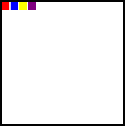
Most elements that we have used so far have a default outer display type of block. This means that no other elements will occupy the same vertical space as that element, effectively, any new element added will create a "new line".
Not all elements are this way. For example,
Well, regardless of the defaults for the element, you can change this property by setting:
display: block display: inline-block
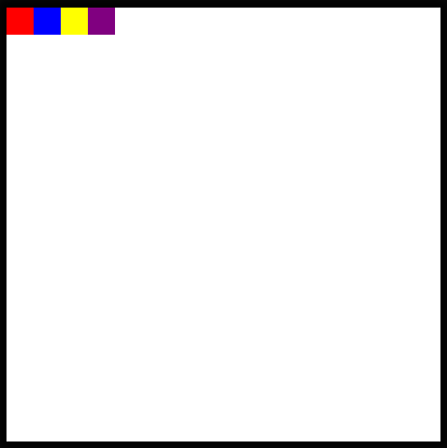
Now in your code pen, change the .box ruleset to make all of the boxes appear side by side.
As for the inner display types, we have a couple more options about how to position things. We can turn our element into a flexbox or a grid, which will affect how its children are laid out.
Each of these concepts deserves an entire post for its own, but basically, a flex box will "flexibly" position elements contained within a parent element inline. The flexbox is more adaptive to different screen sizes since it places items relative to one another and the containing element rather than relative to the window.
To see this in action, take a look at the .frame ruleset in the Codepen.
Uncomment the following line of code:
display: flex;
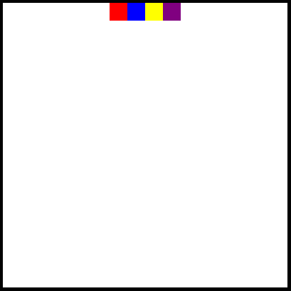
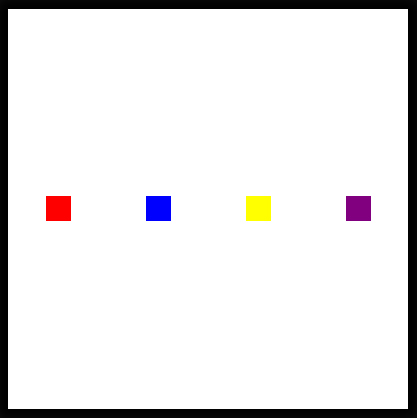
It looks very similar to having four inline-blocks right? By default, a flex container justifies its items to the start of the flexbox, or the left, but, this can be changed too!
Below the declaration of the flexbox, add this:
justify-content: center;
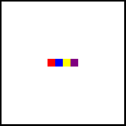
And now we should see all of the boxes appear at the middle of the screen!
But, what if we don't want them to be stuck at the top like that? Let's also add:
align-items: center;
Great!
Note: Before moving on in the CodePen, make sure that you comment out or remove the lines containing display: flex and the justify-content or align-items properties that you added.
In addition to the flexbox, we also have the option to turn our entire element into a grid, where we can place items!
I wont get much into the details of this code here, but know that it is possible by declaring the element to be a grid, providing a grid template and then placing items within the grid!
Uncomment the following lines in the .frame ruleset!
display: grid; grid-template: 1fr 1fr / 1fr 1fr; align-items: center; justify-items: center;
Now, you should see each of the boxes positioned each in the center of a quadrant of the frame!
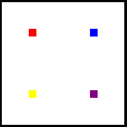
지난 기사와 마찬가지로 여기에는 일련의 과제가 있습니다.시도하기 전에 그리드 레이아웃을 생성하는 코드 줄을 삭제하거나 다시 주석 처리하는 것이 좋습니다!
챌린지 #1:아래 그림과 같이 측면을 건드리지 않고 수평면과 수직 중앙에 각 블록을 균등하게 표시하는 올바른 justify-content 속성을 MDN에서 검색하세요.
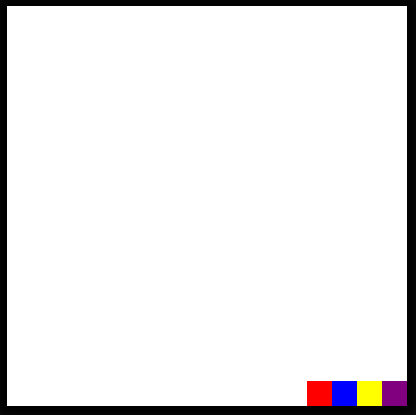
챌린지 #2:아직 플렉스 컨테이너에서 모든 상자를 그룹화하여 오른쪽 하단에 배치할 수 있는지 확인하세요! (이를 위해 어떤 속성을 조정해야 합니까?)
도전 #3:요소의 표시 순서를 바꾸는 플렉스 속성을 찾을 수 있나요?

챌린지를 완료한 것을 축하합니다! 더 많은 HTML과 CSS를 보려면 다음 주에 만나요!
The above is the detailed content of I Like to Move It, Move It (Part 2). For more information, please follow other related articles on the PHP Chinese website!


![[Web front-end] Node.js quick start](https://img.php.cn/upload/course/000/000/067/662b5d34ba7c0227.png)


