


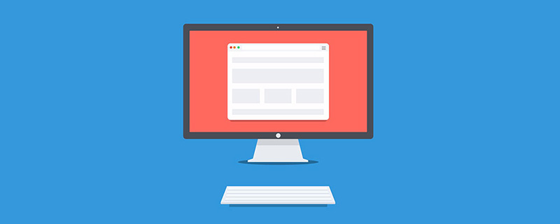
In diesem Artikel werden 6 Front-End-HTML+CSS-Effekte vorgestellt, die es wert sind, erlernt zu werden. Es hat einen gewissen Referenzwert. Freunde in Not können sich darauf beziehen. Ich hoffe, es wird für alle hilfreich sein.
Vorwort: Lernen kann nicht beim Sammeln aufhören, Sie müssen es selbst tun und Ihr eigenes Denken hinzufügen.
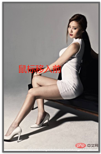
Wenn wir das Bild betrachten, haben wir möglicherweise das Gefühl, dass das Bild etwas klein ist, daher geben wir dem Benutzer ein Erlebnis, wenn der Benutzer die Maus hineinbewegt. Das Bild wird nach und nach größer.
Rendering:
Wissenspunkte:
CSS3 „Übergang“: Transition()----definiert, wie das Bild vergrößert werden soll und die Zeit des Vergrößerungsprozesses
„2D-Konvertierung“ von CSS3: transform:scale()----Bild vergrößern
„Überlauf“ von CSS3:overflow:hidden----Wenn das Bild vergrößert wird, sollte der Überlauf ausgeblendet werden
Code:
<div class="imgDiv">
    <img  src="https://timgsa.baidu.com/timg?image&quality=80&size=b9999_10000&sec=1589451318456&di=6aa6f77e865a4b51ab43b265753ab260&imgtype=0&src=http%3A%2F%2Fb-ssl.duitang.com%2Fuploads%2Fitem%2F201506%2F27%2F20150627225153_AwJYF.thumb.700_0.jpeg" alt="6 Frontend-HTML+CSS-Effekte, die es wert sind, erlernt zu werden" >
</div>

.imgDiv{
    width:300px;
    overflow: hidden;
    box-shadow: 0 1px 4px rgba(0,0,0,0.6);
    border:5px solid rgba(0,0,0,0.6);
    box-sizing: border-box;
}
.imgDiv img{
    width:300px;
}
.imgDiv img:hover{
    transform:scale(1.1) ;
    transition: 0.5s linear;
}Wissenspunkte:
1.
2. CSS-Graufilter: Graustufen()
3. CSS-Sepiafilter: Sepia()
Code:
.imgDiv{
    width:300px;
    overflow: hidden;
    border:5px solid rgba(0,0,0,0.6);
    box-sizing: border-box;
    display: flex;
    flex:auto;
    margin-top:100px;
    margin-left:100px;
}
.imgDiv img{
    width:300px;
    filter:grayscale(100%);<-新增->
}
.imgDiv img:hover{
    transform:scale(1.1) ;
    transition: 0.5s linear;
    filter:grayscale(0);<-新增->
}Rendering: 
Wissenspunkte:
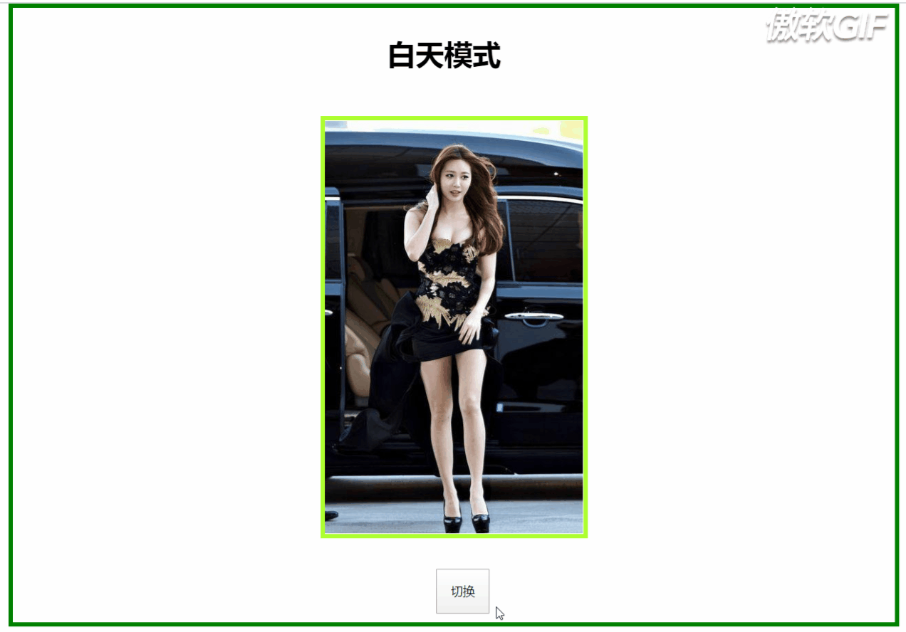
1. CSS-Filter: invertieren () ist die Farbe des Bildes weiß, invertieren (1) ist schwarz.
<div id="body">
    <div class="text"><h1 id="text">白天模式</h1></div>
<div class="imgDiv">
    <img  src="https://timgsa.baidu.com/timg?image&quality=80&size=b9999_10000&sec=1589524167527&di=c6cd44a0f1e364a7d37a08e8a61d52b6&imgtype=0&src=http%3A%2F%2Fhbimg.b0.upaiyun.com%2F80833e85c3cdc40a722f7d914761bee6e175abf3bcc6f-deDZNA_fw658" alt="6 Frontend-HTML+CSS-Effekte, die es wert sind, erlernt zu werden" >
</div>
<div class="container" id="container">
    <button (click)="translate()">切换</button>
</div>
</div>


isChange:boolean=true;
  translate(){
    var body=document.getElementById("body");
    var text=document.getElementById("text");
    var container=document.getElementById("container");
    if(this.isChange){
      body.setAttribute("style","filter:invert(100%)");
      text.innerHTML="白天模式";
      this.isChange=false;
    }else{
      body.setAttribute("style","filter:invert(0%)");
      text.innerHTML="黑夜模式";
      this.isChange=true;
    }
}Rendering:
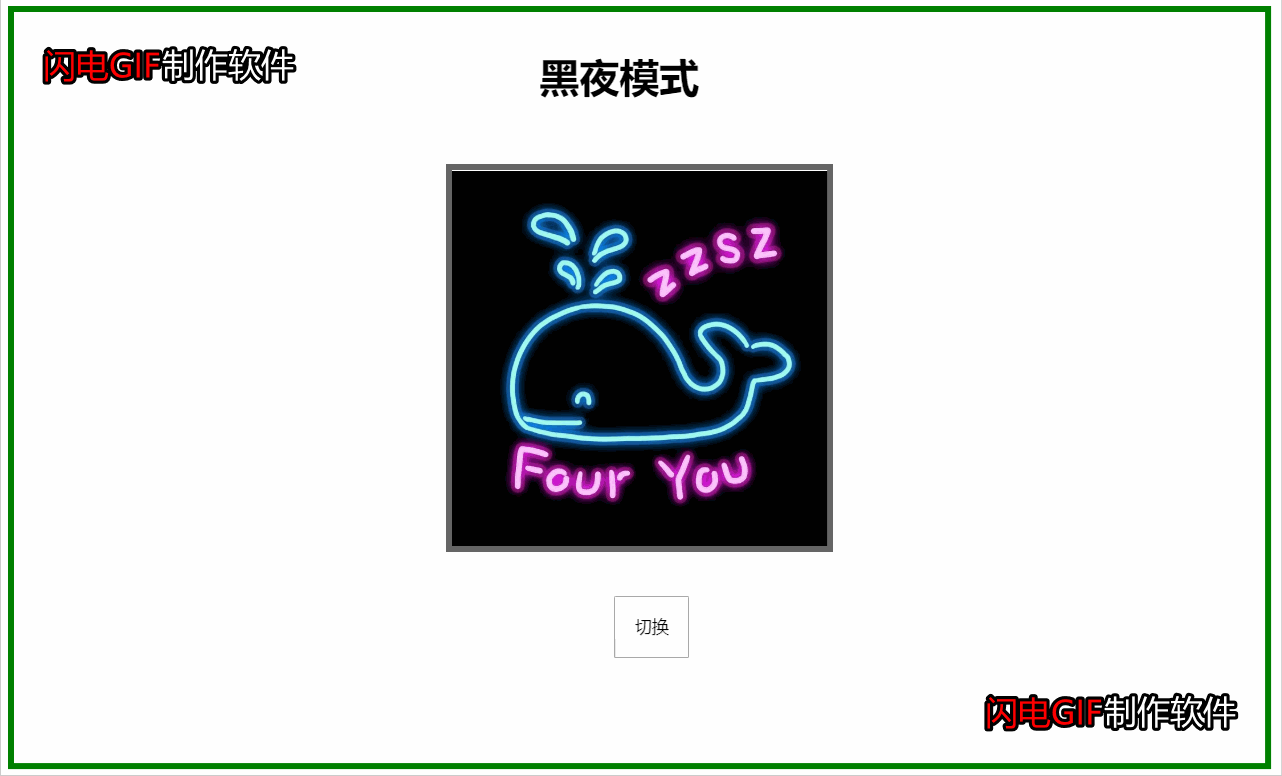
Hinweis:
Dies ist kein „ernsthafter“ Tag- und Nachtmodus, da die Farbe seiner untergeordneten Elemente geändert wird, nachdem das übergeordnete Element den Inversionsfilter festgelegt hat auch umgekehrt werden. Dadurch verlieren untergeordnete Elemente wie Bilder ihr ursprüngliches Aussehen.
Bei Verwendung des Umkehrfilters müssen Sie zuerst die Hintergrundfarbe für das Element festlegen, sonst funktioniert es nicht.
Der Inversionsfilter invertiert nicht nur Schwarz und Weiß, sondern verfügt auch über eine entsprechende Invertierung für jede Farbe.
Wissenspunkte:
1. CSS-Übergang: Übergang
2. Hier verwendet das Unterelement auch das obige invert() zum Ändern Bei der Schriftfarbe können Sie js auch direkt zum Konvertieren der Farbattribute der Schriftart verwenden, die Filtereffizienz ist jedoch höher
Bei Interesse können Sie den
kleinen Behälter an eine beliebige Stelle des großen Behälters verschieben, beispielsweise in die Mitte, und ihn so einstellen, dass sich der Effekt auf beide Seiten erstreckt oder kreisförmig erscheint. 5. Gemischter Modus Spielfilm Overlay
 Bildschirmfilter
Overlay-Overlay
abdunkeln, aufhellen, aufhellen, Farbe ausweichen, Farbe ausweichen -Brandfarbe vertieft sich
hart-hell-stark Licht
Ausschluss Ausschluss
Farbton Farbton
Sättigung Sättigung.
Farbe Farbe
Leuchtkraft
<div id="body">
    <div id="translate"></div>
    <div class="text"><h1 id="text">白天模式</h1></div>
<div class="imgDiv">
    <img  src="http://img5.imgtn.bdimg.com/it/u=2473598420,2292311239&fm=26&gp=0.jpg" alt="6 Frontend-HTML+CSS-Effekte, die es wert sind, erlernt zu werden" >
</div>
<div class="container" id="container">
    <button (click)="translate()">切换</button>
</div>
</div>

<-只展示id=translate的css->
#translate{
    position: absolute;
    width:0px;
    height:0px;
    transition:width 2s,height 2s;
    background-color:black;
}

export class HoverToLargeImageComponent implements OnInit {
  isChange:boolean=true;
  translate(){
    var text=document.getElementById("text");
    var translate=document.getElementById("translate");
    if(this.isChange){
      translate.setAttribute("style","width:990px;height:690px;");
      text.innerHTML="黑夜模式";
      text.setAttribute("style","filter:invert(100%)")
      this.isChange=false;
    }else{
      translate.setAttribute("style","width:0px;height:0px");
      text.innerHTML="白天模式";
      text.setAttribute("style","filter:invert(0)")
      this.isChange=true;
    }
  }
}Hinweis:
befindet, sollte von nachfolgenden Elementen abgedeckt werden und kann nicht angezeigt werden. Die Verwendung von Z-Index kann jedoch das Problem der Elementabdeckung lösen.
isolation属性:隔离,主要与mix-blend-mode属性一起使用,将混合模式只应用于某一个元素或某一组元素。可取值:auto|isolate(创建新的堆叠上下文)。使用了isolate之后,该元素就不会再与父元素混合,而是与它的子元素混合。
这里用了四张图片,四种不同的混合属性值和背景色,感受混合模式的炫。
知识点:
CSS之背景固定:background-attachment
上代码:
<div class="container">
    <div class="parallax-img">
        <div class="title">
            <h1>因为爱,所以爱</h1>
        </div>
    </div>
   <div class="myLove">
       <div><img  src="http://f.hiphotos.baidu.com/zhidao/pic/item/a50f4bfbfbedab642e3fbc9af436afc379311e1e.jpg" alt="6 Frontend-HTML+CSS-Effekte, die es wert sind, erlernt zu werden" ></div>
       <div class="article">
           <article>与你一见如故,是我今生最美丽的相遇。
        与你一诺相许,是我素色年华里最永恒的风景。
        一直想说,无论走到哪里,最想去的是你的身边。
        愿我们彼此相爱,一直到时间的尽头。
        我相信我们可以一起,等青丝变白发。
        你在,我在,就是海枯石烂。
        没有过多的华丽,只有一句我喜欢你,却能让彼此牵挂于心。
        亲爱的,你知道吗,哪怕遍体鳞伤,我仍有爱你的余力。
        有的人你只看了一眼,却影响其一生。
        生活就像是包饺子,不管你是什么馅,我都会紧紧的把你包在我心里,任生活的沸水怎样煮,都磨不掉		      我对你的爱!
        好久没有见你了,心中十分挂念,可是又不敢去看你,因为害怕打扰你,你会不开心,所以我尽力的控制自己思念的心。

不知道这些日子,你是不是跟我一样,牵挂你,想念你;我是真的特别想你,想看看你的笑,想看看你纯真的脸;想着你,我就特别来劲,晚上都无法睡好!
            </article>
        </div>
   </div>
   <div class="parallax-img1">
       <div>
           <h1>我爱你,无畏人海的拥挤</h1>
       </div>
   </div>
   <div class="parallax-img2">
    <div>
        <h1>你小心一吻便颠倒众生  一吻便救一个人</h1>
    </div>
   </div>
 </div>


.container {
    height: 100vh;
}
.parallax-img {
    background-attachment: fixed;
    background-position: center;
    background-repeat: no-repeat;
    background-size: cover;
    height: 100%;
    background-image: url("http://ppe.oss-cn-shenzhen.aliyuncs.com/collections/182/7/thumb.jpg");
}
.title{
    position: relative;
    width:300px;
    height: 150px;
    left: 50%;
    top:50%;
    transform: translate(-50%,-50%);
    background-color: gray;
    line-height: 150px;
    text-align: center;
    color:tan;
}
.myLove{
    display: flex;
    height:400px;
    width:100%;
    background-color: gray;
}
.myLove div{
    width:30%;
    height: 80%;
    margin-left: 100px;
    margin-top:50px;
}
.myLove div img{
    width:100%;
    height:100%;
}
.myLove .article{
    margin-left: 250px;
}
.parallax-img1 {
    background-attachment: fixed;
    background-position: center;
    background-repeat: no-repeat;
    background-size: cover;
    height: 100%;
    background-image: url("http://ppe.oss-cn-shenzhen.aliyuncs.com/collections/182/5/thumb.jpg");
}

.parallax-img2{
    background-attachment: fixed;
    background-position: center;
    background-repeat: no-repeat;
    background-size: cover;
    height: 100%;
    background-image: url("http://ppe.oss-cn-shenzhen.aliyuncs.com/collections/181/10/thumb.jpg");
}
.parallax-img1 div,.parallax-img2 div {
    position: relative;
    left: 50%;
    top:50%;
    transform: translate(-50%,-50%);
    background-color: gray;
    width:40%;
    height:50px;
    text-align: center;
    color: tan;
}效果图:
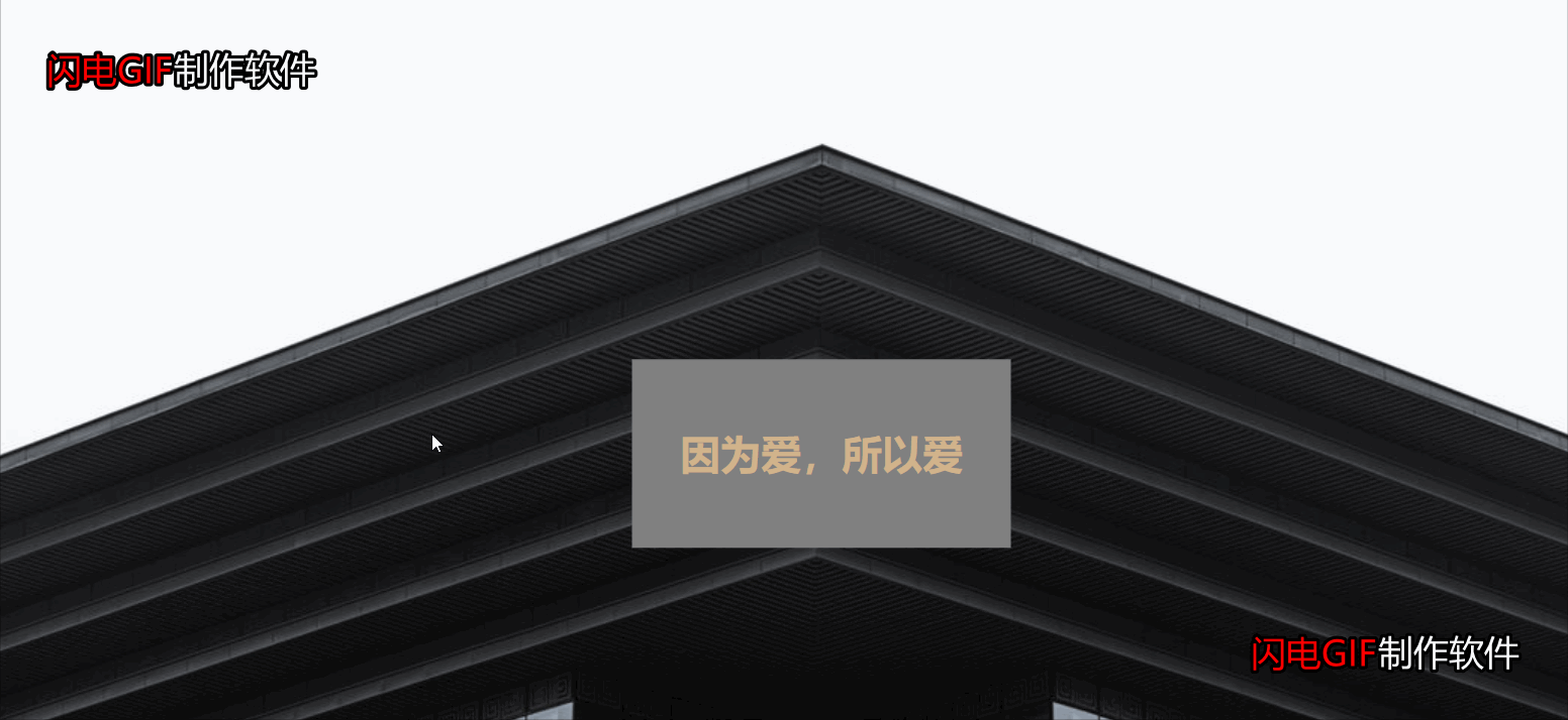
注意:
如果能录全屏则效果更佳,但由于图片上传大小限制,只能录制中间部分和快速拉过。如果喜欢,可以自己试试,代码已全部粘贴出来。
其实就是一个CSS属性的知识,就看你如何配置图片、色效使效果更炫酷。
图片能决定视图效果,因此,上面三张图片来源于原博客。
更多编程相关知识,请访问:编程视频!!
Das obige ist der detaillierte Inhalt von6 Frontend-HTML+CSS-Effekte, die es wert sind, erlernt zu werden. Für weitere Informationen folgen Sie bitte anderen verwandten Artikeln auf der PHP chinesischen Website!
 Ist Python Front-End oder Back-End?
 So implementieren Sie Instant Messaging im Frontend
 Der Unterschied zwischen Front-End und Back-End
 Einführung in die Beziehung zwischen PHP und Frontend
 Die Rolle der Server-Netzwerkkarte
 So konvertieren Sie HTML-Dateien in PDF-Dateien
 Konfiguration der Python-Umgebungsvariablen
 Der Computer hat Internetzugang, aber der Browser kann die Webseite nicht öffnen


![[Web-Frontend] Node.js-Schnellstart](https://img.php.cn/upload/course/000/000/067/662b5d34ba7c0227.png)


