


flex is called elastic layout. When the parent element is set to the flex value, the child elements will automatically become its members, and then various layout effects can be achieved by setting attribute values. For example, by setting the justify-content attribute to the parent element to achieve the horizontal and vertical centering effect
Various page layouts can be implemented simply, completely, and responsively through Flex. With the development of browsers, it is now supported by all browsers, which means that it is now safe to use this feature. Next, I will share with you how to layout web pages through flex
[Recommended course: CSS Tutorial】
flex layout
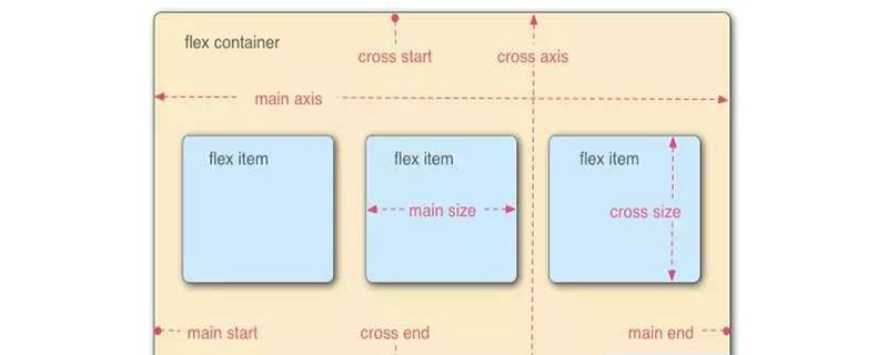
is called the "flexible box model". When the parent container sets display: flex, the child element automatically becomes Among its members, the container has two axes by default: the horizontal main axis and the vertical cross axis. The items are arranged along the main axis by default.
Some properties of the flex container (parent container):
flex-direction: determines the direction of the main axis (ie, the arrangement direction of the items)
flex -wrap: If one axis cannot be arranged, how to wrap the line
flex-flow: It is the abbreviation of the flex-direction attribute and the flex-wrap attribute. The default value is row nowrap
justify-content: Defines the alignment of items on the main axis
align-items: Defines how items are aligned on the cross axis
align-content: Defines the alignment of multiple axes. If the item has only one axis, this property has no effect
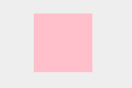
Example
flex achieves horizontal and vertical centering
* {
            margin: 0;
            padding: 0;
        }

html {
            width: 100%;
            height: 100%;
        }
 body {
            display: flex;
            width: 100%;
            height: 100%;
            background: #eee;
            justify-content: center;
            align-items: center;
        }
 .box {
            width: 200px;
            height: 200px;
            background:pink;
}Rendering:
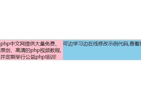
Two columns of equal height layout:
Fixed width on the left , the right side occupies the remaining width:
<style>
    *{
        margin: 0;
        padding:0;
    }
    .grid{
        display: flex;
        border: 1px solid #ccc;
    }
    .left{

        background-color:pink;
        flex-basis: 200px;
}
    .right{

        background-color:skyblue;
        flex-basis:calc(100% - 200px);
    }
</style>Rendering:
The above is the detailed content of How to layout web pages through flex. For more information, please follow other related articles on the PHP Chinese website!


![[Web front-end] Node.js quick start](https://img.php.cn/upload/course/000/000/067/662b5d34ba7c0227.png)


