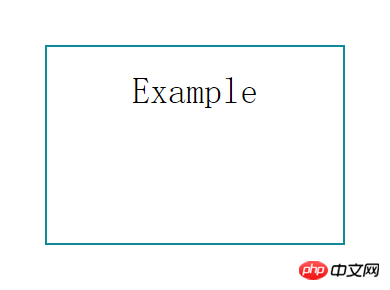
This time I will bring you the implementation of multi-background simulated dynamic borders and what are the precautions for realizing multi-background simulated dynamic borders. The following is a practical case, let's take a look.
First let’s take a look at the renderings to be achieved

Implementation method As follows
The first thing I thought of was the border attribute, but the border attribute cannot set the length. If implemented with borders, other elements need to be used to simulate it, which is more troublesome. Then I suddenly remembered that I had seen someone using CSS3 multiple backgrounds to simulate borders on the Internet, so I gave it a try.
css3 background
CSS3 has made some modifications to the background. The most obvious one is to set multiple backgrounds, which not only adds 4 new attributes, and also adjusted and enhanced the current attributes.
1. Multiple background images
In css3, you can apply multiple background images to a label element. The code is similar to the css2.0 version, but the referenced images need to be separated by "," commas. The first image is the background positioned at the top of the element, and subsequent background images are displayed below it in turn, as follows:
background-image: url(top-image.jpg), url(middle-image.jpg), url(bottom-image.jpg);
2. New attribute: Background Clip
This discussion brings us back to the issue mentioned at the beginning of the article about the background being blocked by the border. The addition of background-clip gives us complete control over the position of the background display.
The attribute values are as follows:
background-clip: border; The background begins to display under the border
background-clip: padding; The background begins to display under padding, not Start under the border border
Background-clip: content; The background starts under the content area, not under the border border or padding.
background-clip: no-clip; Default attribute value, similar to background-clip: border;
3. New attribute: Background Origin
This attribute needs to be used in conjunction withbackground-position. You can use background-position to calculate positioning from the border, padding or content boxes content area. (Similar to background-clip)
background-origin: border; starting from the border border position
background-origin: padding; starting from the padding position
background-origin: content; starting from the position of the content-box content area;
The difference between background-clip and background-origin is well analyzed and explained by the www.CSS3.info website .
4. New attribute: Background Size
The Background Size attribute is used to reset your background image.
There are several attribute values:
background-size: contain; Reduce the background image to fit the label element (mainly the ratio of pixels)
background-size: cover; Let the background image be enlarged and extended to the entire label element size (mainly the pixel ratio)
background-size: 100px 100px; Indicate the size of the background image to be scaled
background-size: 50% 100%; The percentage is based on the size of the content tag element to scale the size of the image
You can go to the CSS 3 specifications site to see a simple case description.
5. New attribute: Background Break
In css3, label elements can be divided into different areas (such as: allowing inline elements to span across multiple lines), background- The break attribute can control the background to be displayed in different areas.
Property value:
Background-break: continuous; This property is the default value, ignoring the gaps between areas (applying images to them is like treating them as one area)
Background-break: bounding-box; Reconsider the spacing between areas
Background-break: each-box; 对每一个独立的标签区域进行背景的重新划分。
6、背景颜色的调整
background-color属性在css3版本里面稍微做了增强,除了指定background color背景颜色之外,还可以对不使用的标签元素背景图片进行去色处理。
background-color: green / blue;此例子里,这背景颜色可能是绿色,然而,如果底部背景图片无效的话,蓝色将代替绿色来显示。如果你没有指定某个颜色的话,它将其视为透明。
7、背景重复的调整
css2里当设置背景的时候,它经常被标签元素截取而显示不全,css3介绍了2个新属性来修复此问题。 space:图片以相同的间距平铺且填充整个标签元素 round:图片自动缩放直到适应且填充整个标签元素
CSS 3 specifications网站对background-repeat: space的使用就是一个现成的例子。
8、Background Attachment 的调整
Background Attachment有了一个新属性值:local,当标签元素滚动时它才有效(如设置overflow:scroll;),当background-attachment设置为scroll时,背景图片是不随内容滚条滚动的。现在,有了background-attachment:local,就可以做到让背景随元素内容滚动而滚动了。
css3 多背景模拟元素边框
我们这里主要使用了background-img、background-size 和 background-position 三个属性。
background-image: [background-image], [background-image], [background-image]; background-position: [background-position], [background-position], [background-position]; background-repeat: [background-repeat], [background-repeat], [background-repeat];
简写形式如下:
background: [background-image] [background-position] [background-repeat], [background-image] [background-position] [background-repeat], [background-image] [background-position] [background-repeat];
现在我们用多背景来模拟一个元素的边框
/*CSS*/ .exammple { background: linear-gradient(0, #108b96 2px, #108b96 2px) no-repeat, linear-gradient(-90deg, #108b96 2px, #108b96 2px) no-repeat, linear-gradient(-180deg, #108b96 2px, #108b96 2px) no-repeat, linear-gradient(-270deg, #108b96 2px, #108b96 2px) no-repeat; background-size: 100% 2px, 2px 100%, 100% 2px, 2px 100%; background-position: left top, right top, right bottom, left bottom; }
我们用四个渐变的背景来模拟四个边框(为什么我们要用渐变而不是直接的Color呢?这是由于Css的多背景只能是background-image, background-color不支持多个值,所有即便是纯色的边框,我们也只能使用渐变)。

接下来我们让边框动起来
/*CSS*/ .exammple { transition: ease-in .3s; background: linear-gradient(0, #108b96 2px, #108b96 2px) no-repeat, linear-gradient(-90deg, #108b96 2px, #108b96 2px) no-repeat, linear-gradient(-180deg, #108b96 2px, #108b96 2px) no-repeat, linear-gradient(-270deg, #108b96 2px, #108b96 2px) no-repeat; background-size: 0 2px, 2px 0, 0 2px, 2px 0; background-position: left top, right top, right bottom, left bottom; } .exammple:hover { background-size: 100% 2px, 2px 100%, 100% 2px, 2px 100%; }
相信看了本文案例你已经掌握了方法,更多精彩请关注php中文网其它相关文章!
推荐阅读:
The above is the detailed content of Implement multiple background simulation dynamic borders. For more information, please follow other related articles on the PHP Chinese website!
 What are the methods to change IP in dynamic vps instantly?
 What to do if phpmyadmin fails to import sql file
 Check cpu usage in linux
 How to open zip file
 what are prime numbers
 Introduction to frequency converter maintenance methods
 oracle database running sql method
 Usage of sprintf function in php


