


Rounded corners: border-radius
Shadow: box-shadow
BorderPicture: border-image
Box-sizing: border-box;
A value sets the horizontal and vertical radii of the four corners of the box. Each corner can be set independently. The value order is upper left, upper right, lower right, lower left, clockwise setting, which can be abbreviated. The logic is the same aspaddingandmargin. The units support pixels and percentages (referring to width and height)
You can use the horizontal radius/vertical radius to control the radius independently, and each radius can be controlled independently
p:nth-child(5){ border-radius: 0px 200px; } p:nth-child(7){ width: 400px; /* 如果中间有斜杠,控制的是水平方向和垂直方向的半径大小 */ border-radius: 200px/100px; }
Capsule production: The value is greater than or equal to half of the short side, and more than half will not Change.
p { width: 200px; height: 100px; background-color: palevioletred; border-radius: 50px; }
Value description:
First value: Npx Shadow offsets N pixels horizontally Second value: Npx The shadow is offset by N pixels in the vertical direction. The third value: feather size. The fourth value: shadow size. The fifth value: color (default black). The sixth parameter: inner and outer shadow (default is outer shadow, inner shadow is inset) You can write multiple shadows, separated by commas
The shadow can be abbreviated, but you need to note that some values need to be filled in. 0
p:nth-child(8):hover{ /* 阴影可以写多个 */ background-color: #000; box-shadow: 10px 10px 10px 2px red, 20px 20px 10px 4px green,30px 30px 2px 6px blue; }
Syntax:text-shadow: horizontal offset vertical offset feather size color
Follows the Jiugong format cut Picture, cut the top, bottom, left and right respectively.
Value description:
border-image-source:url('border.png'); Picture path border-image-slice:26; Picture cutting, Do not bring units, follow the nine-square format cutting method (one cut each for top, bottom, left and right) border-image-repeat: round or stretch or repeat; round has no defects, stretch defaults to stretching, repeat tiles (may have defects)
Abbreviation: border-image:url('border.png') 26 round;
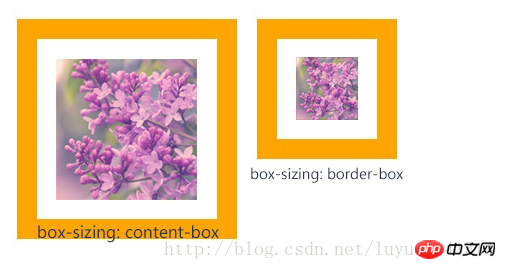
content-box:padding and border are not included in the defined width and height.The actual width of the objectis equal to the sum of the set width value, border and padding, that is (Element width = width + border + padding)
Thisattributebehaves as in standard modeBox model.
border-box:padding and border are included within the defined width and height. The actual width of the object is equal to the set width value. Even if border and padding are defined, the actual width of the object will not be changed, that is (Element width = width)
This attribute behaves like a box model in weird mode.
 vcq91q7SuzwvcD4NCjxwcmUgY2xhc3M9"brush:sql;"> /*bootstrapSet this style globally*/ *, *::before, *:after{ border-sizing:border-box; }
Small example: Implement a two-column layout, always maintaining a 10px spacing in the middle


