Let’s discuss and learn with you a three-column (three-column) layout using p+css, and the adaptive width of the left and right sides is fixed in the middle, which sounds quite interesting. Because I have only encountered it before, the left and right columns are fixed and the middle is adaptive. This morning, I discussed and learned with several friends in Adang Daxia's writing high-quality front-end code group a three-column (three-column) layout using p+css, with fixed left and right adaptive widths in the middle. Sounds quite interesting. Because I have only encountered it before, the left and right columns are fixed and the middle is adaptive. So after thinking about it, I immediately started typing on the keyboard and tried it myself, and then tested it with everyone, and it still passed the test of each browser. In order to facilitate my own reference in the future, I also want friends who don’t know to learn this layout together, especially I sorted out the code and posted it to share and learn with everyone.
Before talking about this layout, I would also like to recall with you another type of three-column layout, which is that the left and right columns are fixed and the middle has an adaptive width. If you ask Dad G and Du Niang online about this kind of layout method, there will definitely be a lot of them, but I still have to repeat it to facilitate my own reference in the future. My memory is too bad, so I can't help it. Without talking about anything else, let’s get into the topic. For the adaptive layout method of fixing one column in the middle on both sides, I first used the absolute positioning method. Let’s look at the code first
The code is as follows:
<p id="left">左边栏p> <p id="right">右边栏p> <p id="main">主内容p>
For example, my left and right columns are both 220px, and the middle width is adaptive, then we use absolute positioning to achieve it The method is like this
The code is as follows:
html,body { margin:0; padding:0; height: 100%; } #left, #right { position: absolute; top:0; width: 220px; height: 100%; } #left { left:0; } #right { right:0; } #main { margin: 0 230px; height: 100%; }
This method is the simplest and the most troublesome. If the middle column contains a minimum width limit, Or there are internal elements with width. When the browser width is small to a certain extent, layer overlap will occur. I personally no longer recommend using this layout.
The second method uses floating layout
This method is very similar to the absolute positioning method above, except that floating is used here instead of absolute. Positioning, first look at its html code
The code is as follows:
<p id="left">left p> <p id="right">rightp> <p id="main">mianp>
This method I use is the floating principle, and the left and right fixed widths are floated left and right respectively. , at this time the main content column (the middle column has no fixed size) will be automatically inserted into the middle of the left and right columns. The most important thing to note is that the middle column must be placed behind the left and right columns, as shown in the html code above , let’s take a look at how the css style is implemented.
The code is as follows:
#left, #right { float: left; width: 220px; height: 200px; background: blue; } #right{ float: right; } #main { margin: 0 230px; background: red; height: 200px; }
Isn’t it such a simple method? You can use it on your local machine Go ahead and test it, the effect is as follows:
The third method: negative margin
Using this method is a little more complicated Some, using negative margin values, and html tags have also been added, let’s look at the code first
The code is as follows:
<p id="main"> <p id="mainContainer">main contentp> p> <p id="left"> <p id="leftContainer" class="inner">left contentp> p> <p id="right"> <p id="rightContainer" class="inner">rightp> p>
From From the above Html code, we can clearly see that I have added a p inside the three p's of main, left, and right. So what role do they play? You can clearly understand it from the CSS below. come out.
The code is as follows:
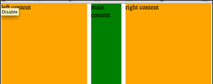
#main { float: left; width: 100%; } #mainContainer { margin: 0 230px; height: 200px; background: green; } #left { float: left; margin-left: -100%; width: 230px } #right { float: left; margin-left: -230px; width: 230px; } #left .inner, #right .inner { background: orange; margin: 0 10px; height: 200px; }
Let’s briefly talk about its implementation principle. This method of layout mainly uses negative margin values. First, I set a 100% width in p#main and float it left, and the main content is placed in its inner layer p#mainContainer, and a margin-left and margin-right setting are required in this main content layer. , and these two values are very particular and cannot be set casually. These two values need to be equal to the width of the left and right columns. Ours here is 230px. Both the left and right columns are laid out using negative margin values and left floating. The left column is left floating and added with a "margin-left:-100%". This is because there is a p#main in front of p#left. And its width is 100%, so set the margin-left: -100% in the left column; it just positions the left column to the leftmost side of the page; and the right column also floats left, but its defined "margin-left" " is also a negative value and is equal to its own width of 230px; finally, adding a p.inner to p#left and p#right is to better control the spacing between the sidebar and the main content column. For example, 10px in this example. You can see if the effect is the same as the second method.
The above has finished the common layout methods, and then let’s look at another three-column layout with a fixed width in the middle and adaptive width on both sides. For me, this is a layout method that I rarely encounter. I don’t know what you think about it. So let’s take a look at the implementation process of this layout method. Let’s also look at the html code first:
代码如下:
<p id="left"> <p class="inner">this is left sidebar contentp> p> <p id="main"> <p class="inner">this is main contentp> p> <p id="right"> <p class="inner">this is right siderbar contentp> p>
这种方法也是借助于负的margin来实现的,首先我们在中间列定好固定值,因为此值是不会在改变的,接着对其进行左浮动;那么关键地主是在左右边栏设置地方,这种方法是将其都进行50%的宽度设置,并加上中负的左边距,此负的左边距最理想的值是中间栏宽度的一半加上1px,比如说此例中是"540px/2+1"也就是说他们都有一个"margin-left: -271px",这样一来,左右边栏内容无法正常显示,那是因为对他们进行了负的左边距操作,现在只需要在左右边栏的内层p.inner将其拉回来,就OK了,大家可以看下在的代码:
代码如下:
#left, #right { float: left; margin: 0 0 0 -271px; width: 50%; } #main { width: 540px; float: left; background: green; } .inner { padding: 20px; } #left .inner, #right .inner { margin: 0 0 0 271px; background: orange; }
具体效果如下:
这种方法如果在ie下会存在布局混乱的bug,你可以将p#right和p#left中的width值稍作修改:
代码如下:
#left, #right { float: left; margin: 0 0 0 -271px; width: 50%; *width: 49.9%; }
这样一来,在ie下也就安全了。
实现这种效果的方法可能有很多,希望大家有更好的方法能一起分享一起学习。
2012年09月26日更新——CSS3 Flexbox
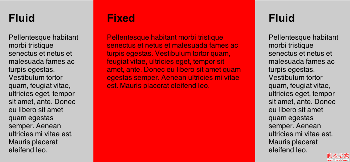
前面介绍了三种方法,实现L1F2L3布局效果,也就是第一列和第三列自适应宽度,中间一列固定宽度。今天在给大家推荐一种CSS3实现这种布局的方法,采用CSS3的Flexbox,这种方法 不足之处就是只能在部分浏览器中使用,详细的请看下面代码:
HTML结构
代码如下:
<p class="grid"> <p class="col fluid"> ... p> <p class="col fixed"> ... p> <p class="col fluid"> ... p> p>
CSS代码
代码如下:
.grid { display: -webkit-flex; display: -moz-flex; display: -o-flex; display: -ms-flex; display: flex; } .col { padding: 30px; } .fluid { flex: 1; } .fixed { width: 400px; }
效果如下面的demo所示:
更多Discussion on CSS three-column layout - fixed width in the middle and adaptive width on both sides相关文章请关注PHP中文网!


