


![[Web front-end] Node.js quick start](https://img.php.cn/upload/course/000/000/067/662b5d34ba7c0227.png)


 天蓬老师
天蓬老师Correction status:qualified
Teacher's comments:


 Collection
 Collection
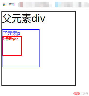
(一)子元素字体大小的em是相对于父元素字体大小
(二)元素的width/height/padding/margin用em的话是相对于该元素的font-size
代码:
html:
<div>父元素div<p>子元素p<span>孙元素span</span></p></div>
css:
div {font-size: 40px;width: 7.5em; /* 300px */height: 7.5em;border: solid 2px black;}p {font-size: 0.5em; /* 20px */width: 7.5em; /* 150px */height: 7.5em;border: solid 2px blue ;color: blue;}span {font-size: 0.5em;width: 7.5em;height: 7.5em;border: solid 2px red;display: block;color: red;}
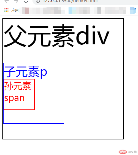
rem是全部的长度都相对于根元素,根元素是<html>元素。通常做法是给html元素设置一个字体大小,然后其他元素的长度单位就为rem。
代码:
html:
<div>父元素div<p>子元素p<span>孙元素span</span></p></div>
css:
html {font-size: 10px;}div {font-size: 4rem; /* 40px */width: 20rem; /* 200px */height: 20rem;border: solid 2px black;}p {font-size: 2rem; /* 20px */width: 10rem;height: 10rem;border: solid 2px blue;color:blue ;}span {font-size: 1.5rem;width: 5rem;height: 5rem;border: solid 2px red;display: block;color: red;}
在PC端,视口指的是在PC端,指的是浏览器的可视区域;
而在移动端,它涉及3个视口:Layout Viewport(布局视口),Visual Viewport(视觉视口),Ideal Viewport(理想视口)。
视口单位中的“视口”,PC端指的是浏览器的可视区域;移动端指的就是Viewport中的Layout Viewport。
根据CSS3规范,视口单位主要包括以下4个:
1.vw:1vw等于视口宽度的1%。2.vh:1vh等于视口高度的1%。3.vmin:选取vw和vh中最小的那个。4.vmax:选取vw和vh中最大的那个。
vh and vw:相对于视口的高度和宽度,而不是父元素的(CSS百分比是相对于包含它的最近的父元素的高度和宽度)。1vh 等于1/100的视口高度,1vw 等于1/100的视口宽度。
比如:浏览器高度950px,宽度为1920px, 1 vh = 950px/100 = 9.5 px,1vw = 1920px/100 =19.2 px。
vmax相对于视口的宽度或高度中较大的那个。其中最大的那个被均分为100单位的vmax。
vmin相对于视口的宽度或高度中较小的那个。其中最小的那个被均分为100单位的vmin。
图一 全屏显示色块样式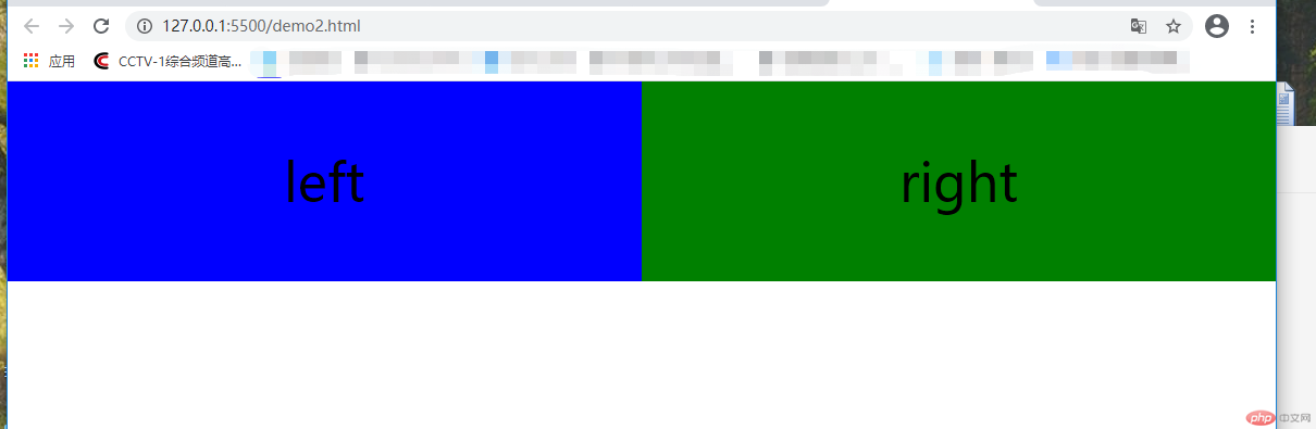
图二 压缩视口色块的变化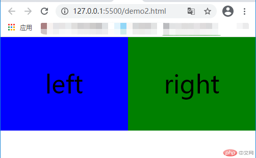
代码:
html:
<div class="left">left</div><div class="right">right</div>
css:
* {padding: 0;margin: 0}.left {float: left;width: 50vw;height: 20vh;background-color: blue;text-align: center;line-height: 20vh;font-size: 3rem}.right {float: right;width: 50vw;height: 20vh;background-color: green;text-align: center;line-height: 20vh;font-size: 3rem}