


![[Web front-end] Node.js quick start](https://img.php.cn/upload/course/000/000/067/662b5d34ba7c0227.png)


Correction status:Uncorrected
Teacher's comments:


 Collection
 Collection
.container {
/ 最外面的大容器设置成grid布局指定最小宽度 /
display: grid;
/ 设置gap网格间距 /
gap: 5px;
min-width: 1000px;
}
.container > .row {
/ 每行都设置成grid布局并设置成12份 /
display: grid;
grid-template-columns: repeat(12, 1fr);
gap: 5px;
min-height: 50px;
}
.row > .item {
/ 设置一下每一个项目的外观方便看出来 /
background-color: lightgreen;
padding: 10px;
border: 1px solid red;
border-radius: 8px;
}
/ 以下代码设置每列的合并情况,这里为了方便使用设置了十二种情况 /
.col6 {
grid-column: span 6;
}
.col4 {
grid-column: span 4;
}
.col3 {
grid-column: span 3;
}
.col2 {
grid-column: span 2;
}
.col1 {
grid-column: span 1;
}
.col7 {
grid-column-end: span 7;
}
.col8 {
grid-column: span 8;
}
.col9 {
grid-column: span 9;
}
.col10 {
grid-column: span 10;
}
.col11 {
grid-column: span 11;
}
.col12 {
grid-column: span 12;
}
------------html代码```html<!DOCTYPE html><html lang="en"><head><meta charset="UTF-8" /><meta name="viewport" content="width=q, initial-scale=1.0" /><title>作业12列栅格布局做一个企业页面框架</title><style>@import url(grid_12.css);.container > :nth-last-child(2) {min-height: 80vh;}.item {text-align: center;}</style></head><body><div class="container"><div class="row"><div class="item col12 header">导航区</div></div><div class="row"><div class="item col2 left">左侧区</div><div class="item col8 main">主内容区</div><div class="item col2 right">右侧区</div></div><div class="row"><div class="item col12 footer">页脚区</div></div></div></body></html>
预览效果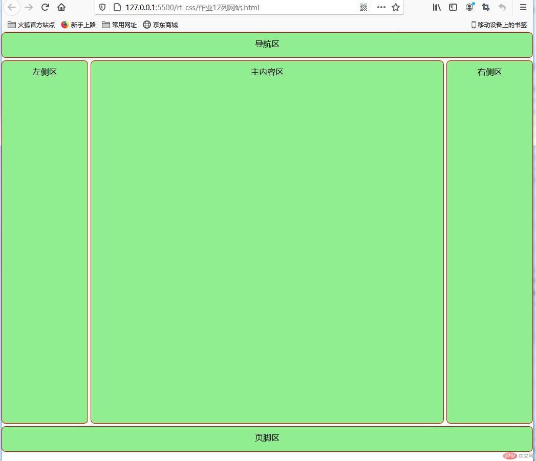
* {margin: 0;padding: 0;box-sizing: border-box;}a {/* 去掉链接文本的下划线 */text-decoration: none;/* 修改颜色 */color: #555;/* 设置阴影效果 */text-shadow: 2px 2px 10x #555;/* 设置对齐方式 */align-content: center;}h1 {/* 取消标题 文本加粗 */font-weight: normal;color: white;text-align: center;/* 外边距20 */margin-top: 20px;}body {/* 整个body颜色改成lightseagreen */background-color: lightseagreen;}.container {/* 最大容器使用网格布局 */display: grid;/* 重点: 这里通过auto-fill自动填充实现媒体查询效果,后面的250 200px表示的是大小值 */grid-template-columns: repeat(auto-fill, 250px);grid-template-rows: repeat(auto-fill, 200px);place-content: space-evenly;/* 最小宽度和高度设置成100个视口高度 */min-width: 100vw;min-height: 100vh;/* padding: 50px; *//* 网络间距调整成30比较合适 */gap: 30px;}img {/* 此处的图片大小是指定的,因为产品原始图片大小不同,不固定下来显示不正常 */width: 230px;height: 180px;/* text-align: center; */}.container > .item {/* 网络项目中的内容使用flex布局做精细调整 */display: flex;/* flex布局流使用列的方式 不换行 */flex-flow: column nowrap;/* 项目加圆角 */border-radius: 10px;padding: 10px;background-color: #eee;/* 设置交叉轴和主轴对齐 */align-items: center;justify-self: center;}.item :last-child {/* 这里单独设置了一下文字描述的内边距因为不设置字会压到图片内容 */font-size: 20px;color: #000;padding: 10px;}.container > .item:hover {box-shadow: 2px 2px 2px #555;/* 设置鼠标经过交果,以下通过calc函数改变了宽度和高度 */width: calc(100% * 1.04);height: calc(100% * 1.04);background-color: lightcyan;}
HTML代码
<!DOCTYPE html><html lang="en"><head><meta charset="UTF-8" /><meta name="viewport" content="width=device-width, initial-scale=1.0" /><title>产品图册实例</title><!-- <link rel="stylesheet" href="//m.sbmmt.com/rt_css/style.css" /> --><style>@import url(/rt_css/style.css);</style></head><body><h1>产品图册</h1><div class="container"><div class="item"><a href=""><img src="\网络相册素材\K1.jpg" alt="" /> </a><a href="">商泰收款机</a></div><div class="item"><a href=""><img src="\网络相册素材\K2.jpg" alt="" /></a><a href="">海信收款机</a></div><div class="item"><a href=""><img src="\网络相册素材\K3.jpg" alt="" /></a><a href="">唯拓收款机</a></div><div class="item"><a href=""><img src="\网络相册素材\K4.jpg" alt="" /></a><a href="">中崎</a></div><div class="item"><a href=""><img src="\网络相册素材\K5.jpg" alt="" /></a><a href="">商宜</a></div><div class="item"><a href=""><img src="\网络相册素材\K6.jpg" alt="" /></a><a href="">生意通</a></div><div class="item"><a href=""><img src="\网络相册素材\K7.png" alt="" /></a><a href="">赢通</a></div></div></body></html>
运行效果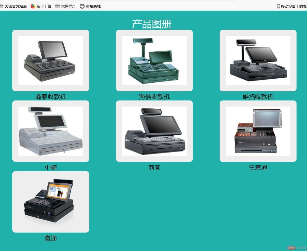
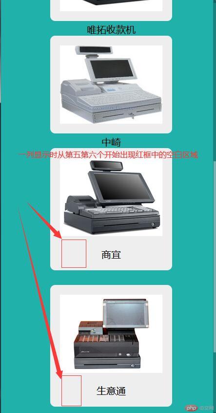
变为一列时运行效果如下图: