


 Collection
 Collection
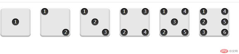
<!DOCTYPE html><html lang="en"><head><meta charset="UTF-8" /><meta name="viewport" content="width=device-width, initial-scale=1.0" /><title>flex布局</title><style>* {margin: 0;padding: 0;box-sizing: border-box;}body {display: flex;}[class$="face"] {display: flex;margin: 16px;padding: 4px;background-color: #e7e7e7;width: 104px;height: 104px;box-shadow: inset 0 5px white, inset 0 -5px #bbb, inset 5px 0 #d7d7d7,inset -5px 0 #d7d7d7;border-radius: 10%;object-fit: contain;}.pip {width: 24px;height: 24px;/* 设置圆角 */border-radius: 50%;/* 设置阴影 */box-shadow: inset 0 3px #111, inset 0 -3px #555;background-color: #333;color: white;text-align: center;}/* 处理第一个让他中部居中 */.first-face {display: flex;/* 设置在主轴上居中对齐 */justify-content: center;/* 在交叉轴上居中对齐,这样就形成了中部居中 */align-items: center;}/* 第二个让两个项目一个角一个*/.second-face {display: flex;/* 首先让项目在主轴上两端对齐 */justify-content: space-between;}/* 再让第二个项目出现在交叉轴结束处 */.second-face > .pip:nth-of-type(2) {/* 允许该项目跟别的项目有不一样的对齐方式 */align-self: flex-end;}/* 现在处理第三个 */.third-face {display: flex;/* 先让所有项目两端对齐 */justify-content: space-between;}/* 再把第二个拉到居中位置 */.third-face > .pip:nth-of-type(2) {/* 再次使用让第二个与其它有不一样的对齐方式 */align-self: center;}/* 让第三个也使用不一样的对齐方式,仍然使用align-self */.third-face > .pip:nth-of-type(3) {/* 这次是放在交叉轴的结束位置 */align-self: flex-end;}/* 现在处理第四个时出现了列的概念每个列是单独盒子 */.fourth-face {display: flex;/* 让fourth-face做个一个大盒子两端对齐 */justify-content: space-between;}.fourth-face > .column {display: flex;/* 把列的小盒子中方向改为列显示 */flex-direction: column;/* 再来一次两端对齐这样四个项目就分部在大项目的角上了 */justify-content: space-between;}/* 第五个用的是三列了 */.fivth-face {display: flex;justify-content: space-between;}.fivth-face > .column {display: flex;/* 让这三个列统一主轴方向变列 */flex-direction: column;/* 让这三个列统一两端对齐 */justify-content: space-between;}.fivth-face > .column:nth-of-type(2) {/* 让第二列在主轴居中 */justify-content: center;}/* 第六个用两列就可以了 */.sixth-face {display: flex;justify-content: space-between;}.sixth-face > .column {display: flex;justify-content: space-between;/* 主轴方向调整成列,根上面第五个一样 */flex-direction: column;}</style></head><body><div class="first-face"><div class="pip">1</div></div><div class="second-face"><div class="pip">1</div><div class="pip">2</div></div><div class="third-face"><div class="pip">1</div><div class="pip">2</div><div class="pip">3</div></div><div class="fourth-face"><div class="column"><div class="pip">1</div><div class="pip">2</div></div><div class="column"><div class="pip">3</div><div class="pip">4</div></div></div><div class="fivth-face"><div class="column"><div class="pip">1</div><div class="pip">2</div></div><div class="column"><div class="pip">3</div></div><div class="column"><div class="pip">4</div><div class="pip">5</div></div></div><div class="sixth-face"><div class="column"><div class="pip">1</div><div class="pip">2</div><div class="pip">3</div></div><div class="column"><div class="pip">4</div><div class="pip">5</div><div class="pip">6</div></div></div></body></html>
上个运行效果看看


![[Web front-end] Node.js quick start](https://img.php.cn/upload/course/000/000/067/662b5d34ba7c0227.png)


