

這篇文章主要為大家介紹了一款純css3實現的豎形二級導航的實例教程,這款導航選單特色是可以是無限級。下面有程式碼,不會的朋友可以來借鏡學習哦
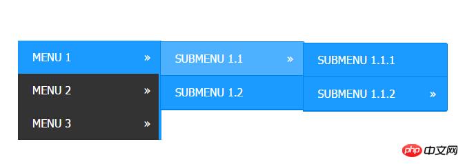
之前為大家分享了好多導覽選單。今天為大家帶來一款純css3實現的垂直二級導航。這款導航選單可以是無限級。一起看下效果圖:
實作的程式碼。
html程式碼:
<p style="width: 700px; margin: auto;">
        <p class="W1-h16">
            <ul>
                <li class="has-sub"><a href="#">Menu 1</a>
                    <ul>
                        <li class="has-sub"><a href="#">Submenu 1.1</a>
                            <ul>
                                <li><a href="#">Submenu 1.1.1</a></li>
                                <li class="has-sub"><a href="#">Submenu 1.1.2</a>
                                    <ul>
                                        <li><a href="#">Submenu 1.1.2.1</a></li>
                                        <li><a href="#">Submenu 1.1.2.2</a></li>
                                    </ul>
                                </li>
                            </ul>
                        </li>
                        <li><a href="#">Submenu 1.2</a></li>
                    </ul>
                </li>
                <li class="has-sub"><a href="#">Menu 2</a>
                    <ul>
                        <li><a href="#">Submenu 2.1</a></li>
                        <li><a href="#">Submenu 2.2</a></li>
                    </ul>
                </li>
                <li class="has-sub"><a href="#">Menu 3</a>
                    <ul>
                        <li><a href="#">Submenu 3.1</a></li>
                        <li><a href="#">Submenu 3.2</a></li>
                    </ul>
                </li>
            </ul>
        </p>
</p>css3程式碼:
#.W1-h16 {
padding: 0;
margin: 0;
border: 0;
line-height: 1;
}
.W1-h16 ul,
.W1-h16 ul li,
.W1-h16 ul ul {
list-style: none;
margin: 0;
padding: 0;
}
.W1-h16 ul {
position: relative;
z-index: 500;
float: left;
}
.W1-h16 ul li {
float: left;
min-height: 0.05em;
line-height: 1em;
vertical-align: middle;
position: relative;
}
.W1-h16 ul li.hover,
.W1-h16 ul li:hover {
position: relative;
z-index: 510;
cursor: default;
}
.W1-h16 ul ul {
visibility: hidden;
position: absolute;
top: 100%;
left: 0px;
z-index: 520;
width: 100%;
}
.W1-h16 ul ul li {
float: none;
}
.W1-h16 ul ul ul {
top: 0;
rightright: 0;
}
.W1-h16 ul li:hover > ul {
visibility: visible;
}
.W1-h16 ul ul {
top: 0;
left: 99%;
}
.W1-h16 ul li {
float: none;
}
.W1-h16 ul ul {
margin-top: 0.05em;
}
.W1-h16 {
width: 13em;
background: #333333;
font-family: 'Oxygen Mono', Tahoma, Arial, sans-serif;
zoom: 1;
}
.W1-h16:before {
content: '';
display: block;
}
.W1-h16:after {
content: '';
display: table;
clear: both;
}
.W1-h16 a {
display: block;
padding: 1em 1.3em;
color: #ffffff;
text-decoration: none;
text-transform: uppercase;
}
.W1-h16 > ul {
width: 13em;
}
.W1-h16 ul ul {
width: 13em;
}
.W1-h16 > ul > li > a {
border-right: 0.3em solid #1b9bff;
color: #ffffff;
}
.W1-h16 > ul > li > a:hover {
color: #ffffff;
}
.W1-h16 > ul > li a:hover,
.W1-h16 > ul > li:hover a {
background: #1b9bff;
}
.W1-h16 li {
position: relative;
}
.W1-h16 ul li.has-sub > a:after {
content: '»';
position: absolute;
rightright: 1em;
}
.W1-h16 ul ul li.first {
-webkit-border-radius: 0 3px 0 0;
-moz-border-radius: 0 3px 0 0;
border-radius: 0 3px 0 0;
}
.W1-h16 ul ul li.last {
-webkit-border-radius: 0 0 3px 0;
-moz-border-radius: 0 0 3px 0;
border-radius: 0 0 3px 0;
border-bottom: 0;
}
.W1-h16 ul ul {
-webkit-border-radius: 0 3px 3px 0;
-moz-border-radius: 0 3px 3px 0;
border-radius: 0 3px 3px 0;
}
.W1-h16 ul ul {
border: 1px solid #0082e7;
}
.W1-h16 ul ul a {
color: #ffffff;
}
.W1-h16 ul ul a:hover {
color: #ffffff;
}
.W1-h16 ul ul li {
border-bottom: 1px solid #0082e7;
}
.W1-h16 ul ul li:hover > a {
background: #4eb1ff;
color: #ffffff;
}
.W1-h16.align-rightright > ul > li > a {
border-left: 0.3em solid #1b9bff;
border-right: none;
}
.W1-h16.align-rightright {
float: rightright;
}
.W1-h16.align-rightright li {
text-align: rightright;
}
.W1-h16.align-rightright ul li.has-sub > a:before {
content: '+';
position: absolute;
top: 50%;
left: 15px;
margin-top: -6px;
}
.W1-h16.align-rightright ul li.has-sub > a:after {
content: none;
}
.W1-h16.align-rightright ul ul {
visibility: hidden;
position: absolute;
top: 0;
left: -100%;
z-index: 598;
width: 100%;
}
.W1-h16.align-rightright ul ul li.first {
-webkit-border-radius: 3px 0 0 0;
-moz-border-radius: 3px 0 0 0;
border-radius: 3px 0 0 0;
}
.W1-h16.align-rightright ul ul li.last {
-webkit-border-radius: 0 0 0 3px;
-moz-border-radius: 0 0 0 3px;
border-radius: 0 0 0 3px;
}
.W1-h16.align-rightright ul ul {
-webkit-border-radius: 3px 0 0 3px;
-moz-border-radius: 3px 0 0 3px;
border-radius: 3px 0 0 3px;
}#以上就是本文的全部內容,希望對大家的學習有所幫助,更多相關內容請關注PHP中文網!
相關推薦:
##
以上是css3實現的垂直二級導航的詳細內容。更多資訊請關注PHP中文網其他相關文章!


