

本篇文章主要介紹了淺談CSS3滑鼠移入圖片動態提示效果(transform),內容挺不錯的,現在分享給大家,也給大家做個參考。
第一次嘗試著寫博客,不好或有誤的地方希望大家多多指正吶,今天主要寫的是關於CSS3的一個重要屬性transform的一些用法,這些例子是之前在慕課在網路上學習某位老師的課程後自己敲的。
一、前言
#1. transform是什麼?
transform的意思是:改變,使....變形;轉換
#2. transform的常見屬性有哪些?
transform的屬性包括: translate()/rotate() / skew() / scale() /,分別還有x、y之分,例如:rotatex() 和rotatey() ,以此類推。
transform:translate()
意義:變動,位移;例如向右位移20像素,向上位移50像素(向左向下為負值) 實例如下
.test01{-webkit-transform:translate(20px,50px);-moz-transform:translate(20px,50px)}transform:rotate()
意義:旋轉;「deg」是表示旋轉的度數例如「180deg」表示旋轉「180度」 實例如下
.test02{-webkit-transform:rotate(180deg);-moz-transform:rotate(180deg)}transform:skew()
#意義:傾斜 實例如下
.test03{-webkit-transform:skew(20deg);-moz-transform:skew(20deg)} #transform:scale()
意思:比例 1.8表示以1.8的比例放大如果是放大整數倍如放大3倍必須寫成3.0 實例如下
.test03{-webkit-transform:scale(2.5);-moz-transform:scale(2.5)}3. transform的實例
demo01 說明:滑鼠移入後圖片左移內容依序進入
步驟:
1.寫好html程式碼並透過css設定好內容和圖片的初始樣式(文字內容都在圖片上);
2.將描述內容透過transform屬性位移到左側看不到為止(transform:translate(-600px,0););
#3.接下來設定滑鼠移入時(:hover)的樣式 同樣是利用transform 使內容左移的距離為0(transform:translate(0,0))這裡用到transition-delay屬性主要是為了讓三個內容分別延遲不同的時間形成依序進入的效果。
/*图片左移 文字依次进入*/
.test1{background: #fff;}
.test1 figcaption p{background: #fff;color:#333;margin:5px 0;transform: translate(-600px,0px);}
.test1 figcaption{padding:20px}
.test1:hover figcaption p{transform: translate(0,0);}

.test1 figcaption p:nth-of-type(1){transition-delay: 0.2s;}
.test1 figcaption p:nth-of-type(2){transition-delay: 0.3s;}
.test1 figcaption p:nth-of-type(3){transition-delay: 0.4s;}
.test1:hover img{transform: translate(-5px,0);}
<!--移动-->
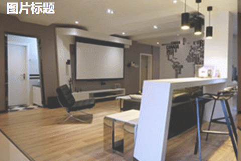
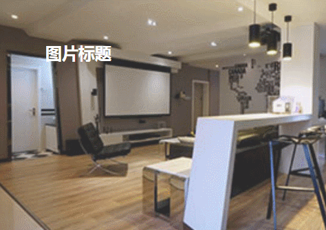
<figure class="test1">
<img src="img/altimg05.jpg">
<figcaption>
<h2>图片标题</h2>
<p>这里是图片的相关描述内容</p>
<p>这里是图片的相关描述内容</p>
<p>这里是图片的相关描述内容</p>
</figcaption>
</figure>#demo02 說明:滑鼠移入後圖片變模糊矩形從圖片外旋轉進入圖片中指定位置文字從右側飛過來並逐漸顯示
步驟:
1.寫好html程式碼並透過css設定好內容和圖片的初始樣式(矩形文字都在圖片上);
2.將矩形經由transform屬性位移到上方看不到為止並設定旋轉的角度為0 transform: translate(0,-400px) rotate(0deg);
3.接下來設定滑鼠移入時(:hover)的樣式位移設定為0並旋轉360度 transform: translate(0,0) rotate(360deg);
#/*旋转*/
.test2{background: #ccc;}
.test2 figcaption{width: 100%;height: 100%;}
.test2 figcaption h2{margin:15% 0 0 15%}
.test2 figcaption p{margin-left:15%;transform: translate(50px,0);opacity: 0;}
.test2 figcaption p{border:2px solid #ccc;width: 80%;height: 80%;position:absolute;top:10%;left:10%;transform: translate(0,-400px) rotate(0deg);}
.test2:hover figcaption p{transform: translate(0,0) rotate(360deg);}
.test2:hover img{opacity: 0.6;}
.test2:hover figcaption p{transform: translate(0,0);opacity: 1;}
        <!--旋转-->
        <figure class="test2">
            <img src="img/altimg05.jpg">
            <figcaption>
                <h2>图片标题</h2>
                <p>飞来飞去</p>


                <p></p>
            </figcaption>
</figure>demo03 說明:滑鼠移入後扭曲的字正常顯示(因為例子中扭曲了90度所以視覺上看不到文字)
#步驟:
1.寫好html程式碼並透過css設定好內容和圖片的初始樣式;
#2.將文字內容扭曲90度transform: skew(90deg);
3.接下來設定滑鼠移入時(:hover)的樣式將文字內容扭曲0度transform: skew(0);
/*扭曲*/
.test3{background:#CCCCCC;}
.test3 figcaption{position: absolute;left:15%;top:15%}
.test3 figcaption h2{transform: skew(90deg);}
.test3 figcaption p{transform: skew(90deg);}
.test3:hover img{opacity: 0.6;}
.test3:hover figcaption h2{transform: skew(0);}
.test3:hover figcaption p{transform: skew(0);}
        <!--扭曲-->
        <figure class="test3">
            <img src="img/altimg05.jpg">
            <figcaption>
                <h2>图片标题</h2>
                <p>这里是图片的相关描述内容</p>
            </figcaption>
</figure>demo04 說明:滑鼠移入後矩形和文字顯示並縮小 圖片也縮小
/*缩放*/
.test4{background: #000;}
.test4 figcaption{width: 100%;height: 100%;}
.test4 figcaption h2{margin:15% 0 0 15%;opacity:0;transform: scale(1.2);}
.test4 figcaption p{margin-left:15%;opacity:0;transform: scale(1.2);}
.test4 figcaption p{border:2px solid #ccc;width: 80%;height: 80%;position:absolute;top:10%;left:10%;transform: scale(1.2,1.2);opacity: 0;}
.test4:hover figcaption p{transform: scale(1,1);opacity: 1;}
.test4:hover img{opacity: 0.6;transform: scale(0.9,0.9);}
.test4:hover figcaption h2{opacity: 1;transform: scale(1);}
.test4:hover figcaption p{opacity: 1;transform: scale(1);}
        <!--缩放-->
        <figure class="test4">
            <img src="img/altimg05.jpg">
            <figcaption>
                <h2>图片标题</h2>
                <p>这里是图片的相关描述内容</p>
                <p></p>
            </figcaption>
</figure>3.接下来设置鼠标移入时(:hover)的样式 内容透明度设置为1 设置矩形缩放为1 这里利用到transition属性 主要是为了缩小放大过程逐渐变化;
/*井字格*/
.test5{background: #000;}
.test5 figcaption{width: 100%;height: 100%;}
.test5 figcaption h2{margin: 15% 0 0 18%;opacity: 0;}
.test5 figcaption p{margin-left: 18%;opacity: 0;}
.test5 figcaption p{position: absolute;}
.test5 figcaption p.p01{width: 80%;height:70%;border-top: 2px solid #ccc;border-bottom: 2px solid #ccc;left:10%;top:15%;opacity: 0;transform: scale(0.8);}
.test5 figcaption p.p02{width: 70%;height:80%;border-left: 2px solid #ccc;border-right: 2px solid #ccc;left: 15%;top:10%;opacity: 0;transform: scale(0.8);}
.test5:hover p.p01{opacity: 1;transform: scale(1);transition: transform 0.3s ease-in}
.test5:hover p.p02{opacity: 1;transform: scale(1);transition: transform 0.3s ease-in}
.test5:hover figcaption p{opacity: 1;}
.test5:hover figcaption h2{opacity: 1;}
.test5:hover img{opacity: 0.6;}
        <!--井字格-->
        <figure class="test5">
            <img src="img/altimg05.jpg">
            <figcaption>
                <h2>图片标题</h2>
                <p>这里是图片的相关描述内容</p>
                <p class="p01"></p>
                <p class="p02"></p>
            </figcaption>
</figure>以上是几个简单的小例子,之所以用figure和figcaption标签,主要是标签的语义化,截取动态图用到的是GifCam第一次用 挺好用的 很可爱 哈哈。
figure标签主要是用于规定独立的流内容(图片,图表,照片,代码等)而figcaption与figure标签配套使用,主要用于定义figure元素的标题
哦,对了,由于这几个例子写在一个html里面 所以提取出了部分公用的样式
body,figure,figcaption,h2,p{margin:0;padding:0;font-family: "微软雅黑";}
figure{position: relative;overflow: hidden;float: left;width:33.33%;height: 350px;}
figcaption{position: absolute;top: 0;left: 0;color:#fff;}
figure img{width:101%;height: 360px;opacity: 0.8;transition: all 0.35s}
figure figcaption p,h2,span,p{transition: all 0.35s}
@media screen and (max-width: 600px) {
    figure{width: 100%;}
}
@media screen and (min-width:601px) and (max-width: 1000px) {
    figure{width: 50%;}
}
@media screen and (min-width: 1001px) {
    figure{width: 33.33%;}
}总结:
之所以选择写博客主要是为了锻炼自己的表达能力,培养一个总结知识点的好习惯,以前看别人写的一些好的文章时都很羡慕,自己却总是不知道从何下手,直到最近投简历的时候发现很多公司都要求注明自己的博客地址,所以有必要逼着自己写一下东西啦!
以上就是本文的全部内容,希望对大家的学习有所帮助,更多相关内容请关注PHP中文网!
相关推荐:
以上是CSS3滑鼠移入圖片動態提示效果的詳細內容。更多資訊請關注PHP中文網其他相關文章!


