

.demo{
padding: 2em 0;
}
.box{
text-align: center;
overflow: hidden;
color: #fff;
position: relative;
}
.box:after{
content: "";
width: 100%;
height: 100%;
background: linear-gradient(to bottom, rgba(0, 0, 0, 0) 0%, rgba(0, 0, 0, 0.08) 69%, rgba(0, 0, 0, 0.76) 100%);
position: absolute;
top: 0;
left: 0;
transition: all 0.5s ease 0s;
}
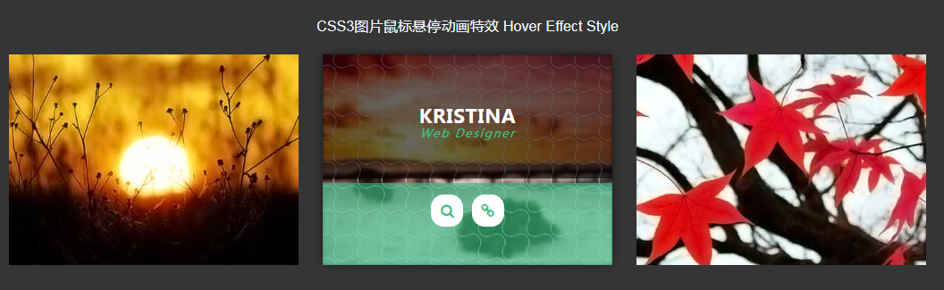
这是一款在鼠标hover图片的时候,使用transition和transform来制作图片说明文本和图标的CSS3动画特效,酷炫鼠标悬停图片css3动画特效代码。
申明:本站所有资源都是转载各大下载站,或由网友投稿发布,请自行检测软件的完整性,如有侵权请联系我们删除下架,联系方式:admin@php.cn


