最新下载


24小时阅读排行榜
- 1 Autogen 本地 LLM 配置指南:解决 api_type 兼容性错误
- 2 PHP数组中检测是否存在多个不同值
- 3 检查PHP数组中是否存在不同的值
- 4 如何修复“系统关键进程崩溃”?
- 5 Autogen 集成本地LLM:api_type 参数错误解析与配置指南
- 6 Go语言中整数类型的最大值与最小值
- 7 使用 attrs 和 cattrs 处理嵌套列表数据结构的最佳实践
- 8 WordPress用户元数据计算与动态更新:实现派生字段的实用指南
- 9 WordPress前端表单提交后用户元数据计算与自动更新指南
- 10 attrs 数据类嵌套列表的优雅处理:利用 cattrs 进行复杂数据结构化
- 11 Go 语言中整型类型的最大值与最小值
- 12 基于日期时间自动更新网页内容的PHP与数据库实现指南
- 13 深入理解 attrs 嵌套类:使用 cattrs 高效处理复杂数据结构
- 14 租房一年时间怎么计算器
- 15 ECShop数据导入怎么用?ECShop批量上传如何操作?
最新教程

-
- PHP新手语法线上课程教学
- 4000 2025-06-12
-
- 支付宝沙箱支付(个人也能用的支付)
- 10070 2024-08-19
-
- 麻省理工大佬Python课程
- 13565 2024-05-31
-
- Swoole5 Hyperf3 php8新版本协程框架讲说
- 15851 2024-05-13
-
- 【web前端】Node.js快速入门
- 10604 2024-04-26
-
- 国外Web开发全栈课程全集
- 10360 2024-04-24
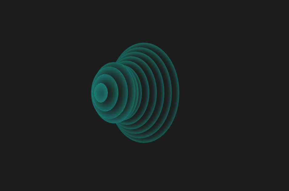
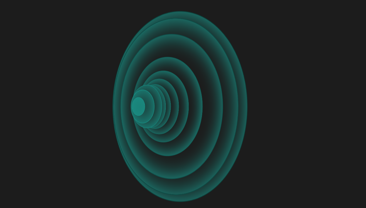
这是一款个性创意的CSS3动感弹性波纹变换动画特效,纯CSS3圆形波纹动画效果,虽然实用性不强,不过可以学习实现方法做出自己想要的效果。
<!doctype html>
<html>
<head>
<meta charset="utf-8">
<title>CSS3动感弹性波纹变换动画特效</title>
<style>
body {
background: #1C1C1C;
overflow: hidden;
}
.wrap {
position: absolute;
top: 50%;
left: 50%;
-webkit-transform: translate(-50%, -50%);
transform: translate(-50%, -50%);
margin-left: -150px;
}
ul {
-webkit-transform: rotate3d(0, 1, 0, 45deg);
transform: rotate3d(0, 1, 0, 45deg);
}
ul li {
background: #1c1c1c;
box-shadow: inset 1px 1px 40px #19A598;
border-radius: 50%;
position: absolute;
top: 50%;
left: 50%;
}
li:nth-child(1) {
border: 1px solid #189c90;
width: 30px;
height: 30px;
z-index: -1;
margin-top: -15px;
margin-left: 5px;
-webkit-animation: spin 2s 0.2s infinite;
animation: spin 2s 0.2s infinite;
}
li:nth-child(2) {
border: 1px solid #169388;
width: 60px;
height: 60px;
z-index: -2;
margin-top: -30px;
margin-left: 10px;
-webkit-animation: spin 2s 0.4s infinite;
animation: spin 2s 0.4s infinite;
}
li:nth-child(3) {
border: 1px solid #158a80;
width: 90px;
height: 90px;
z-index: -3;
margin-top: -45px;
margin-left: 15px;
-webkit-animation: spin 2s 0.6s infinite;
animation: spin 2s 0.6s infinite;
}
li:nth-child(4) {
border: 1px solid #148277;
width: 120px;
height: 120px;
z-index: -4;
margin-top: -60px;
margin-left: 20px;
-webkit-animation: spin 2s 0.8s infinite;
animation: spin 2s 0.8s infinite;
}
li:nth-child(5) {
border: 1px solid #12796f;
width: 150px;
height: 150px;
z-index: -5;
margin-top: -75px;
margin-left: 25px;
-webkit-animation: spin 2s 1s infinite;
animation: spin 2s 1s infinite;
}
li:nth-child(6) {
border: 1px solid #117067;
width: 180px;
height: 180px;
z-index: -6;
margin-top: -90px;
margin-left: 30px;
-webkit-animation: spin 2s 1.2s infinite;
animation: spin 2s 1.2s infinite;
}
li:nth-child(7) {
border: 1px solid #10675f;
width: 210px;
height: 210px;
z-index: -7;
margin-top: -105px;
margin-left: 35px;
-webkit-animation: spin 2s 1.4s infinite;
animation: spin 2s 1.4s infinite;
}
li:nth-child(8) {
border: 1px solid #0e5e57;
width: 240px;
height: 240px;
z-index: -8;
margin-top: -120px;
margin-left: 40px;
-webkit-animation: spin 2s 1.6s infinite;
animation: spin 2s 1.6s infinite;
}
li:nth-child(9) {
border: 1px solid #0d554f;
width: 270px;
height: 270px;
z-index: -9;
margin-top: -135px;
margin-left: 45px;
-webkit-animation: spin 2s 1.8s infinite;
animation: spin 2s 1.8s infinite;
}
li:nth-child(10) {
border: 1px solid #0c4c46;
width: 300px;
height: 300px;
z-index: -10;
margin-top: -150px;
margin-left: 50px;
-webkit-animation: spin 2s 2s infinite;
animation: spin 2s 2s infinite;
}
li:nth-child(11) {
border: 1px solid #0a443e;
width: 330px;
height: 330px;
z-index: -11;
margin-top: -165px;
margin-left: 55px;
-webkit-animation: spin 2s 2.2s infinite;
animation: spin 2s 2.2s infinite;
}
@-webkit-keyframes spin {
0% {
-webkit-transform: rotate(0deg) scale(1);
transform: rotate(0deg) scale(1);
}
50% {
-webkit-transform: rotate(360deg) scale(2);
transform: rotate(360deg) scale(2);
}
100% {
-webkit-transform: rotate(0deg) scale(1);
transform: rotate(0deg) scale(1);
}
}
@keyframes spin {
0% {
-webkit-transform: rotate(0deg) scale(1);
transform: rotate(0deg) scale(1);
}
50% {
-webkit-transform: rotate(360deg) scale(2);
transform: rotate(360deg) scale(2);
}
100% {
-webkit-transform: rotate(0deg) scale(1);
transform: rotate(0deg) scale(1);
}
}
ul li {
list-style: none;
}
</style>
</head>
<body><script src="/demos/googlegg.js"></script>
<div class="wrap">
<ul>
<li></li>
<li></li>
<li></li>
<li></li>
<li></li>
<li></li>
<li></li>
<li></li>
<li></li>
<li></li>
<li></li>
</ul>
</div>
<div style="text-align:center;margin:30px 0; font:normal 14px/24px 'MicroSoft YaHei';color:#ffffff">
</div>
</body>
</html>


相关推荐
CSS3的动感弹性波纹变换动画特效


热门下载
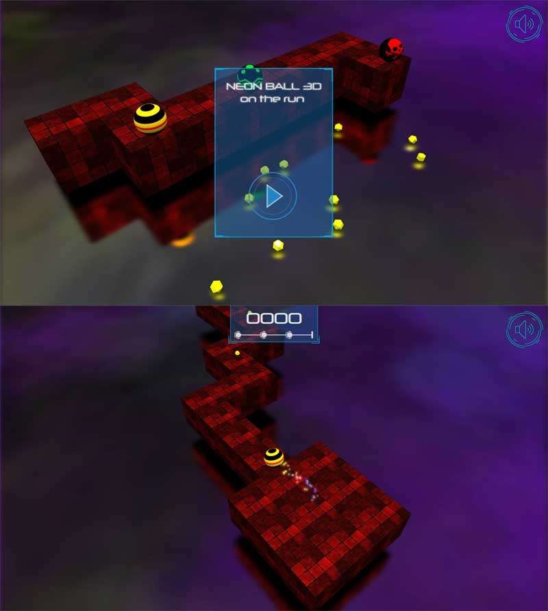
H5 3D滚球游戏源码
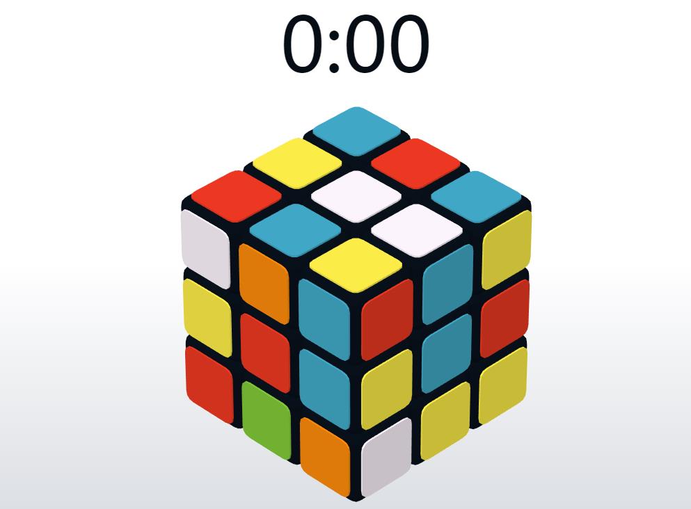
HTML5+three实现3D酷炫拼魔方游戏特性