Use rem to solve the problem of mobile site adaptation. It is not recommended to use Chrome browser during debugging. The minimum font size is size 12, but on mobile pages, the font size can be smaller than size 12, resulting in a situation where what you see is not what you get. Therefore, it is recommended to use firefox for debugging.
Rem is set to 20px (125%) The advantage is that it will not appear below the minimum font size (Chrome, etc), and there will be no rounding error (IE when expressed as a percentage, etc). In addition, it converts to integer Font size is easy.
Chrome can set the minimum font. If it is just a mobile terminal, there is no need to worry. Fonts smaller than 12px are very compatible. If it is a PC, it is recommended not to use fonts smaller than 12px
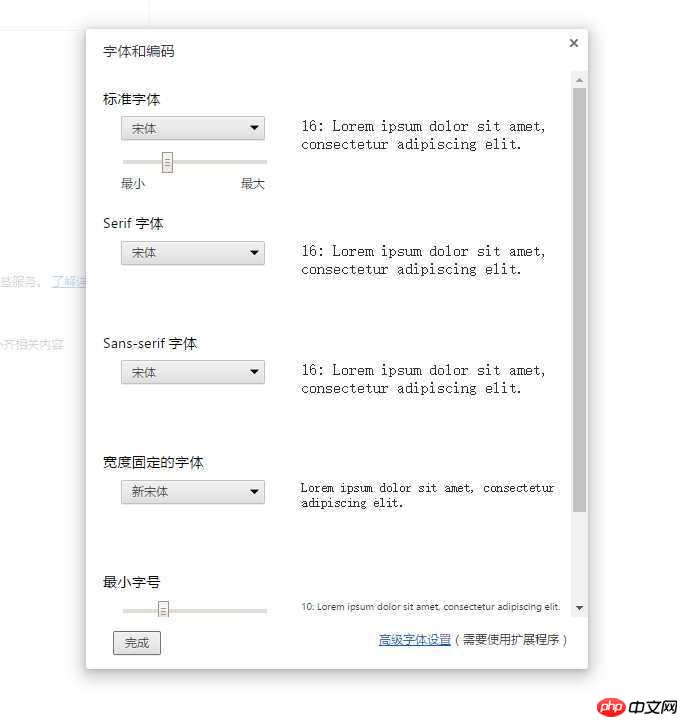
Chrome Set Minimum Font: Advanced Settings/Characters and Encoding Of course, you can have a need for fonts smaller than 12px, which should be used in mobile projects and development Stages are convenient for debugging in Chrome.
You can use other browsers to test. Generally, the design draft will not be lower than 12px...
Use rem to solve the problem of mobile site adaptation. It is not recommended to use Chrome browser during debugging. The minimum font size is size 12, but on mobile pages, the font size can be smaller than size 12, resulting in a situation where what you see is not what you get. Therefore, it is recommended to use firefox for debugging.
Set to 100px
Adjust rem base value
Rem is set to 20px (125%)
The advantage is that it will not appear below the minimum font size (Chrome, etc), and there will be no rounding error (IE when expressed as a percentage, etc). In addition, it converts to integer Font size is easy.
I usually use transform:scale(.8,.8);
Chrome can set the minimum font. If it is just a mobile terminal, there is no need to worry. Fonts smaller than 12px are very compatible. If it is a PC, it is recommended not to use fonts smaller than 12px
使用-ms-text-size-adjust:none;-webkit-text-size-adjust:none;
If it is less than 10px, do you still expect users to see it clearly?
Chrome Set Minimum Font: Advanced Settings/Characters and Encoding

Of course, you can have a need for fonts smaller than 12px, which should be used in mobile projects and development Stages are convenient for debugging in Chrome.