

CourseAdvanced21197
Course Introduction:This course uses HTML5 and bootstrap to develop adaptive corporate websites, quickly get started with building web pages, and can be practically applied to study and work.

CourseElementary15892
Course Introduction:This Bootstrap tutorial explains how to apply responsive design to web layouts. In the course, you'll learn about responsive web design. With the popularity of mobile devices, how to allow users to browse your website through mobile devices to obtain good visual effects has become an inevitable problem. Responsive web design is an effective way to achieve this.

CourseElementary7446
Course Introduction:The main idea of the layout mode Flexbox layout introduced by CSS3 is to give the container the ability to allow its sub-items to change their width and height to fill the available space in the best way. Flex containers use Flex items to automatically expand and contract to fill available free space.

CourseElementary18586
Course Introduction:It focuses on introducing the core front-end technologies of HTML, CSS, and web layout. Through video explanations, you can understand what you can do with HTML+CSS, including related tools, back-end languages, logical thinking training and other knowledge points.

CourseAdvanced11403
Course Introduction:"Chuangzhi Podcast Develops a Responsive Electronic Mall" will tell you how to develop a responsive mall system.
css3 - Graphic and text responsive styles
2017-05-16 13:20:57 0 3 619
html5 - Responsive WEB, media query issues.
2017-07-03 11:41:25 0 1 1337
Design responsive pages with images and content
2023-09-07 15:55:30 0 1 456
How to implement this responsive layout using flexbox
2024-02-26 19:29:01 0 2 304

Course Introduction:Guide to Responsive in HTML. Here we discuss Responsive design using HTML and CSS language to make web pages responsive and user-friendly.
2024-09-04 comment 0291

Course Introduction:Lecture 6: Responsive Web Design with Media Queries In this lecture, we’ll dive into responsive web design, a crucial skill for creating websites that look great on all devices, from desktops to smartphones. The key to responsive design is usin
2024-09-05 comment 0380
Course Introduction:This time I will show you how to use the bootstrap responsive navigation bar template, and what are the precautions for using the bootstrap responsive navigation bar template. The following is a practical case, let's take a look.
2018-04-14 comment 01561

Course Introduction:In today's web development landscape, creating a responsive and user-friendly navigation bar is essential. This article walks through the process of designing a responsive navigation bar using HTML, CSS, and JavaScript. Overview The provided code de
2024-08-29 comment 0150
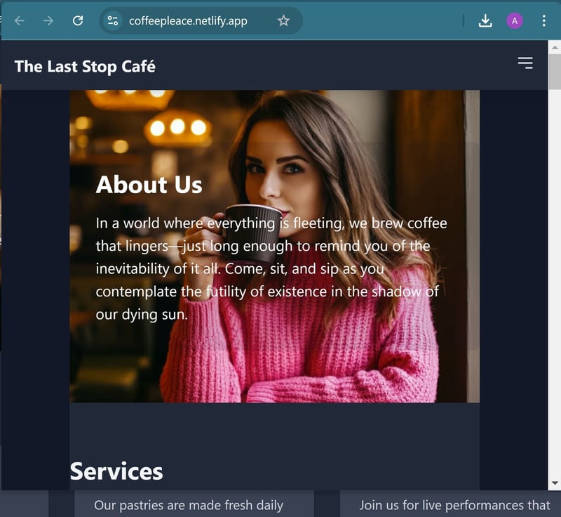
Course Introduction:From Static to Dynamic: Building a Responsive One-Page Website Hey there, fellow code enthusiasts! Today, I want to share my recent experience building a responsive one-page website for a fictional café called "The Last Stop Café". This pro
2024-08-30 comment 0940