From Static to Dynamic: Building a Responsive One-Page Website
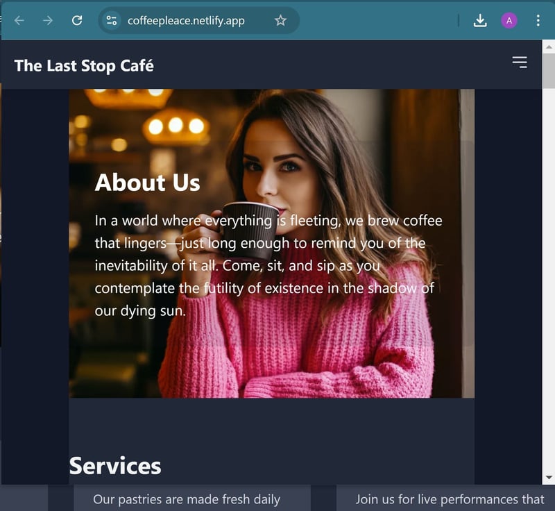
Hey there, fellow code enthusiasts! Today, I want to share my recent experience building a responsive one-page website for a fictional café called "The Last Stop Café". This project was a great exercise in combining HTML, CSS, and JavaScript to create a smooth, user-friendly experience. Let's dive into some key takeaways that you can apply to your own projects!

https://coffeepleace.netlify.app/
When building a one-page website, your HTML structure is crucial. Here are some tips:
Use semantic HTML5 tags like , , , and to give your content meaning and improve accessibility.
Organize your content into logical sections. For our café site, we had sections for About, Services, Menu, Gallery, Team, and Contact.
Use id attributes for your sections. This will be important for smooth scrolling later!
Responsive design is no longer optional. Here's how we made our site look great on all devices:
Use a mobile-first approach. Start with styles for mobile devices and then use media queries to adjust for larger screens.
Leverage CSS Flexbox or Grid for layouts. We used Flexbox for our menu items:
.menu-items { display: flex; flex-wrap: wrap; justify-content: space-between; }
Use relative units (like em, rem, or percentages) instead of fixed pixel values for better scalability.
JavaScript is where the magic happens. Here are some key features we implemented:
Smooth Scrolling
Instead of jarring jumps, we implemented smooth scrolling to sections:
document.querySelectorAll('a[href^="#"]').forEach(anchor => { anchor.addEventListener('click', function (e) { e.preventDefault(); document.querySelector(this.getAttribute('href')).scrollIntoView({ behavior: 'smooth' }); }); });
We created a burger menu for mobile devices that toggles a dropdown menu:
const menuBtn = document.getElementById("menu-btn"); const menu = document.getElementById("menu"); menuBtn.addEventListener("click", () => { menu.classList.toggle("hidden"); });
Dynamic Content Loading
Instead of hardcoding all our content, we used JavaScript to dynamically load data:
const menuSection = document.getElementById("menu"); menuData.forEach(item => { const menuItem = document.createElement("div"); menuItem.innerHTML = ` ${item.name}
${item.description}
${item.price} `; menuSection.appendChild(menuItem); });
Remember, performance is key for user experience. Here are some tips:
Optimize images for web use. Consider using modern formats like WebP.
Minify your CSS and JavaScript files.
Use lazy loading for images that are not immediately visible.
Always test your website on various devices and browsers. Chrome DevTools is your friend for debugging and testing responsiveness.
Building a responsive one-page website is an excellent way to practice your HTML, CSS, and JavaScript skills. It teaches you about structure, style, interactivity, and performance - all crucial aspects of web development.
Happy coding, and may your coffee be strong and your code error-free!
Download the source code: https://buymeacoffee.com/techmobilebox/e/296490
The above is the detailed content of From Static to Dynamic: Building a Responsive One-Page Website. For more information, please follow other related articles on the PHP Chinese website!
 Introduction to service providers with cost-effective cloud server prices
 940mx graphics card
 How to delete array elements in JavaScript
 What does c-side and b-side mean?
 Why is the mobile phone card limited to emergency calls?
 How to use row function
 How to defend cloud servers against DDoS attacks
 Solution to insufficient memory of cloud host server


