Found a total of 10000 related content

How to set ppt widescreen
Article Introduction:ppt sets up widescreen by opening PowerPoint software, selecting a widescreen template, customizing widescreen settings, adjusting slide layout, adding widescreen elements, previewing and saving. Detailed introduction: 1. Open ppt, double-click the icon to open the software; 2. Select a widescreen template, and in the template list, select a template suitable for widescreen; 3. Customize widescreen settings, select "Design", and then in "Page Settings" , select "Custom page size"; 4. Adjust the slide layout, etc.
2023-12-06
comment 0
2253


How is CSS scroll bar style compatible with IE8 and Chrome browsers?
Article Introduction:Recently, when I was improving my website, I accidentally discovered that when clicking on different columns in the navigation, the text on the web page would flash (drift) left and right. After careful inspection and thinking, I found that the problem lies in the scroll bar on the right side of the browser. That is: when the height of the web page content is less than one screen; there is no scroll bar on the right side, the calculated screen width should be the width of the entire monitor (assumed to be 1440), and when the height of the web page content exceeds one screen, the calculated screen width The screen width should be 1440 - the scroll bar width. For this reason, when you set margin: 0 auto and switch between short screen and long screen, it will cause a slight jump of the web page.
2017-07-21
comment 0
3933

8 Bootstrap corporate website templates (source code free download)
Article Introduction:Good-looking and practical corporate website templates can improve your website building efficiency. Below, PHP Chinese website will share with you 8 Bootstrap corporate website templates, all of which can be downloaded for free. Everyone is welcome to use them! For more enterprise website source code templates, please pay attention to the enterprise website source code column of PHP Chinese website!
2021-08-24
comment 0
23066

How to use CSS Viewport units vw and vh to implement layout that adapts to tablet and mobile screens
Article Introduction:How to use CSSViewport units vw and vh to implement layout that adapts to tablet and mobile phone screens. When designing responsive web page layouts, we often need to consider the adaptation issues of different device screen sizes. The CSSViewport units vw (view window width) and vh (view window height) provide a simple way to achieve layout adaptability to tablet and mobile phone screens. Viewport units vw and vh are calculated relative to the width and height of the viewport.
2023-09-13
comment 0
1392

Why do today's websites use responsive layout?
Article Introduction:Why do today’s websites use responsive layout? With the popularity of mobile devices and the rapid development of the Internet, the way people access websites has also changed. In the past, people mainly accessed websites through desktop computers, but now more and more people use mobile devices such as mobile phones and tablets to browse the web. The screen sizes and resolutions of these mobile devices vary, which brings new challenges to website design. The traditional website design method is a fixed layout, which fixes the width of the web page to a specific size to adapt to the desktop computer screen.
2024-02-21
comment 0
1148

Lenovo's patent envisions the future of scroll screen notebooks: the standard screen changes to a fish screen
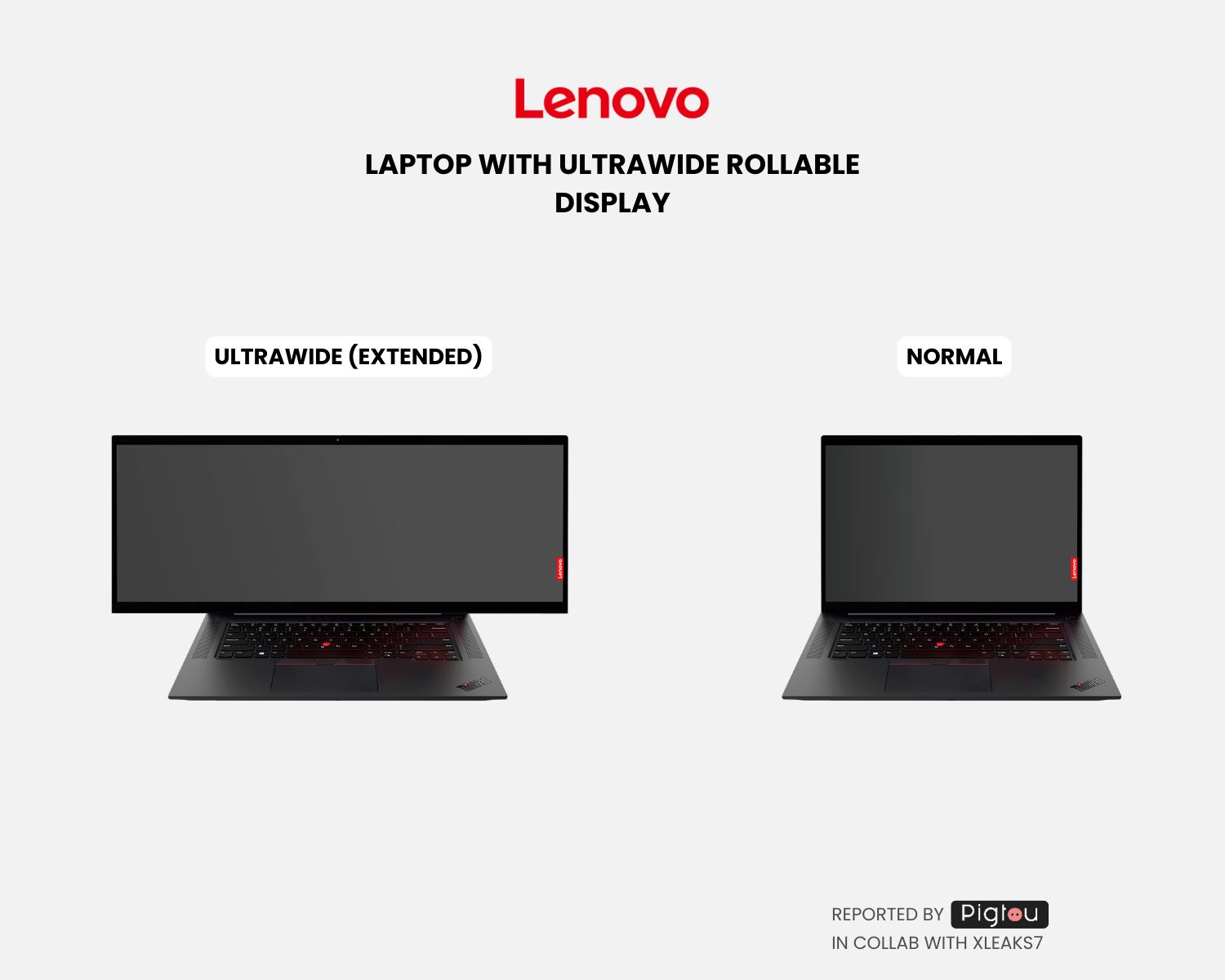
Article Introduction:According to news from this site on February 17, Lenovo has recently been approved for a technology patent, imagining the concept design of future notebooks. The highlight is the use of a scroll screen that automatically extends to both sides when the user needs it, bringing an ultra-wide "fish screen" experience. Source: Pigtou This design patent explores the application scenario of flexible screens on notebooks. A flexible body is added to the device structure, which is composed of fixed and movable parts, and the screen size can be adjusted as needed. The pictures noted on this site are from Pigtou. Simply put, thanks to the use of scrollable screen technology, the screen of a standard laptop can become an ultra-widescreen. This means users can use a larger screen while traveling and improve work efficiency.
2024-02-17
comment 0
1026


Mug Shot Coffee Company Ecommerce Website
Article Introduction:This is a submission for the Wix Studio Challenge .
What I Built
Designed a brand, site layout/template, and built a mobile responsive website for a coffee delivery company. The site uses a 3rd party integration to pull in products and di
2024-07-17
comment 0
349

What are the app production websites (recommended mobile web design and production software)
Article Introduction:But don’t know how to make it? Want to build your own website? Today, so that you can quickly have a website of your own, I will share with you some ways to build a website. There are many ways to make a website, in fact. 1. Use WeChat mini program development. If you want to have a responsive website, because the websites they develop are relatively simple and do not have many technical requirements, then you can choose to use WeChat mini program development. Now many mini program development companies are choosing This way of development. 2. Use a template website, but it takes a long time to make a website using a template website. For example, some companies prefer to use template websites. Template websites are a way to quickly build websites, and they require certain design knowledge, so that they can be quickly produced. a website.
2024-03-26
comment 0
551

Tencent VR live broadcast hall appearance patent authorized
Article Introduction:Tianyancha App shows that recently, the appearance patent applied by Tencent Technology (Shenzhen) Co., Ltd. for the "VR scene live broadcast hall graphical user interface display screen panel" was authorized. The summary shows that the design key point of this design product lies in the graphical user interface on the screen, which is used for immersive live broadcast viewing in virtual scenes. In the main view, users can learn about current live broadcast-related information on the screens on both sides of the virtual bleachers. The display screen panel can be used for mobile phones, computers, tablets, smart TVs, car central control screens, and VR equipment.
2023-09-05
comment 0
710

How does the bootstrap framework adapt to mobile phones?
Article Introduction:Through responsive development, a website can be compatible with multiple terminals. Responsive layout can make the website have a better reading experience on computers, tablets and mobile phones. Different screen sizes display different web page content to users. We can use media queries to detect the size of the screen (mainly detecting width) , and set different CSS styles to achieve responsiveness
2019-07-10
comment 0
4554

How website SEO is affected by responsive layout
Article Introduction:Responsive layout is a website design method that adapts to different devices and screen sizes. As the popularity and usage of mobile devices continues to increase, more and more users access websites through mobile phones and tablets. Therefore, the design of the website not only needs to be beautiful and functional, but also needs to provide a good user experience on different devices. In the past, to accommodate different screen sizes, developers might design a separate website for each screen size. This approach undoubtedly increases the difficulty and cost of development and maintenance. Responsive layout uses
2024-01-27
comment 0
996

Apple's work on touchscreen Macs: What we know so far
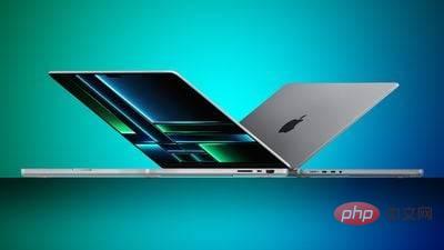
Article Introduction:Apple is rumored to be working on touchscreen Mac technology, and we may see the first touchscreen Mac in just a few years. This guide highlights everything we know so far about Apple's work on touchscreen Macs. Possible Models Apple engineers are "actively involved" in the development of Macs with touch screens, and one of the first Macs with touch screens could be an OLED version of the MacBook Pro. How Touchscreen Macs Work The first touchscreen Macs are expected to continue to have a traditional laptop design, with a trackpad and keyboard. While it will continue to use a standard laptop design, the machine will feature a display that supports touch input
2023-05-05
comment 0
879

Which front-end web company to choose in Lu'an
Article Introduction:With the advent of the Internet era, websites have become an important window for enterprises to display their image and business capabilities. As the primary part of a corporate website, front-end web design and development has attracted even more attention in the Lu'an area. However, the numerous front-end web design and development companies on the Lu'an market make it difficult for customers to choose. Today we are here to summarize some key elements for choosing a front-end web design and development company. We hope it will be helpful to everyone. 1. Consider company size from the perspective of company size. Company size is an important aspect when considering front-end web design and development companies. Advantages of choosing a large company
2023-05-26
comment 0
632

How to design a website with responsive page layout
Article Introduction:How to design a website with responsive page layout With the popularity of mobile devices, more and more people are beginning to use mobile phones and tablets to browse the web. In order to provide a better user experience, it is particularly important to design a website with a responsive page layout. This article will explain how to design a website with a responsive page layout and provide some specific code examples. Using media queries Media queries are an important feature in CSS3 that can apply different styles based on different devices (such as screen width or device type). by using
2024-01-27
comment 0
707

Lenovo has been approved for an innovation patent: scroll screen notebook brings ultra-wide 'fish screen' experience
Article Introduction:Recently, Lenovo has obtained an eye-catching technology patent that demonstrates an innovative design concept for future notebooks. The unique feature of this patent is the adoption of a scroll screen design that can automatically extend to both sides according to user needs, providing an ultra-wide visual experience similar to a "hairtail screen". This patent introduces innovative applications of flexible screens in the notebook computer field. Lenovo has designed a structure that incorporates a flexible body, consisting of fixed parts and movable parts, to achieve flexible adjustment of the screen size to meet the individual needs of users. The use of scrollable screen technology will make the traditional laptop screen wider and bring a more convenient use experience. This innovative design means users can enjoy a larger screen while traveling, improving work efficiency and entertainment.
2024-02-17
comment 0
799

How big is the screen of vivox60
Article Introduction:The vivox60 screen is 6.56 inches. vivo X60 is a mobile phone product released by vivo in December 2020. It adopts a candybar design, has a screen size of 6.56 inches, and the screen material is AMOLED. Vivo X60 is equipped with a 120 Hz refresh rate + 240 Hz touch sampling rate: the former has a clearer visual picture whether it is in a game scene under high-speed movement or smooth when sliding a web page; the latter has a clearer visual image when playing FPS games. Press and shoot at the same time, and the high touch screen sampling rate triggers faster.
2022-12-13
comment 0
17756

Pre-order is open! NexDock XL comes with a full-size keyboard to make your phone run silky smooth
Article Introduction:According to news on June 7, a smartphone accessory called NexDockXL will be launched soon. The accessory looks like a flip-up laptop with a 15.6-inch touchscreen, but it's actually just an add-on device that needs to be connected to a smartphone. By connecting a phone to the NexDockXL, users can run applications on the large touch screen and take advantage of the full-size keyboard and touchpad. According to the editor's understanding, NexDockXL is equipped with a 15.6-inch IPSLCD touch screen with a resolution of 1920x1080 and a refresh rate of 120Hz. The screen supports up to 300 nits of brightness, and it also has a 360-degree hinge design that can be easily switched to tablet or stand mode.
2023-06-07
comment 0
1545

What interesting features does Xiaomi Mi 13 have?
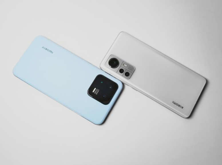
Article Introduction:As the flagship mobile phone of Xiaomi Company, Xiaomi Mi 13 has a variety of highlights and functions. The following are some features worth mentioning: 1. Xiaomi Mi 13 adopts a 6.36-inch straight screen design, with an average width of 1.61mm on the top, middle and bottom sides. The widest position of the side is 1.81mm. Compared with the iPhone Pro version, the visual effects are more shocking. In terms of the aesthetics of the direct-view screen, Xiaomi Mi 13 currently leads the industry, with a screen-to-body ratio of 93.3%. 2. The straight-screen design of Xiaomi Mi 13 provides users with a more comprehensive visual experience and also increases the viewing area of the screen. This means that when enjoying various contents on Xiaomi Mi 13, users can be more immersed in it and gain greater visual enjoyment. Moreover, the width of the bottom border has been optimized, making the entire screen
2024-04-20
comment 0
380
