


Matplotlib is aPython2D plotting library that can generate publication-quality graphics in a variety of hardcopy formats and interactive environments on a variety of platforms.

In the previous Matplotlib data visualization tutorial, we will introducehow to create stacked charts and pie charts. What I bring to you today is the filling of graphic colors and lines.
Color
The first change we want to make is to change plt.title to stock variable.
plt.title(stock)
Now, let’s introduce how to change the label color. We can do this by modifying our axis object:
ax1.xaxis.label.set_color('c') ax1.yaxis.label.set_color('r')
If we run this, we'll see that the labels change color, just like in the words.
Next, we can specify specific numbers for the axes to be displayed, rather than an automatic selection like this:
ax1.set_yticks([0,25,50,75])
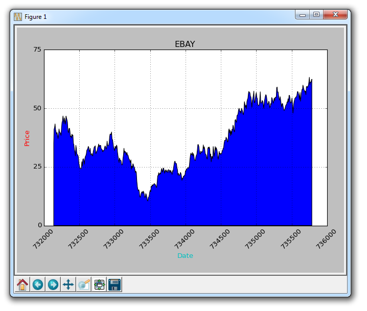
Next, I want to introduce padding. What fill does is fill the color between the variable and a value of your choice. For example, we can do this:
ax1.fill_between(date, 0, closep)
So here, our code is:
import matplotlib.pyplot as plt import numpy as np import urllib import datetime as dt import matplotlib.dates as mdates def bytespdate2num(fmt, encoding='utf-8'): strconverter = mdates.strpdate2num(fmt) def bytesconverter(b): s = b.decode(encoding) return strconverter(s) return bytesconverter def graph_data(stock): fig = plt.figure() ax1 = plt.subplot2grid((1,1), (0,0)) stock_price_url = 'http://chartapi.finance.yahoo.com/instrument/1.0/'+stock+'/chartdata;type=quote;range=10y/csv' source_code = urllib.request.urlopen(stock_price_url).read().decode() stock_data = [] split_source = source_code.split('\n') for line in split_source: split_line = line.split(',') if len(split_line) == 6: if 'values' not in line and 'labels' not in line: stock_data.append(line) date, closep, highp, lowp, openp, volume = np.loadtxt(stock_data, delimiter=',', unpack=True, converters={0: bytespdate2num('%Y%m%d')}) ax1.fill_between(date, 0, closep) for label in ax1.xaxis.get_ticklabels(): label.set_rotation(45) ax1.grid(True)#, color='g', linestyle='-', linewidth=5) ax1.xaxis.label.set_color('c') ax1.yaxis.label.set_color('r') ax1.set_yticks([0,25,50,75]) plt.xlabel('Date') plt.ylabel('Price') plt.title(stock) plt.legend() plt.subplots_adjust(left=0.09, bottom=0.20, right=0.94, top=0.90, wspace=0.2, hspace=0) plt.show() graph_data('EBAY')
The result is:
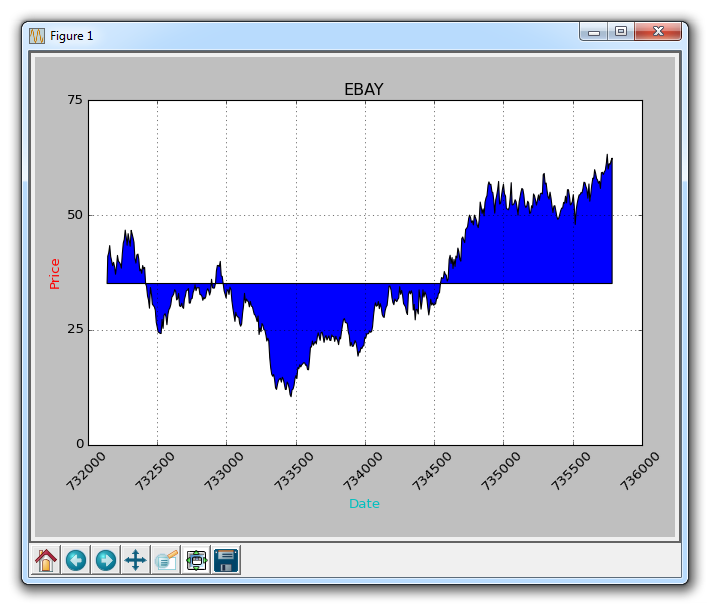
filled one The problem is, we might end up covering everything. We can solve it with transparency:
ax1.fill_between(date, 0, closep)
Now, let’s introduce conditional fill. Let's assume the starting position on the chart is where we start buying eBay. Here, if the price is below this price, we can pad up to the original price, and then if it exceeds the original price, we can pad down. We could do this:
ax1.fill_between(date, closep[0], closep)
would generate:
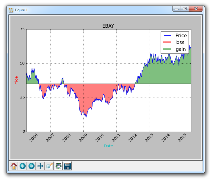
If we wanted to show the gains/losses with red and green fills compared to the original price , green filling is used for rising (note: the color of foreign stock markets is opposite to domestic), red filling is used for falling? no problem! We can add a where parameter like this:
ax1.fill_between(date, closep, closep[0],where=(closep > closep[0]), facecolor='g', alpha=0.5)
Here, we fill the area between the current price and the original price, where the current price is higher than the original price. We give it a green foreground color because this is a rise, and we use a slight transparency.
Lines
We still can't apply labels to polygonal data (like fills), but we can implement empty lines as before, so we can:
ax1.plot([],[],linewidth=5, label='loss', color='r',alpha=0.5) ax1.plot([],[],linewidth=5, label='gain', color='g',alpha=0.5) ax1.fill_between(date, closep, closep[0],where=(closep > closep[0]), facecolor='g', alpha=0.5) ax1.fill_between(date, closep, closep[0],where=(closep < closep[0]), facecolor='r', alpha=0.5)
This gives us some padding, as well as empty lines for handling labels, which we intend to display in the legend. The complete code here is:
import matplotlib.pyplot as plt import numpy as npimport urllib import datetime as dt import matplotlib.dates as mdates def bytespdate2num(fmt, encoding='utf-8'): strconverter = mdates.strpdate2num(fmt) def bytesconverter(b): s = b.decode(encoding) return strconverter(s) return bytesconverter def graph_data(stock): fig = plt.figure() ax1 = plt.subplot2grid((1,1), (0,0)) stock_price_url = 'http://chartapi.finance.yahoo.com/instrument/1.0/'+stock+'/chartdata;type=quote;range=10y/csv' source_code = urllib.request.urlopen(stock_price_url).read().decode() stock_data = [] split_source = source_code.split('\n') for line in split_source: split_line = line.split(',') if len(split_line) == 6: if 'values' not in line and 'labels' not in line: stock_data.append(line) date, closep, highp, lowp, openp, volume = np.loadtxt(stock_data, delimiter=',', unpack=True, converters={0: bytespdate2num('%Y%m%d')}) ax1.plot_date(date, closep,'-', label='Price') ax1.plot([],[],linewidth=5, label='loss', color='r',alpha=0.5) ax1.plot([],[],linewidth=5, label='gain', color='g',alpha=0.5) ax1.fill_between(date, closep, closep[0],where=(closep > closep[0]), facecolor='g', alpha=0.5) ax1.fill_between(date, closep, closep[0],where=(closep < closep[0]), facecolor='r', alpha=0.5) for label in ax1.xaxis.get_ticklabels(): label.set_rotation(45) ax1.grid(True)#, color='g', linestyle='-', linewidth=5) ax1.xaxis.label.set_color('c') ax1.yaxis.label.set_color('r') ax1.set_yticks([0,25,50,75]) plt.xlabel('Date') plt.ylabel('Price') plt.title(stock) plt.legend() plt.subplots_adjust(left=0.09, bottom=0.20, right=0.94, top=0.90, wspace=0.2, hspace=0) plt.show() graph_data('EBAY')
Now our result is:
The above is the detailed content of Filling of graphic colors and lines in Matplotlib. For more information, please follow other related articles on the PHP Chinese website!


![[Web front-end] Node.js quick start](https://img.php.cn/upload/course/000/000/067/662b5d34ba7c0227.png)


