When using the matplotlib module to draw a coordinate chart, you often need to set many parameters for the coordinate axes. These parameters include the range of the horizontal and vertical coordinate axes, the scale size of the coordinate axes, the name of the coordinate axes, etc. There are many functions in matplotlib. Use to set these parameters. We can set the coordinate axis, set the range of the coordinate axis, set the text description on the coordinate axis, etc. In this article, we will introduce to you how to set the coordinate axis in python matplotlib.
Basic usage
For example:
import numpy as np
import pandas as pd
import matplotlib.pyplot as plt
# 生成x轴上的数据:从-3到3,总共有50个点
x = np.linspace(-1, 1, 50)
# 定义一个线性方程
y1 = 2 * x + 1
# 定义一个二次方程
y2 = x ** 2
# 设置x轴的取值范围为:-1到2
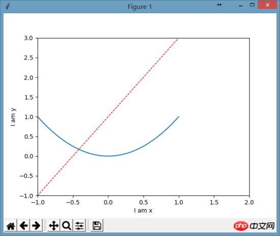
plt.xlim(-1, 2)
# 设置y轴的取值范围为:-1到3
plt.ylim(-1, 3)
# 设置x轴的文本,用于描述x轴代表的是什么
plt.xlabel("I am x")
# 设置y轴的文本,用于描述y轴代表的是什么
plt.ylabel("I am y")
plt.plot(x, y2)
# 绘制红色的线宽为1虚线的线条
plt.plot(x, y1, color='red', linewidth=1.0, linestyle='--')
# 显示图表
plt.show()The output picture is:

Modify the scale of the coordinate axis
Want to modify the scale of the x-axis, from -1 to 2, a total of 5 points:
new_ticks = np.linspace(-1, 2, 5)
plt.xticks(new_ticks)
Just put the above code before drawing the picture, and the final picture drawn will be:

This way x The scale on the axis is modified to a total of 5 points from -1 to 2.
Use text to represent the scale
# 设置y刻度:用文字来显示刻度
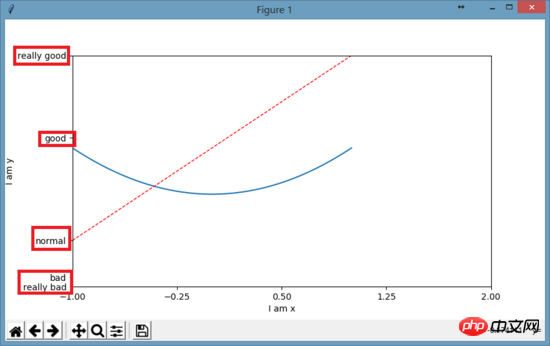
plt.yticks([-2, -1.8, -1, 1.22, 3],
  ['really bad', 'bad', 'normal', 'good', 'really good'])
1.22 => 'good'3 => 'really good'The picture shown is:

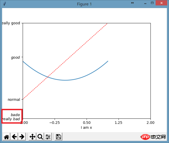
Modify the axis scale font
In order to make the font on the scale appear better, you can use:plt.yticks([-2, -1.8, -1, 1.22, 3], [r'$really\ bad$', r'$bad\alpha$', 'normal', r'$good$', 'really good'])

Summary of definitions and usage of coordinate axes
##HTML5 canvasCanvas coordinate axis conversion, pattern filling, gradient and ShadowPython implements the method of drawing a straight cursor between two coordinate axes in matplotlibThe above is the detailed content of Python matplotlib coordinate axis setting method. For more information, please follow other related articles on the PHP Chinese website!


