I saw an article about building a Bootstrap site in 20 minutes. The content is a bit old. I reused Bootstrap3 to implement it and explained the content involved in as much detail as possible.
1. Create a basic page
We first create a basic HTML template page. This page can be created directly using sublime + emmet.
1.1 Create a new file, Ctrl + N
1.2 Save it to the page file, Ctrl + S, name it index.html
1.3 In this blank page, enter html:5, and then directly press the tab key, You should see a basic HTML5 template page.
1.4 Save again and press Ctrl + S.
The page content should be as follows:
<!DOCTYPE html>
<html lang="en">
<head>
 <meta charset="UTF-8">
 <title>Document</title>
</head>
<body>

</body>
</html>
2. Add Bootstrap file reference
In the folder where the index.html file is located, create a css folder for Save all style files and create a folder named bootstrap in the css subfolder to save our bootstrap files.
You can download the bootstrap package from the bootstrap official website, which has a dist folder, which contains three subfolders: css, font and js. Copy these three subfolders into your css/bootstrap folder.
There are two parts of content involved in the page, styles and scripts.
2.1 Add style reference
Add bootstrap style reference in header. Pay attention to the path.
<link href="css/bootstrap/css/bootstrap.min.css" rel="stylesheet"/>
<link href="css/bootstrap/css/bootstrap-theme.min.css" rel="stylesheet"/>
bootstrap.min.css is the style file of bootstrap, which contains all bootstrap style definitions, and bootstrap-theme.min.css is the theme definition.
2.2 Add script reference
Since bootstrap uses jQuery script, you also need to download the jquery script library.
In the directory where your index.html file is located, create a subdirectory named lib to save the script library for future use, and copy the downloaded jquery.min.js to this directory.
Add jquery and bootstrap script library references immediately between your .
<script type="text/javascript" src="lib/jquery.min.js"></script>
 <script type="text/javascript" src="css/bootstrap/js/bootstrap.min.js"></script>
</body>
3. Add bootstrap container
bootstrap’s .container class is very useful. It can create a centered area in the page, and then we can put content from other locations inside. The container class is equivalent to creating a centered p box with a static width and a magin value of auto. The advantage of twitter bootstrap's container class is that it is responsive, and it will calculate the optimal width based on the width of the current screen and use it.
.container-fluid is a full-width container, using the entire width.
.container {
 padding-right: 15px;
 padding-left: 15px;
 margin-right: auto;
 margin-left: auto;
}
@media (min-width: 768px) {
 .container {
 width: 750px;
 }
}
@media (min-width: 992px) {
 .container {
 width: 970px;
 }
}
@media (min-width: 1200px) {
 .container {
 width: 1170px;
 }
}
.container-fluid {
 padding-right: 15px;
 padding-left: 15px;
 margin-right: auto;
 margin-left: auto;
}In the body tag, create a p using the container class. It will serve as the main outer package for placing other codes on the page.
You can also add a title by the way. Now your page should look like this.
 Twitter Bootstrap Tutorial - A responsive layout tutorial


 <script type="text/javascript" src="lib/jquery.min.js"></script>
 <script type="text/javascript" src="css/bootstrap/js/bootstrap.min.js"></script>
</body>
Although you can’t see much content in the browser yet, the foundation for subsequent operations has been laid.
4. Title and Navigation
Now we can add some visible content to the page.
4.1 Title
Adding a title is very simple, just add an h1 element.
<p class="container">
<h1>Twitter bootstrap tutorial</h1>
</p>
Refresh the page and you should see an eye-catching title. Next we look at navigation.
4.2 Navigation
Navigation can be created using nav elements, and we want to create a navigation bar to organize navigation items. In bootstrap, the navigation bar is called navbar. Continue to add the navigation bar in the container.
<p class="container">
<h1>Twitter bootstrap tutorial</h1>
<nav class="navbar navbar-inverse">
</nav>
</p>
navbar will help us create the navigation bar. The default background color is white. navbar-inverse is set to inverse, so that the background color will be black and the text will be white, which is more eye-catching. Now refresh the page and you will see a black navigation bar without any navigation content.
Add navigation content as follows
<p class="container">
<h1>Twitter bootstrap tutorial</h1>
<nav class="navbar navbar-inverse">
<p class="navbar-collapse">
<ul class="nav navbar-nav">
 <li class="active"><a href="#">Home</a></li>
 <li><a href="#">Page One</a></li>
 <li><a href="#">Page Two</a></li>
</ul>
</p>
</nav>
</p>
ul is the actual navigation content, where .nav indicates that this is a set of navigation, and .navbar-nav indicates that it is used for navigation in navbar. li is the actual navigation item, and you can use .active to describe the currently active navigation.
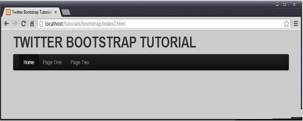
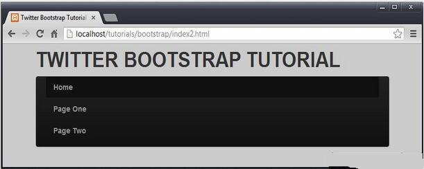
Pay attention to .navbar-collapse, which means that when the width of the viewport is less than 768px, the navigation becomes vertical.
is larger than 768px
is smaller than 768px
4.3 It is not convenient to turn the sandwich menu
into vertical navigation. We hope to become a popular style, like this.

We need to do some extra work. On the one hand, we need to indicate that when the viewport is smaller than a certain width, our specific navigation will be displayed and additional navigation content will be added.
<!-- Brand and toggle get grouped for better mobile display -->
<p class="navbar-header">
 <button type="button" class="navbar-toggle collapsed" data-toggle="collapse" data-target="#navbar-menu" aria-expanded="false">
 <span class="sr-only">Toggle navigation</span>
 <span class="icon-bar"></span>
 <span class="icon-bar"></span>
 <span class="icon-bar"></span>
 </button>
 <a class="navbar-brand" href="#">Brand</a>
</p>
In fact, it is composed of two parts. The button part looks like a lot, and it is used to draw the sandwich button on the right. The following a element is the navigation on the left.
Normally it doesn't show up.
然后,我们需要制定点击三明治按钮的时候,需要显示我们原来的导航。button 元素中,我们有一个 attribute ,data-target="#navbar-menu" ,就是用来完成这一步工作的,这个 #navbar-menu 就是我们为原来的导航所起的 id 标识。
这样,我们的导航就是这样的了。
<h1>Twitter bootstrap tutorial</h1>
<nav class="navbar navbar-inverse">
 <!-- Brand and toggle get grouped for better mobile display -->
 <p class="navbar-header">
 <button type="button" class="navbar-toggle collapsed" data-toggle="collapse" data-target="#navbar-menu" aria-expanded="false">
  <span class="sr-only">Toggle navigation</span>
  <span class="icon-bar"></span>
  <span class="icon-bar"></span>
  <span class="icon-bar"></span>
 </button>
 <a class="navbar-brand" href="#">Brand</a>
 </p>
 <p id="navbar-menu" class="collapse navbar-collapse">
 <ul class="nav navbar-nav">
  <li class="active"><a href="#">Home</a></li>
  <li><a href="#">Page One</a></li>
  <li><a href="#">Page Two</a></li>
 </ul>
 </p>
</nav>
</p>
5. 内容和边栏
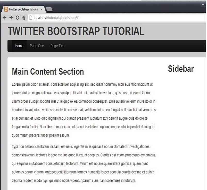
主要内容部分,我们使用 p 来进行布局。
<p id="content" class="row-fluid">
<p class="col-md-9">
 <h2>Main Content Section</h2>
</p>
<p class="col-md-3">
 <h2>Sidebar</h2>
</p>
</p>
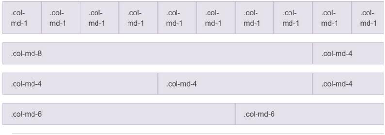
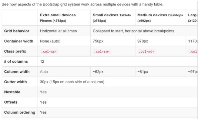
这里使用了 bootstrap 的栅格布局,栅格系统利用了12列的布局,这意味着一个页面可以被分割成12个相同的列。下面这张从bootstrap官方文档中拿到的图片给出了一个很好的展示。
这张表格则给出了详细的说明。
现在页面看起来是这样的。
6. 侧边栏导航
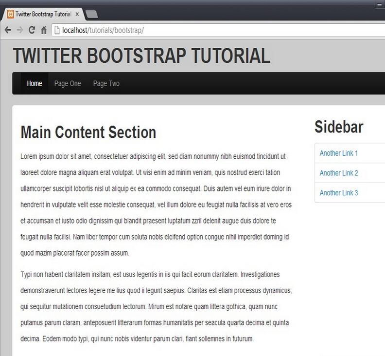
在侧边栏中添加一些导航内容。这里就是普通的导航,使用 .nav 进行声明,.nav-tabs 和 .nav-stacked 是导航的外观。
<p class="col-md-3"> <h2>Sidebar</h2> <ul class="nav nav-tabs nav-stacked"> <li><a href='#'>Another Link 1</a></li> <li><a href='#'>Another Link 2</a></li> <li><a href='#'>Another Link 3</a></li> </ul> </p>
看看最终的效果,一个基于 bootstrap 的响应式布局页面就完成了。
相关文章:


