


Hover on the image
It uses a combination of all the rotate operators


Ditulis oleh Oscar Jite-Orimiono✏️
Sebagai pembangun bahagian hadapan, kemungkinan besar anda pernah mendengar analogi rumah yang digunakan untuk menerangkan HTML, CSS dan JavaScript. HTML ialah struktur (dinding, bilik, pintu, dan sebagainya), CSS ialah penghias (lukisan, susun atur dan perabot), manakala JavaScript membawa fungsi dengan elektrik dan paip.
Mari kita lihat CSS secara berasingan, pertama kerana ia hebat, tetapi kedua CSS berkuasa dengan sendirinya dan boleh membawa beberapa tahap kefungsian di mana JavaScript tidak diperlukan dalam beberapa kes. Dengan CSS, satu-satunya had anda ialah imaginasi anda, tetapi sebaiknya jangan biarkan ia berjalan liar, kerana anda mesti mengekalkan tahap kefungsian yang tinggi.
Dalam siaran ini, anda akan belajar cara mencipta kesan 3D dengan CSS dengan menggunakan sifat dan operasi yang berkaitan yang mengawal elemen dalam ruang 3D maya, selain kami juga akan meliputi ilusi visual dengan bayang-bayang dan cahaya.
Objek dalam ruang 3D mempunyai tiga dimensi: panjang, lebar — secara teknikalnya sama dengan "panjang" tetapi biasanya dianggap sebagai sisi yang lebih pendek dan ketinggian (atau kedalaman). Anda hanya melihat dalam 2D apabila melihat skrin, jadi anda memerlukan sifat CSS seperti transform untuk mencipta kesan 3D.
Harta transformasi mempunyai beberapa operasi yang mengawal dimensi dan kedudukan 3D elemen. Anda mengawal kedudukan mendatar dengan translateX(), kedudukan menegak dengan translateY(), dan ketinggian dan kedalaman dengan translateZ().
Pertimbangkan ilustrasi ini. Kami mempunyai dua elemen segi empat tepat - satu kecil dan satu lagi besar. Elemen kecil ialah anak, dan ia bersarang dalam elemen induk yang lebih besar: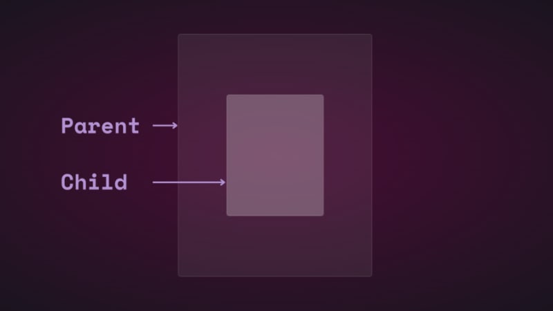
Jika anda menukar kedudukan elemen kanak-kanak secara menegak dan mendatar menggunakan terjemah, anda akan melihatnya bergerak: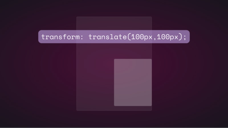
Jika anda cuba menukar kedudukan elemen anak pada paksi z dengan menambahkan translateZ(), tiada apa yang akan berlaku. Paksi-z berserenjang dengan port pandangan, jadi elemen kanak-kanak sepatutnya kelihatan lebih kecil apabila ia bergerak menjauhi skrin dan lebih besar apabila ia bergerak lebih dekat, bukan? Begitulah cara ia berfungsi di dunia nyata apabila melihat objek dari atas. Walau bagaimanapun, perkara tidak berfungsi sama secara maya kerana tiada perspektif.
Dalam CSS, sifat perspektif dan operator perspective() sangat penting untuk cara transformasi 3D berfungsi. Perspektif ialah sudut pandangan anda dan mencipta ilusi kedalaman dan ketinggian.
Sifat perspektif diteruskan pada elemen induk, manakala perspektif() berfungsi dengan sifat transformasi pada elemen anak. Mereka melakukan perkara yang sama - kebanyakan masa.
Mari kita lihat cara sifat perspektif mempengaruhi translateZ(). Kami akan menggunakan animasi mudah untuk menunjukkan.
Berikut ialah HTML dan CSS untuk elemen ibu bapa dan anak:
.parent { display: flex; justify-content: center; align-items: center; background: rgba(255, 255, 255, 0.07); width: 400px; height: 500px; border: 0.5px solid rgba(255, 255, 255, 0.15); border-radius: 5px; z-index: 0; } .child { background: rgba(255, 255, 255, 0.25); width: 200px; height: 250px; border: 1px solid rgba(255, 255, 255, 0.15); border-radius: 5px; z-index: 1; }
Mula-mula, tambahkan perspektif pada elemen induk, kemudian tambahkan animasi transformasi pada anak:
.parent{ perspective: 1000px; } .child{ animation: transform 5s infinite ease-in-out alternate-reverse; } @keyframes transform{ 0%{ transform: translateZ(-200px) } 100%{ transform: translateZ(200px) } }
Dan inilah hasilnya: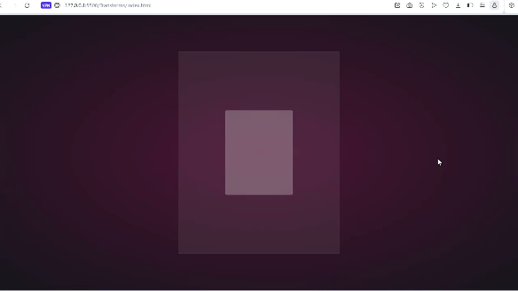
Anda akan mendapat hasil yang sama jika anda menggunakan operator perspective(). Ia adalah cerita yang berbeza apabila digunakan dengan rotate() walaupun.
Mari kita pusingkan kanak-kanak di sepanjang paksi-x dan lihat apa yang berlaku:
.child{ transform: perspective(10px) rotateX(2deg); }
Ini tangkapan skrin: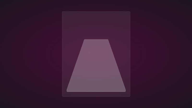
Jika kami menambah sedikit terjemahan pada paksi z, inilah yang anda dapat: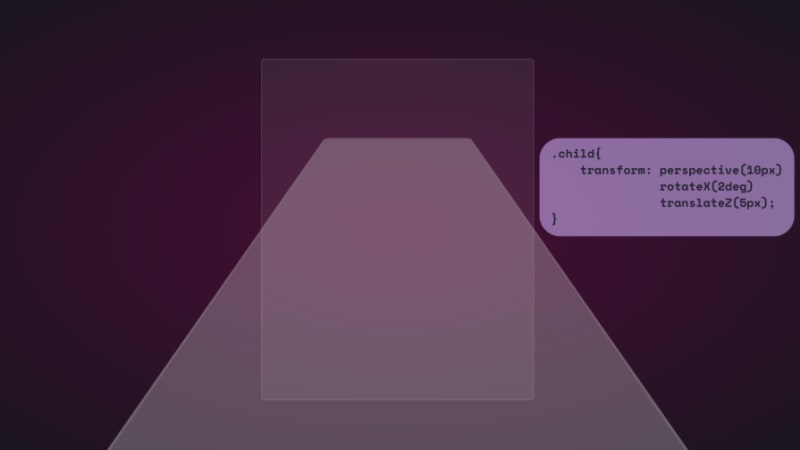
Untuk keseronokan, berikut ialah sejauh mana ia terbentang:
Ia seperti anda berada di permukaan unsur. Alangkah baiknya jika anda dapat melihat ini melalui set kepala VR.
Kita juga boleh menggunakan harta kendiri:
.parent { perspective: 10px; } .child { transform: rotateX(2deg) translateZ(5px); }
Hasilnya adalah sama, tetapi ia tidak akan melimpah melebihi ruang pandang. Kedua-duanya mempunyai kes penggunaan mereka, dan kami akan melihatnya serta operasi transformasi yang lain di tempat kerja semasa kami bergerak.
Perhatikan bahawa nilai perspektif kecil yang digunakan dalam contoh di atas adalah untuk membesar-besarkan kesan 3D supaya anda boleh melihat cara ia berfungsi. Anda kebanyakannya ingin melihat elemen dari atas, jadi nilai yang lebih besar sehingga 1000px sudah memadai. Nilai perspektif yang kecil menjadikan elemen kelihatan lebih 3D.
Inilah CodePen dengan animasi transformasi 3D.
Sudah tiba masanya untuk ke bahagian yang menyeronokkan dan mencipta beberapa kesan 3D dengan CSS!
How objects interact with light is another way to tell they’re in 3D space. We can use the perspective() operator to create reflections and shadows in CSS to generate the illusion that an element is floating in 3D space.
This example will feature text, but you can use other HTML elements:
Text in space
We’re creating a reflection, so we need light. You’ll need the text-shadow property to create this light effect:
.content h1 { position: relative; font-size: 5rem; font-weight: 600; color: #fff; margin: 3px; text-shadow: 0px 0px 10px #b393d350, 0px 0px 20px #b393d350; text-transform: uppercase; }
You should have glowing text at this point:
It’s time to add the reflection using a pseudo-element:
.content h1::before { content: ""; position: absolute; top: 80%; left: 0; height: 100%; width: 100%; background: #b393d3; transform: perspective(10px) rotateX(10deg) scale(1,0.2); filter: blur(1em); opacity: 0.5; }
First, we give the pseudo-element the same dimensions as the text. Then we add a background with the same color as the text-shadow. Next, we add the transform property with three operations.
We’ve already seen how the first two work, so let’s talk about scale(). Remember how the child element stretches beyond the viewport? This prevents that by resizing the element along the x and y directions.
In this example, the reflection we created with the pseudo-element keeps its original size on the x-axis but is reduced to less than half on the y-axis. The opacity and filter make it look like the light fades the further it moves from the text:
The text looks like it’s floating and reflecting light off the floor.
We can also create shadows using a similar method to the light. Let’s work with an image this time.
Here’s the image we’ll work with for this example:
It’s nice to have the shadow match the shape and size of the element. In this case, we have a rocket, and this means our shadow should be round. Consequently, there’s no need for the perspective() operator.
Here’s the HTML:
In CSS, go ahead and give the image any dimensions you want, then add a pseudo-element below it:
.rocket::before { content: ""; position: absolute; bottom: -10%; left: 0; height: 50px; width: 100%; border-radius: 50%; background: radial-gradient(rgba(0, 0, 0, 0.8), transparent, transparent); transition: 0.5s; }
The border-radius of 50 percent gives it an oval shape. You can add more height or a more specific width if you'd like. Shadows are black most of the time, so the background is a blurry radial-gradient fading from black to transparent.
Here’s a screenshot of how it should look at this point:
Finally, let’s add some animation:
.rocket:hover img{ transform: translateY(-40px); } .rocket:hover::before { opacity: 0.8; transform: scale(0.8); }
This will move the rocket up and down, and the shadow will change as it moves. Hover on the rocket in the CodePen to see this 3D effect.
You can create 3D text with the CSS box-shadow property. You’ll need multiple shadow layers to create this effect.
Here’s the HTML:
3D text in 3D space
Next, we need CSS to turn it into 3D text. We’ll use perspective and transform to tilt the text at an angle:
.content { position: relative; transform: translate(-50%, -50%); display: flex; align-items: center; justify-content: center; text-align: center; perspective: 1500px; transform-style: preserve-3d; } .content h1 { font-size: 5rem; font-weight: 600; color: #b393d3; text-shadow: 1px 4px 1px #480d35, 1px 5px 1px #480d35, 1px 6px 1px #480d35,/* to create the sides*/ 1px 10px 5px rgba(16, 16, 16, 0.5), 1px 15px 10px rgba(16, 16, 16, 0.4), 1px 20px 30px rgba(16, 16, 16, 0.3); /* real shadow */ margin: 3px; transform: rotateX(15deg) rotateY(-20deg) rotateZ(10deg); text-transform: uppercase;
Here’s how the text should look at this point: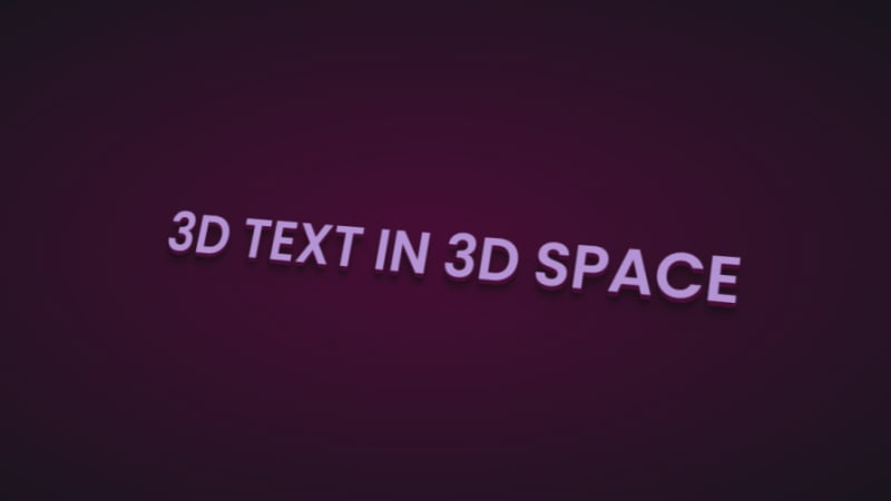
Now let’s add some animation:
.content:hover h1{ transform: rotateX(2deg) rotateY(0deg) rotateZ(0deg); font-size: 4rem; transition: 500ms ease-in-out; }
Here’s the 3D text plus tilt on hover effect on CodePen.
Let’s work with an image this time, and we’ll use the one below:
Here’s the HTML:
Hover on the image
It uses a combination of all the rotate operators
You could use a background image, but what’s important is that there’s a clear parent and child element.
In the CSS, use the transform property tilt the image at an angle, then reset it on hover:
.tilt-img { width: 600px; height: auto; margin-top: 20px; perspective: 1000px; } .tilt-img img { width: 100%; height: 100%; object-fit: contain; border-radius: 10px; transform: rotateX(15deg) rotateY(-5deg) rotateZ(1deg); box-shadow: 5px 5px 2px rgba(0, 0, 0, 0.5); transition: 2s; } .tilt-img:hover img{ transform: none; box-shadow: 0px 2px 3px rgba(0, 0, 0, 0.5); }
You can reverse it and add the tilt on hover, or change the transform values:
See the 3D image tilt with CSS on CodePen.
Here, we’re going to make an element tilt and follow the movement of the mouse when you hover over it. We’re going to work with vanilla-tilt.js, a JavaScript library.
Here’s what we’re aiming for: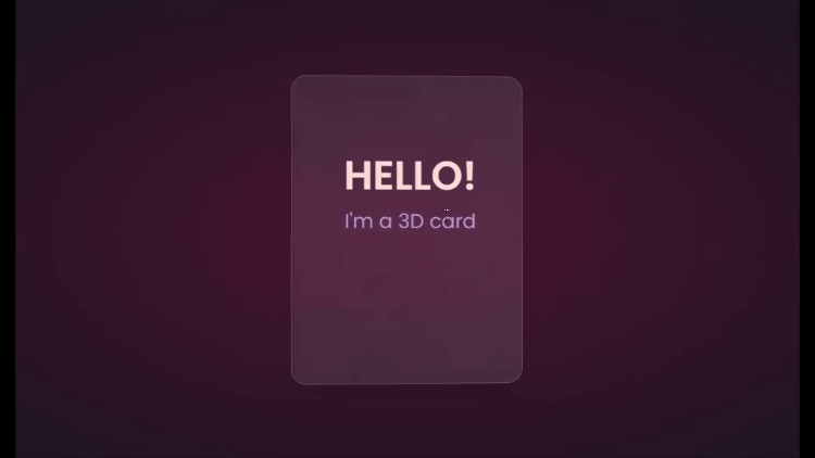
We’ll start with HTML, creating a card and some text:
Hello!
I'm a 3D card
Next, we’ll style with CSS:
.box { position: relative; border-radius: 20px; transform-style: preserve-3d; } .box .card { position: relative; background: rgba(255, 255, 255, 0.07); width: 300px; min-height: 400px; backdrop-filter: blur(10px); border: 0.5px solid rgba(255, 255, 255, 0.15); border-radius: 20px; box-shadow: 0 25px 45px rgba(0,0,0,0.05); } .elements{ position: absolute; top: 100px; left: 50px; width: 200px; height: auto; text-align: center; background: transparent; transform: translateZ(80px); } .elements h2{ font-size: 3rem; font-weight: 600; color: #f6d8d5; text-transform: uppercase; } .elements p{ font-size: 1.5rem; color: #b393d3; }
The two CSS properties directly responsible for creating the 3D effect on the card are transform and transform-style.
First, we have the transform-style, set to preserve-3d, applied to the box. This means the card and any nested element are now in a 3D space. The transform property is applied to the text’s parent element, with the class name .elements. Here, translateZ(80px) moves the text toward the viewer.
These two properties combined create the illusion of depth, and the text will appear to be floating above the card.
Head to cdnjs.com to grab the Vanilla-tilt CDN and link it to your HTML document. Next, go to the main site and copy the VanillaTilt.init JavaScript function that controls the tilt. Add it just before the closing body tag:
Now all you have to do is replace .your-element with the class name of your element getting the 3D tilt effect, and you’re in business.
By default, the maximum tilt rotation and transition speed are defined by max and speed respectively. You can also add a glare, easing, or tilt direction and angle.
Here’s how to get the exact effect shown in the “HELLO” example above:
More functions and effects are listed on the main site.
Here’s a CodePen showing the 3D tilt effect.
Just to show that the library isn’t doing all the work and how important the transform and transform-style properties are for this 3D effect, here’s what it would look like if they weren’t included: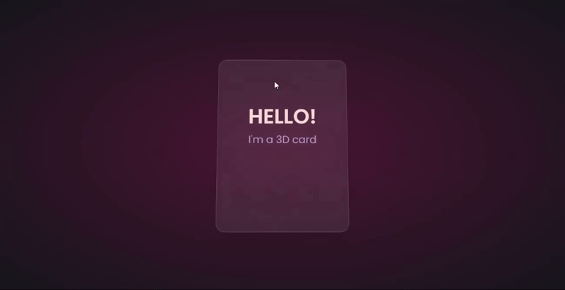
The text appears flush against the card and you’re left with only the tilting, which is nice, but not as nice as the 3D effect created when those properties are included.
Let’s explore another practical use case of this 3D effect.
Using the same card, we’ll add a background image and caption that’ll appear on hover:
.box .card { position: relative; background: url(/Captions/8.jpg) center; background-size: cover; background-repeat: no-repeat; width: 300px; min-height: 400px; border: 1px solid rgba(255, 255, 255, 0.15); border-radius: 10px; box-shadow: 0 25px 45px rgba(0,0,0,0.05); z-index: 0; } .elements{ position: absolute; top: 60%; left: 30%; width: 250px; height: auto; padding: 10px; border-radius: 5px; text-align: center; background: rgba(255, 255, 255, 0.25); transform: translateZ(80px); z-index: 2; opacity: 0; transition: opacity 500ms; } .box:hover .elements{ opacity: 1; }
Here’s a CodePen with the result of the 3D image card with caption appearing on hover.
Buttons are common web components with many shapes, sizes, and purposes. No matter the button type, they all have one thing in common: you have to click on them to work. But how many times have you seen them actually “click”?
This will be a little micro-interaction that helps the user know they’ve done something. The main CSS property we’ll use for this 3D effect is the transform property.
Here’s how it should look: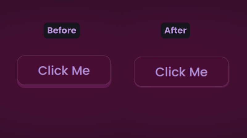
There are two distinct parts of this 3D button — the top with the "Click Me” text and the bottom and sides with a lighter color.
You’ll start with the HTML for the button:
In CSS, we’ll start with the bottom. That’s the button with the class name btn:
.btn { position: relative; background: #17151d; border-radius: 15px; border: none; cursor: pointer; }
Next, we have the top of the button:
.text { display: block; padding: 10px 40px; border-radius: 15px; border: 1px solid rgba(255, 255, 255, 0.15); background: #480d35; font-size: 1.5rem; font-weight: 500; color: #b393d3; transform: translateY(-6px); transition: transform ease 0.1s; }
The transform property is what creates the 3D effect of the button clicking. All that’s left is to reverse the transformation by a few pixels when you click on it:
.btn:active .text{ transform: translateY(-2px); }
And that’s how to create a 3D click button. Here’s a CodePen you can interact with.
The transform property and its operators have excellent support across all the major browsers — unless you still use Internet Explorer. You can check it out yourself on CanIuse: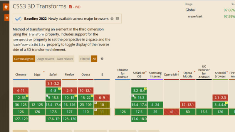
Unfortunately, the borders of the cards do not appear straight during animation on Firefox browsers, but it’s not clear why. Apart from that, the animation runs smoothly. Compare performance across browsers, and try different border thickness.
The web is your canvas, and CSS is your paintbrush. In this post, you’ve learned how to create 3D effects with the transform property. What other effects can you think of?
As web frontends get increasingly complex, resource-greedy features demand more and more from the browser. If you’re interested in monitoring and tracking client-side CPU usage, memory usage, and more for all of your users in production, try LogRocket.
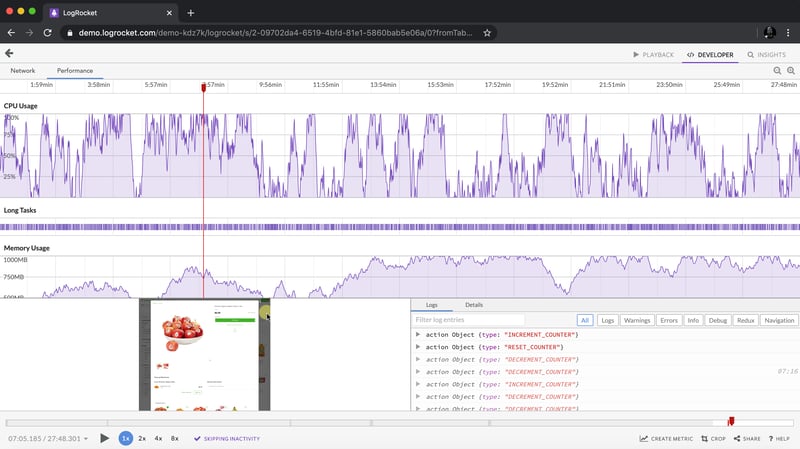
LogRocket is like a DVR for web and mobile apps, recording everything that happens in your web app, mobile app, or website. Instead of guessing why problems happen, you can aggregate and report on key frontend performance metrics, replay user sessions along with application state, log network requests, and automatically surface all errors.
Modernize how you debug web and mobile apps — start monitoring for free.
Atas ialah kandungan terperinci Mencipta kesan dalam CSS. Untuk maklumat lanjut, sila ikut artikel berkaitan lain di laman web China PHP!
 Cara menggunakan fungsi paksi dalam Matlab
 Tujuan arahan rm-rf dalam linux
 Syiling kurang nilai untuk disimpan pada tahun 2024
 Bagaimana untuk membuka Windows 7 Explorer
 Apakah kaedah diagnostik SEO?
 fail srt
 Bagaimana untuk belajar pengaturcaraan python dari awal
 Bagaimana untuk membatalkan ralat komit git


![[Web front-end] Permulaan pantas Node.js](https://img.php.cn/upload/course/000/000/067/662b5d34ba7c0227.png)


