Home > Article > Web Front-end > In-depth understanding of the usage skills of CSS property *-gradient

This article will teach you how to use CSS properties *-gradient. It has certain reference value. Friends in need can refer to it. I hope it will be helpful to everyone.
[Recommended tutorial: CSS video tutorial ]
Let me first introduce an interesting attribute—— conic-gradient
I am interested in it because I found that it can be used to make pie charts!
For example: 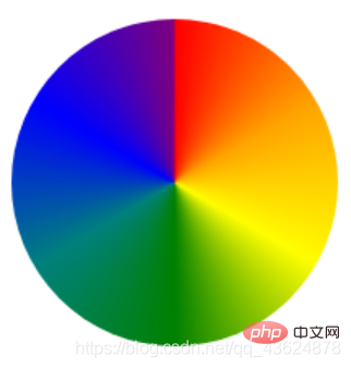
Like this: 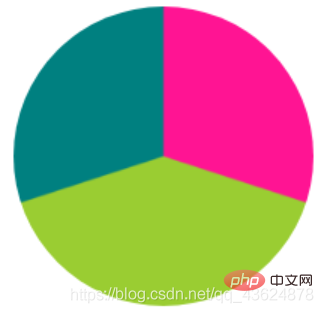
The principle is also very simple: take the starting point as the center, and then realize the gradient around the center in a clockwise direction Effect. It must receive multiple color value parameters. Each color value can be followed by two percentages, which are the starting point and ending point of the current color value (separated by spaces):
background: conic-gradient(pink 0 30%, yellow 0 70%, lime 0 100%);
You can also write it separately:
background: conic-gradient(pink 0, pink 30%, yellow 30%, yellow 70%, lime 70%, lime 100%);
(The second way is more compatible than the first one)
Wait! Isn’t the second picture above exactly what we want?
According to the picture, it is not difficult for us to come up with the following code:
{
    width: 200px;
    height: 200px;
    background: conic-gradient(deeppink 0, deeppink 30%, yellowgreen 30%, yellowgreen 70%, teal 70%, teal 100%);
    border-radius: 50%;
}
But, it is completely "static".
Most of us have probably used echarts to draw graphics: according to the data sent from the backend and rendered into the specified parameters (array) of the Map object of echarts, a circle displayed in different colors that meets the requirements can be obtained. Pie chart. How to do this using CSS?
Of course we need the help of JS - because CSS3 has introduced custom variables, which can combine css attributes with JavaScript variables:
After exploration,Currently a better practice should be to set the start and end positions of gradient colors as custom variables, and then when JavaScript gets the data, change its value to change the color distribution in the pie chart!
Put a demo that I wrote before:
:root{
	--zero:0;
	--one:50%;
}
.circle{
	width: 300px;
	height: 300px;
	border-radius: 50%;
	/* background: conic-gradient(red, yellow, lime, aqua, blue, fuchsia, red); */
	background: conic-gradient(red var(--zero) var(--one),yellow var(--one) 100%);
}If you want to dynamically increase the color value (such as adding new survey objects), you can dynamically modify the attributes in style:
xxx.style.xxx="xxx"; //改变
This is much more convenient than using "::afterpseudo-element"!
The pseudo-element method may have been played by many people: using the rotate attribute of transform to rotate a content box and display part of it to achieve the purpose.
There are many "sexy operations" that should be searched online, so I won't go into details here (: compared to the browser's "indifference" to this attribute in the past two years to the current part Support is also a great improvement, let us continue to look forward to it)
In addition to being used as a certain attribute on some websites There seems to be nothing worth paying attention to except the background of the element:
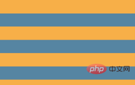
For example, Striped background
"If multiple color stops have the same position, they will create an infinitely small transition area.
The starting and ending colors of the transition are the first and last specified values respectively. From the effect point of view, the color will change suddenly at those
positions, rather than a smooth gradient process."
Because the gradient is A code-generated image that can be treated like any other background image and can be resized via background-size; and since the background is repeatedly tiled by default, the entire container has actually been Filled with horizontal stripes:
background: linear-gradient(#fb3 50%, #58a 50%);
background-size: 100% 30px;
##Vertical stripes The code for vertical stripes is almost the same as horizontal stripes, the main difference is: we need to ## Add an extra parameter at the beginning to specify the direction of the gradient. In the code for horizontal stripes, we
can actually add this parameter, but its default value to bottom is originally consistent with our intention, so it is omitted. Finally, we also need to reverse the value of background-size
:
background: linear-gradient(to right, #fb3 50%, #58a 0);
background-size: 30px 100%;
倾斜条纹
“传统的”仅仅改变linear-gradient第一个参数——角度值的方式或者通过background-size增加“精确度”的方式都不能有效的达到真正意义上完美的倾斜背景:它们总是会在大小改变或者换一个倾斜度时把整个图案搞乱!
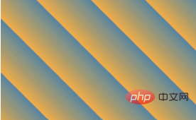
幸运的是,我们还有更好的方法来创建斜向条纹:一个鲜为人知的真相是 linear-gradient() 和 radial-gradient() 还各有一个循环式的加强版:repeating-linear-gradient() 和 repeating-radial-gradient()。
它们的工作方式跟前两者类似,只有一点不同:色标是无限循环重复的,直
到填满整个背景!
background: repeating-linear-gradient(45deg, #fb3, #58a 30px);
哦,对了,同上面一样,所有的“-gradient”属性在没有限制起始位置和终止位置时都会有“渐变光晕”,如果我们改为下面这样:
background: repeating-linear-gradient(60deg, #fb3 0 15px, #58a 0 30px);

看到这张图你有没有想到一个著名的案例——三角形?
background: #eee;
background-image: linear-gradient(45deg, transparent 75%, #bbb 0);
而我们以前用CSS一般是像这样写的:
width: 0;
height: 0;
border: 50px solid transparent;
border-top-color: black ;
其实,linear-gradient用处还远远不止这些…
2020-10-17更新
我们大概都知道:滚动条是一种常见的界面控件,用来提示一个元素除了可以看到的内容之外,还包含了更多内容。但是,它往往太过笨重,在视觉上喧宾夺主,因此现代操作系统已经开始简化它的外观,当用户不与可滚动的元素交互时,滚动条就会被完全隐藏。
目前已知的“去除滚动条”的方法中,最常用的有:::-webkit-scrollbar{display:none;} ,但是很显然,IE上无法使用 —— 它只允许改变滚动块的颜色。
在CSS3的时代,我们可以在想要加滚动条的地方外包裹一层p,为其设置
overflow:hidden,内部用calc()函数动态计算width使其溢出!这可以有效解决IE下兼容性问题。
我们现在已经很少通过滚动条来滚动页面了(更多的是使用触摸手势),但滚动条对于元素内容可滚动的提示作用仍然是十分有用的,哪怕对于那些没有发生交互的元素也是如此;而且这种提示方式十分巧妙。
据说曾经 Google 推出了一款 RSS 阅读器(已经没了),它的用户体验设计师找到了一种非常优雅的方式来作出类似的提示:当侧边栏的容器还有更多内容时,一层淡淡的阴影会出现在容器的顶部和底部。就像这样: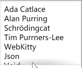
让我们首先从一段简单的结构代码开始,一个带有示意性内容的普通无序列表:
我们可以给
overflow: auto;
width: 10em;
height: 8em;
padding: .3em .5em;
border: 1px solid silver;
接下来,有趣的事情即将发生。我们用一个径向渐变在顶部添加一条阴影:
background: radial-gradient(at top, rgba(0,0,0,.2),transparent 70%) no-repeat;
background-size: 100% 15px;
现在,当我们滚动列表时,这条阴影会一直停留在相同的位置。这正是背景图像的默认行为:它的位置是相对于元素固定的!不论元素的内容是否发生了滚动。这一点也适用于 background-attachment: fixed 的背景图像。它们唯一的区别是,当页面滚动时,后者是相对于视口固定的。有没有办法让背景图像跟着元素的内容一起滚动呢?
现在常见的值只有inherit、scroll、fixed,但是从W3C文档中可以看到:后来为background-attachment 属性增加了一个新的关键字,叫作 local !
如果将此属性应用到这条阴影上,它会带给我们正好相反的效果:当我们滚动到最顶端时,能看到一条阴影;但当我们向下滚动时,这条阴影就消失了。
但这不重要,我们的思路对了!
我想到了一个很常用的hack:我们需要两层背景:一层用来生成那条阴影,另一层基本上就是一个用来遮挡阴影的白色矩形,其作用类似于遮罩层。生成阴影的那层背景将具有默认的 background-attachment 值(scroll),因为我们希望它总是保持在原位。我们把遮罩背景的 background-attachment 属性设置为 local,这样它就会在我们滚动到最顶部时盖住阴影,在向下滚动时跟着滚动,从而露出阴影。
background: linear-gradient(white 30%, transparent),
 			radial-gradient(at 50% 0, rgba(0,0,0,.2),transparent 70%);
background-repeat: no-repeat;
background-size: 100% 50px, 100% 15px;
background-attachment: local, scroll;
没错,这就是linear-gradient的另一个应用 —— 渐变遮罩层!
但是现在我们会发现:现在只有上边有,下边怎么搞?
这就需要用到css中的“简写”以及对*-gradient的理解了:如果不加第一个参数(不指明方向),则默认是从上到下渐变的,但是如果加了第一个参数但是没有指明to bottom或100%,那么它默认是从下向上渐变的!
background: linear-gradient(white 30%, transparent) top / 100% 50px,
	radial-gradient(at 50% 0, rgba(0,0,0,.2),transparent 72%) top / 100% 15px,
	linear-gradient(to top, white 15px, hsla(0,0%,100%,0)) bottom / 100% 50px,
 	radial-gradient(at bottom, rgba(0,0,0,.2), transparent 72%) bottom / 100% 15px;
background-repeat: no-repeat;
background-attachment: local, scroll,local, scroll;
更多编程相关知识,请访问:编程视频!!
The above is the detailed content of In-depth understanding of the usage skills of CSS property *-gradient. For more information, please follow other related articles on the PHP Chinese website!