

This article mainly introduces the configuration of lib-flexible rem based on vue-cli to implement mobile terminal adaptation. Friends who need it can refer to
Installing flexible
npm install lib-flexible --save
Introduce flexible
Add the following code to the project entry file main.js and introduce flexible
import 'lib-flexible'
px to rem
Use webpack's px2rem-loader to automatically convert px to rem
Install px2rem-loader
npm install px2rem-loader --save-dev
Configure px2rem-loader
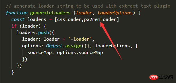
In vue- In the file generated by cli, find the following file build/utils.js, and add the configuration as shown below
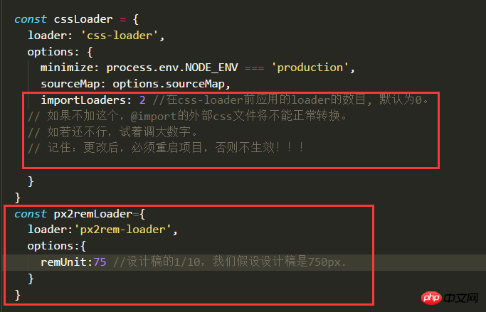
About importLoaders: If you have any questions, please refer to webpack in-depth and actual combat 4-4
2017.12.8 update instructions: If you need to configure importLoaders, please refer to the instructions at the bottom.
px2rem Usage
After installing px2rem, there are some differences in using px. You can refer to the official introduction of px2rem, which is briefly introduced below. one time.
Write px directly, and it will be converted directly into rem after compilation ---- Except for the following two situations, use this
for other lengths. Add /*no*/ after px, and it will not be converted. px, will be output as is. --- Generally, the border needs to use this
to add /*px*/ after px. Three sets of codes will be generated according to the different dpr. ----General fonts need to use this
Sample code
Before compilation (code written by yourself)
.selector { width: 150px; height: 64px; /*px*/ font-size: 28px; /*px*/ border: 1px solid #ddd; /*no*/ }
After compilation (packaged Code)
.selector { width: 2rem; border: 1px solid #ddd; } [data-dpr="1"] .selector { height: 32px; font-size: 14px; } [data-dpr="2"] .selector { height: 64px; font-size: 28px; } [data-dpr="3"] .selector { height: 96px; font-size: 42px; }
Restart the project, and you can happily use the px on the design draft.
Note: Pitfall
You cannot add a meta tag named viewport to the header of index.html, flexible will automatically add it for us!
Update: When css is imported from the outside, can px2rem convert rem issues?
2017.12.8 Update: In practical applications, it is found that for css files imported from the outside, sometimes px2rem can convert them normally. The time cannot be changed, what is the reason? I tested three different ways of introducing CSS, and found that the first one can be converted normally, but the second and third ones cannot be converted normally. As for the reason, I still don’t understand it due to my lack of knowledge. Please ask a master to explain the difference between the three introduction methods.
If you understand these methods, there is no need to configure the importLoaders of cssLoader, because the following method is easier to control whether the externally imported css needs to be converted to rem, but changing the importLoaders cannot control it, it will force conversion .
The above is what I compiled for everyone. I hope it will be helpful to everyone in the future.
Related articles:
How to solve the problem of Router cross-module jump
##detailed introduction to vuex Chinese document
How to generate a drop-down list with pure js
How to use vue-cli webpack Introducing jquery (detailed tutorial)
The above is the detailed content of How to implement mobile adaptation in vue-cli. For more information, please follow other related articles on the PHP Chinese website!


![[Web front-end] Node.js quick start](https://img.php.cn/upload/course/000/000/067/662b5d34ba7c0227.png)


