 Web Front-end
 JS Tutorial
 How to implement a custom control bottom drawer menu using React Native
How to implement a custom control bottom drawer menu using React Native
This article mainly introduces the example of the drawer menu at the bottom of the React Native custom control. Now I share it with you and give it as a reference.
1. Requirements Analysis
In native development, customizing Views is a common occurrence. Often the system controls cannot meet the actual requirements. need. A variety of product designs require us to create different views. There are many blog posts on the Internet about custom View content. This blog will share with you how to implement drawer menu control effects with custom components in React Native. The importance of sharing function in App must be self-evident, so how to achieve this effect in RN?
The React Native system library only provides the implementation of IOS, namely ActionSheetIOS. There are two implementations of the display mode of this control:
(1)showActionSheetWithOptions
(2) showShareActionSheetWithOptions
The first is to display an ActionSheet pop-up box on the iOS device. The second implementation is to display a share popup on the iOS device. Borrowing the official picture description is as follows:
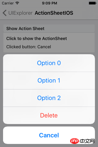
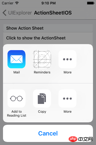
The implementation system on IOS devices has been provided, and then we need to adapt to Android. In native development, customizing View also has a basic process:
(1) Customize the control class, inherit View or system control.
(2) Custom properties
(3) Get custom properties and initialize a series of tool classes
(4) Override the onMeasure method to measure the control
(5) If it is a custom layout, you also need to rewrite onLayout for layout
The idea of customizing components in React Native is basically similar to native customization. So according to this process, we can implement it step by step.
2. Function implementation
1. Customize the component and implement Component
export default class AndroidActionSheet extends Component
2. Custom attributes
// 1.声明所需要的属性
static propTypes= {
  title: React.PropTypes.string, // 标题
  content: React.PropTypes.object, // 内容
  show: React.PropTypes.func, // 显示
  hide: React.PropTypes.func, // 隐藏
}constructor(props) {
super(props);
this.translateY = 150;
this.state = {
visible: false,
sheetAnim: new Animated.Value(this.translateY)
}
this.cancel = this.cancel.bind(this);
}3. Implement basic layout
/**
* Modal为最外层,ScrollView为内容层
*/
render() {
    const { visible, sheetAnim } = this.state;
    return(
      <Modal
      visible={ visible }
      transparent={ true }
      animationType="none"
      onRequestClose={ this.cancel }
      >
      <View style={ styles.wrapper }>
              <TouchableOpacity style={styles.overlay} onPress={this.cancel}></TouchableOpacity>
          <Animated.View
            style={[styles.bd, {height: this.translateY, transform: [{translateY: sheetAnim}]}]}>
            { this._renderTitle() }
            <ScrollView
                      horizontal={ true }
                      showsHorizontalScrollIndicator={ false }>
              {this._renderContainer()}
            </ScrollView>
          </Animated.View>
        </View>
      </Modal>
    )
}You can see that we have defined the basic layout above, and use _ in the layout renderTitle() method to render the title part, the content area is ScrollView, and it is horizontal scrolling, that is, when the menu item exceeds the screen width, it can be selected by sliding horizontally. The renderContainer method is called internally to render the menu:
/**
* 标题
*/
_renderTitle() {
  const { title,titleStyle } = this.props;
  if (!title) {
    return null
  }
    // 确定传入的是不是一个React Element,防止渲染的时候出错
  if (React.isValidElement(title)) {
    return (
      <View style={styles.title}>{title}</View>
    )
  }
  return (
    <Text style={[styles.titleText,titleStyle]}>{title}</Text>
  )
}

/**
* 内容布局
*/
_renderContainer() {
    const { content } = this.props;
    return (
      <View style={styles.container}>
        { content }
      </View>
    )
}When we need to click Modal to close, we also need to process the closing operation. Modal does not provide us with external closing processing, so we need to implement it separately, from In the layout code, we see TouchableOpacity as the mask layer, and add a stand-alone event, call cancel to process:
/**
 * 控制Modal点击关闭,Android返回键关闭
 */
 cancel() {
  this.hide();
}4. Custom method, external call
Externally we need to control the display and hiding of controls, so we need to publicly display and close the method:
/**
 * 显示
 */
show() {
  this.setState({visible: true})
  Animated.timing(this.state.sheetAnim, {
    toValue: 0,
    duration: 250
  }).start();
}/**
* 隐藏
*/
hide() {
this.setState({ visible: false })
Animated.timing(this.state.sheetAnim, {
toValue: this.translateY,
duration: 150
}).start();
}5. Use
<ActionSheet
ref='sheet'
title='分享'
content={this._renderContent()}
/>At this point, our custom component is completed. Overall, the basic principle is still very simple. It can be easily implemented by mainly using custom attributes, parameter transfer, and animation. The focus of this blog is not to let everyone know how to write this effect, but to let everyone understand how to implement it step by step when we encounter an implementation that needs to be customized.
3. Renderings

The above is what I compiled for everyone. I hope it will be useful to everyone in the future. helpful.
Related articles:
Using time plug-in and obtaining selection value in mint-ui
VUE2 realizes secondary province and city linkage selection
Use react to implement paging components
The above is the detailed content of How to implement a custom control bottom drawer menu using React Native. For more information, please follow other related articles on the PHP Chinese website!

Hot AI Tools

Undresser.AI Undress
AI-powered app for creating realistic nude photos

AI Clothes Remover
Online AI tool for removing clothes from photos.

Undress AI Tool
Undress images for free

Clothoff.io
AI clothes remover

AI Hentai Generator
Generate AI Hentai for free.

Hot Article

Hot Tools

Notepad++7.3.1
Easy-to-use and free code editor

SublimeText3 Chinese version
Chinese version, very easy to use

Zend Studio 13.0.1
Powerful PHP integrated development environment

Dreamweaver CS6
Visual web development tools

SublimeText3 Mac version
God-level code editing software (SublimeText3)

Hot Topics
 1378
1378
 52
52
 How to build a real-time chat app with React and WebSocket
Sep 26, 2023 pm 07:46 PM
How to build a real-time chat application using React and WebSocket Introduction: With the rapid development of the Internet, real-time communication has attracted more and more attention. Live chat apps have become an integral part of modern social and work life. This article will introduce how to build a simple real-time chat application using React and WebSocket, and provide specific code examples. 1. Technical preparation Before starting to build a real-time chat application, we need to prepare the following technologies and tools: React: one for building
 Guide to React front-end and back-end separation: How to achieve decoupling and independent deployment of front-end and back-end
Sep 28, 2023 am 10:48 AM
React front-end and back-end separation guide: How to achieve front-end and back-end decoupling and independent deployment, specific code examples are required In today's web development environment, front-end and back-end separation has become a trend. By separating front-end and back-end code, development work can be made more flexible, efficient, and facilitate team collaboration. This article will introduce how to use React to achieve front-end and back-end separation, thereby achieving the goals of decoupling and independent deployment. First, we need to understand what front-end and back-end separation is. In the traditional web development model, the front-end and back-end are coupled
 How to build simple and easy-to-use web applications with React and Flask
Sep 27, 2023 am 11:09 AM
How to use React and Flask to build simple and easy-to-use web applications Introduction: With the development of the Internet, the needs of web applications are becoming more and more diverse and complex. In order to meet user requirements for ease of use and performance, it is becoming increasingly important to use modern technology stacks to build network applications. React and Flask are two very popular frameworks for front-end and back-end development, and they work well together to build simple and easy-to-use web applications. This article will detail how to leverage React and Flask
 How to build a reliable messaging app with React and RabbitMQ
Sep 28, 2023 pm 08:24 PM
How to build a reliable messaging application with React and RabbitMQ Introduction: Modern applications need to support reliable messaging to achieve features such as real-time updates and data synchronization. React is a popular JavaScript library for building user interfaces, while RabbitMQ is a reliable messaging middleware. This article will introduce how to combine React and RabbitMQ to build a reliable messaging application, and provide specific code examples. RabbitMQ overview:
 React responsive design guide: How to achieve adaptive front-end layout effects
Sep 26, 2023 am 11:34 AM
React Responsive Design Guide: How to Achieve Adaptive Front-end Layout Effects With the popularity of mobile devices and the increasing user demand for multi-screen experiences, responsive design has become one of the important considerations in modern front-end development. React, as one of the most popular front-end frameworks at present, provides a wealth of tools and components to help developers achieve adaptive layout effects. This article will share some guidelines and tips on implementing responsive design using React, and provide specific code examples for reference. Fle using React
 React code debugging guide: How to quickly locate and solve front-end bugs
Sep 26, 2023 pm 02:25 PM
React code debugging guide: How to quickly locate and resolve front-end bugs Introduction: When developing React applications, you often encounter a variety of bugs that may crash the application or cause incorrect behavior. Therefore, mastering debugging skills is an essential ability for every React developer. This article will introduce some practical techniques for locating and solving front-end bugs, and provide specific code examples to help readers quickly locate and solve bugs in React applications. 1. Selection of debugging tools: In Re
 React Router User Guide: How to implement front-end routing control
Sep 29, 2023 pm 05:45 PM
ReactRouter User Guide: How to Implement Front-End Routing Control With the popularity of single-page applications, front-end routing has become an important part that cannot be ignored. As the most popular routing library in the React ecosystem, ReactRouter provides rich functions and easy-to-use APIs, making the implementation of front-end routing very simple and flexible. This article will introduce how to use ReactRouter and provide some specific code examples. To install ReactRouter first, we need
 How to build a fast data analysis application using React and Google BigQuery
Sep 26, 2023 pm 06:12 PM
How to use React and Google BigQuery to build fast data analysis applications Introduction: In today's era of information explosion, data analysis has become an indispensable link in various industries. Among them, building fast and efficient data analysis applications has become the goal pursued by many companies and individuals. This article will introduce how to use React and Google BigQuery to build a fast data analysis application, and provide detailed code examples. 1. Overview React is a tool for building


