

This time I will bring you a detailed explanation of the steps to develop a mobile Web App using the Mobile framework. What are the precautions for developing a mobile Web App using the Mobile framework? The following is a practical case, let’s take a look.
1. jQuery Mobile’s progressive enhancement design and browser supportAccording to Wikipedia’s explanation, the design of progressive enhancement mainly includes the following points
basic content should be accessible to all web browsers (all browsers should be able to access all basic content)
basic functionality should be accessible to all web browsers (all browsers The server should have access to all basic functions)
sparse, semantic markup contains all content (all content should be within a small number of semantic tags)
enhanced layout is provided by externally linked CSS (enhanced functionality should be provided by external CSS)
enhanced behavior is provided by unobtrusive, externally linked JavaScript (enhanced behavior provided by external JavaScript)
end-user web browser preferences are respected (end-user browser habits should be respected)
If HTML5 technologies such as Web SQL Database are used in actual development, the final Web App support will be lower than the support of jQuery Mobile above, but the two mainstream mobile browsers Android and Apple iOS system browsers And its desktop version certainly provides the best support.
2.HTML5 data-* attributesjQuery Mobile relies on HTML5 data-* attributes to provide a series of support (UI components, transitions and page structures), and does not support browsing of this HTML5 attribute. The browser will ignore the effect of these attributes by default. For example, to add a header to the page, you can use the following HTML:
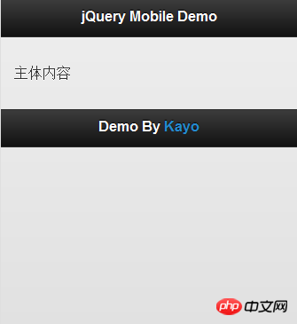
<p data-role="header">
  <h1>jQuery Mobile Demo</h1>
</p>
This will generate a jQuery Mobile style header, as you can see from the picture below. It turns out that this header style is very suitable for mobile devices, and after adding the data-role="header" attribute, the h1 in p will also be rendered into a certain style. This is the convenience and speed of jQuery Mobile, and it is also its design. Purpose - Write Less, Do More.
In addition, jQuery Mobile also has the following data-role attributes (some attributes), which have been given certain styles and user operation response effects.
data-role="content" , data-role="button" , data-theme="" , data-role="controlgroup" , data-inline="true" , data-role=" fieldcontain", data-role="listview", data-rel="dialog", data-transition="pop", respectively corresponding to the main content, buttons, theme colors, edited buttons, inline buttons, form elements, lists Views, dialog boxes, page transitions.
3.jQuery Mobile Basic useMethod1.Introduction of jQuery Mobile
To use jQuery Mobile, you need to introduce the jQuery Mobile component in the web page header, including the following Part
(1) jQuery library
(2) jQuery Mobile CSS
(3) jQuery Mobile library
You can introduce the above components through such a head
<head>
  <title>jQuery Mobile Demo</title>
  <meta http-equiv="Content-Type" content="text/html; charset=UTF-8" />
  <meta name="viewport" content="width=device-width, initial-scale=1">
  <link rel="stylesheet" href="http://code.jquery.com/mobile/1.0/jquery.mobile-1.0.min.css" />
  <script type="text/javascript" src="http://code.jquery.com/jquery-1.6.4.min.js"></script>
  <script type="text/javascript" src="http://code.jquery.com/mobile/1.0/jquery.mobile-1.0.min.js"></script>
</head>
2. Add viewportIn the Android browser, if the page width is not set, it will think that the page width is 980px, so we can add a viewport in the head to let the mobile browser know the screen size, just a The viewport tag already brings a better experience to users.
<meta name="viewport" content="width=device-width, initial-scale=1, maximum-scale=1.5">
3. Simple page exampleAfter introducing the components required by jQuery Mobile, we can create a jQuery Mobile page. A simple example is given below.
<head>
  <title>jQuery Mobile Demo</title>
  <meta http-equiv="Content-Type" content="text/html; charset=UTF-8" />
  <meta name="viewport" content="width=device-width, initial-scale=1">
  <link rel="stylesheet" href="http://code.jquery.com/mobile/1.0/jquery.mobile-1.0.min.css" />
  <script type="text/javascript" src="http://code.jquery.com/jquery-1.6.4.min.js"></script>
  <script type="text/javascript" src="http://code.jquery.com/mobile/1.0/jquery.mobile-1.0.min.js"></script>
</head>


    jQuery Mobile Demo


    主体内容


    Footer
For jQuery Mobile, each defined data-role="page" is equivalent to a page. jQuery Mobile uses Ajax to operate the DOM by default, automatically hiding the first For all pages except one page, when a link is clicked to link to other pages, the content of the new page will be loaded in the Ajax method. A complete example is given below. In addition, we can also use some HTML5 semantic tags. For example, the p of header can directly use the header tag. For details, see the example below.
<head> <title>jQuery Mobile Demo</title> <meta http-equiv="Content-Type" content="text/html; charset=UTF-8" /> <meta name="viewport" content="width=device-width, initial-scale=1"> <link rel="stylesheet" href="http://code.jquery.com/mobile/1.0/jquery.mobile-1.0.min.css" /> <script type="text/javascript" src="http://code.jquery.com/jquery-1.6.4.min.js"></script> <script type="text/javascript" src="http://code.jquery.com/mobile/1.0/jquery.mobile-1.0.min.js"></script> </head>
jQuery Mobile Demo
jQuery Mobile Demo
四.开发原则首先我们必须知道,一款优秀的 Web App ,需要有良好的 UI 与用户体验(UE),虽然本质上作为一个站点,内容才是用户需要的,但我们仍需要使用良好的 UI 与 UE 来作为内容与用户的连接,因此我们引入 jQuery Mobile 来为 Web App 制作 UI 与交互。
有了 Web App 的界面,还需要数据的交互,这样才能做出 App 。这里可以使用 PHP 等服务器脚本与 Mysql 等数据库来为 Web App 提供数据驱动,但 Kayo 希望采用一种新的方法,也就是 HTML5 的方法,使用 HTML5 规范提供的 Web SQL Database —— 一个简单强大的 Javascript 数据库 API, 可以在本地数据库中存储数据(如内嵌在浏览器中的 SQLite ),另外还可以使用 HTML5 规范中的 Storage (本地储存) 来储存数据,这样就可以减少 Web App 对于网络的依赖,并且整个 Web App 都是使用前端的技术完成(很震撼吧!)。
最后不得不提的是 offline application cache (离线程序缓存),它也是 HTML5 的特性,允许用户在无网络连接的情况下运行 Web App,因此我们可以利用此特性制作支持离线使用的 Web App ,进一步减少 Web App 对于网络的依赖。
1.响应式设计响应式网页设计由 Ethan Marcotte 提出,通俗点说,就是网站界面能够兼容多种终端,而不是每种终端各自做一个界面。腾讯等大型网站都有针对不同的设备做出不同的界面,比如 3g 版,触屏版,ipad……,这样就会增加了很多重复的工作量,因此我们可以为网站渐进的设计一个界面,自动适应不同的设备,当然设备间的效果可以有所差距。这里 Kayo 小插一段,响应式设计的诞生,很大程度上归功于移动互联网的发展与移动设备硬件的提升,而移动互联网的发展本身也依赖于移动设备硬件的提升,因此想不断提升的 App ,还得先要硬件厂商给力。
言归正传,这里提到响应式设计的理念当然是希望在设计 Web App 时也应用到,而这些 jQuery Mobile 已经为开发者预先做好, jQuery Mobile 不但默认的 UI 样式里已经按响应式设计做好,它还另外提供了一些为响应式设计而做的方法,日后会详细介绍。
2.渐进式设计
“前端设计时通过渐进增强功能来设计一直也是 Kayo 的设计想法,因为不同的平台,不同的设备有着不同的 Web 环境,因此对于一些出色的前端效果很难保证在每台设备上都呈现相同的效果,因此与其为了在所有设备上做到一样的效果而降低整体的前端样式,不如对于好的设备可以呈现更出色的效果,而基本的效果就兼容所有的设备。jQuery Mobile 的设计也是如此,核心的功能支持所有的设备,而较新的设备则可以获得更为优秀的页面效果。”
相信看了本文案例你已经掌握了方法,更多精彩请关注php中文网其它相关文章!
推荐阅读:
jQuery+formdata做出上传进度特效(附步骤代码)
The above is the detailed content of Detailed explanation of the steps to develop mobile Web App using Mobile framework. For more information, please follow other related articles on the PHP Chinese website!


![[Web front-end] Node.js quick start](https://img.php.cn/upload/course/000/000/067/662b5d34ba7c0227.png)


