


This article mainly introduces the effect of jQuery plug-in HighCharts to draw a 2D donut chart, and analyzes the implementation steps and related operating techniques of jQuery using the HighCharts plug-in to draw a donut chart in the form of examples. It also comes with demo source code for readers to download and refer to. Friends in need You can refer to it, I hope it can help everyone.
The example in this article describes the effect of drawing a 2D donut chart with the jQuery plug-in HighCharts. Share it with everyone for your reference, the details are as follows:
1. Example code:
<!DOCTYPE html>
<html>
<head>
<meta charset="UTF-8">
<title>HighCharts 2D圆环图</title>
<script type="text/javascript" src="js/jquery-1.7.2.min.js"></script>
<script type="text/javascript" src="js/highcharts.js"></script>
<script type="text/javascript">
$(function(){
var colors = Highcharts.getOptions().colors,
categories = ['花', '树', '鱼', '鸟', '鲸'],
name = 'Browser brands',
data = [{
y: 55.11,
color: colors[0],
drilldown: {
name: '花的种类',
categories: ['梅花', '桃花', '梨花', '樱花'],
data: [13.6, 7.35, 33.06, 2.81],
color: colors[0]
}
}, {
y: 21.63,
color: colors[1],
drilldown: {
name: '树的种类',
categories: ['樟树', '桉树', '茶树', '桃树', '梨树'],
data: [15.20, 3.83, 18.58, 13.12, 45.43],
color: colors[1]
}
}, {
y: 11.94,
color: colors[2],
drilldown: {
name: '鱼的种类',
categories: ['鲫鱼', '鲢鱼', '草鱼', '青鱼', '鲦鱼','鳙鱼', '鲥鱼'],
data: [41.12, 10.19, 11.12, 14.36, 21.32, 9.91, 17.50],
color: colors[2]
}
}, {
y: 7.15,
color: colors[3],
drilldown: {
name: '鸟的种类',
categories: ['松鸡', '卷尾', '鹪鹩', '岩鹨', '山鹑','画眉', '金鸡'],
data: [14.55, 19.42, 16.23, 16.21, 18.20, 23.19, 10.14],
color: colors[3]
}
}, {
y: 2.14,
color: colors[4],
drilldown: {
name: '鲸的种类',
categories: ['须鲸', '蓝鲸', '虎鲸'],
data: [ 24.12, 18.37, 32.65],
color: colors[4]
}
}];
// 构建物种数据
var speciesData = [];
var speData = [];
for (var i = 0; i < data.length; i++) {
// 添加物种数据
speciesData.push({
name: categories[i],
y: data[i].y,
color: data[i].color
});
for (var j = 0; j < data[i].drilldown.data.length; j++) {
var brightness = 0.4 - (j / data[i].drilldown.data.length) / 5 ;
speData.push({
name: data[i].drilldown.categories[j],
y: data[i].drilldown.data[j],
color: Highcharts.Color(data[i].color).brighten(brightness).get()
});
}
}
// 创建圆环图
$('#donutChart').highcharts({
chart: {
type: 'pie'
},
title: {
text: '物种数量及其比例'
},
yAxis: {
title: {
text: '比例'
}
},
plotOptions: {
pie: {
shadow: true,
center: ['50%', '50%']
}
},
tooltip: {
valueSuffix: '%'
},
series: [{
name: '物种',
data: speciesData,
size: '70%',
dataLabels: {
formatter: function() {
return this.y > 5 ? this.point.name : null;
},
color: 'white',
distance: -30
}
}, {
name: '数量',
data: speData,
size: '80%',
innerSize: '80%',
dataLabels: {
formatter: function() {
return this.y > 1 ? '<b>'+ this.point.name +':</b> '+ this.y +'%' : null;
}
}
}]
});
});
</script>
</head>
<body>
<p id="donutChart" style="width: 1250px; height: 550px; margin: 0 auto"></p>
</body>
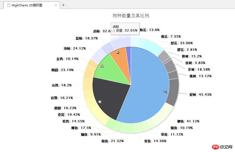
</html>2. Operation rendering:
Related recommendations:
HighCharts draws 2D pie chart effect with Legend to share examples
Details on how to pass PHP dynamically transfers data to highcharts
Example code of highcharts usage
The above is the detailed content of HighCharts drawing 2D donut chart effect example sharing. For more information, please follow other related articles on the PHP Chinese website!


![[Web front-end] Node.js quick start](https://img.php.cn/upload/course/000/000/067/662b5d34ba7c0227.png)


