


Currently, data visualization has become a very important part of the field of data science. The data generated in different network systems needs to be properly visualized in order to be better presented to users for reading and analysis. This article mainly explains in detail 9 JavaScript chart libraries and their usage. Friends who need them can refer to them. I hope it can help everyone.
For any organization, if it can fully obtain data, visualize data and analyze data, it can greatly help understand the deep-seated reasons for the generation of data so that correct decisions can be made accordingly. .
For front-end developers, it is a great skill to be able to master data visualization techniques in interactive web pages. Of course, front-end data visualization will also become easier through some JavaScript chart libraries. Using these libraries, developers can easily transform data into easy-to-understand charts without having to consider the programming challenges of different syntaxes.
The following are the 9 selected JavaScript chart libraries:
Chart.js Chartist FlexChart Echarts NVD3 C3.js TauCharts ReCharts Flot
Chart.js

Chart.js is a simple, user-friendly chart library and a JavaScript library based on HTML5. Used to create animated, interactive and customizable charts and graphs.
With Chart.js, users can easily and intuitively view mixed chart types. Responsive web pages can also be created using Chart.js by default.
The Chart.js library allows users to quickly create visual data. Chart.js is easy to set up and very beginner-friendly. With Chart.js you don’t have to worry about browser compatibility issues because Chart.js supports older browsers.
Use npm to install Chart.js:
npm install chart.js --save
Chart.js code example for drawing radar chart:
const ctx = document.getElementById("myChart");
const options = {
 scale: {
 // Hides the scale
 }
};
const data = {
 labels: ['Running', 'Swimming', 'Eating', 'Cycling'],
 datasets: [
       {
  data: [-10, -5, -3, -15],
  label: "two",
  borderColor: '#ffc63b'
  },
      {
  data: [10, 5, 3, 10],
  label: "three",
  borderColor: '#1d9a58'
  },
  {
 data: [18, 10, 4, 2],
 label: "one",
 borderColor: '#d8463c'
 },
]
}

const myRadarChart = new Chart(ctx, {
 data: data,
 type: 'radar',
 options: options
});Chartist

The Chartist library is great for creating beautiful, responsive, and readable Friendly charts. Chartist uses SVG to render charts.
Chartist also provides the ability to customize charts using CSS media queries and creative animations. Users use Chartist to realize all their creativity in chart design.
Chartist is easy to configure and customize using Sass. However, it does not support older browsers.
Using Chartist, you can beautify your SVG through CSS styles. Users can completely realize all the chart styles they want.
Install Chartist using npm:
npm install chartist --save
Chartist Code example for creating a pie chart with custom labels:
var data = {
 labels: ['Bananas', 'Apples', 'Grapes'],
 series: [20, 15, 40]
};
var options = {
 labelInterpolationFnc: function(value) {
 return value[0]
 }
};
var responsiveOptions = [
 ['screen and (min-width: 640px)', {
 chartPadding: 30,
 labelOffset: 130,
 labelDirection: 'explode',
 labelInterpolationFnc: function(value) {
 return value;
 }
 }],
 ['screen and (min-width: 1024px)', {
 labelOffset: 80,
 chartPadding: 20
 }]
];
new Chartist.Pie('.ct-chart', data, options, responsiveOptions);FlexChart

onload = function() {
 // wrap data in a CollectionView so the grid and chart
 // get notifications
 var data = new wijmo.collections.CollectionView(getData());
 // create the chart
 var theChart = new wijmo.chart.FlexChart('#theChart', {
 itemsSource: data,
 bindingX: 'country',
 series: [
 { binding: 'sales', name: 'Sales' },
 { binding: 'expenses', name: 'Expenses' },
 { binding: 'downloads', name: 'Downloads' }
 ]
 })
 // create a grid to show the data
 var theGrid = new wijmo.grid.FlexGrid('#theGrid', {
 itemsSource: data
 })
 // create some random data
 function getData() {
 var countries = 'US,Germany,UK,Japan,Italy,Greece'.split(','),
 data = [];
 for (var i = 0; i < countries.length; i++) {
 data.push({
  country: countries[i],
  sales: Math.random() * 10000,
  expenses: Math.random() * 5000,
  downloads: Math.round(Math.random() * 20000),
 });
 }
 return data;
 }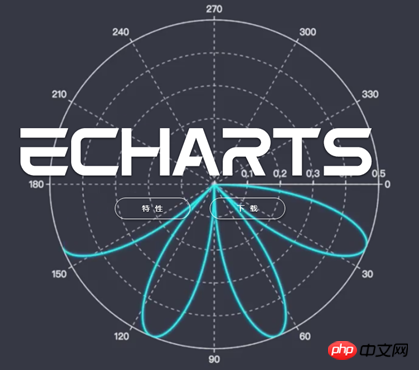
}Echarts
var dom = document.getElementById("container");
var myChart = echarts.init(dom);
var app = {};
option = null;
option = {
 title: {
 text: 'Large-scale scatterplot'
 },
 tooltip : {
 trigger: 'axis',
 showDelay : 0,
 axisPointer:{
  show: true,
  type : 'cross',
  lineStyle: {
  type : 'dashed',
  width : 1
  }
 },
 zlevel: 1
 },
 legend: {
 data:['sin','cos']
 },
 toolbox: {
 show : true,
 feature : {
  mark : {show: true},
  dataZoom : {show: true},
  dataView : {show: true, readOnly: false},
  restore : {show: true},
  saveAsImage : {show: true}
 }
 },
 xAxis : [
 {
  type : 'value',
  scale:true
 }
 ],
 yAxis : [
 {
  type : 'value',
  scale:true
 }
 ],
 series : [
 {
  name:'sin',
  type:'scatter',
  large: true,
  symbolSize: 3,
  data: (function () {
  var d = [];
  var len = 10000;
  var x = 0;
  while (len--) {
   x = (Math.random() * 10).toFixed(3) - 0;
   d.push([
   x,
   //Math.random() * 10
   (Math.sin(x) - x * (len % 2 ? 0.1 : -0.1) * Math.random()).toFixed(3) - 0
   ]);
  }
  //console.log(d)
  return d;
  })()
 },
 {
  name:'cos',
  type:'scatter',
  large: true,
  symbolSize: 2,
  data: (function () {
  var d = [];
  var len = 20000;
  var x = 0;
  while (len--) {
   x = (Math.random() * 10).toFixed(3) - 0;
   d.push([
   x,
   //Math.random() * 10
   (Math.cos(x) - x * (len % 2 ? 0.1 : -0.1) * Math.random()).toFixed(3) - 0
   ]);
  }
  //console.log(d)
  return d;
  })()
 }
 ]
};
;
if (option && typeof option === "object") {
 myChart.setOption(option, true);
}NVD3

NVD3 是由 Mike Bostock 撰写的基于 D3 的 JavaScript 库。NVD3 允许用户在 Web 应用程序中创建美观的、可复用的图表。
NVD3 具有很强大的图表功能,能够很方便的创建箱形图、旭日形和烛台图等。如果用户想在 JavaScript 图表库中用到大量的能力,推荐试用 NVD3
NVD3 图表库的速度有时可能会成为一个问题,与 Fastdom 安装配合使用,速度会更快。
NVD3 绘制简单的折线图代码示例:
/*These lines are all chart setup. Pick and choose which chart features you want to utilize. */
nv.addGraph(function() {
var chart = nv.models.lineChart()
.margin({left: 100}) //Adjust chart margins to give the x-axis some breathing room.
.useInteractiveGuideline(true) //We want nice looking tooltips and a guideline!
.transitionDuration(350) //how fast do you want the lines to transition?
.showLegend(true) //Show the legend, allowing users to turn on/off line series.
.showYAxis(true) //Show the y-axis
.showXAxis(true) //Show the x-axis
;
chart.xAxis //Chart x-axis settings
.axisLabel('Time (ms)')
.tickFormat(d3.format(',r'));
chart.yAxis //Chart y-axis settings
.axisLabel('Voltage (v)')
.tickFormat(d3.format('.02f'));
/* Done setting the chart up? Time to render it!*/
var myData = sinAndCos(); //You need data...
d3.select('#chart svg') //Select the <svg> element you want to render the chart in.
.datum(myData) //Populate the <svg> element with chart data...
.call(chart); //Finally, render the chart!
//Update the chart when window resizes.
nv.utils.windowResize(function() { chart.update() });
return chart;
});
/**************************************
* Simple test data generator
*/
function sinAndCos() {
var sin = [],sin2 = [],
cos = [];
//Data is represented as an array of {x,y} pairs.
for (var i = 0; i < 100; i++) {
sin.push({x: i, y: Math.sin(i/10)});
sin2.push({x: i, y: Math.sin(i/10) *0.25 + 0.5});
cos.push({x: i, y: .5 * Math.cos(i/10)});
}
//Line chart data should be sent as an array of series objects.
return [
{
values: sin, //values - represents the array of {x,y} data points
key: 'Sine Wave', //key - the name of the series.
color: '#ff7f0e' //color - optional: choose your own line color.
},
{
values: cos,
key: 'Cosine Wave',
color: '#2ca02c'
},
{
values: sin2,
key: 'Another sine wave',
color: '#7777ff',
area: true //area - set to true if you want this line to turn into a filled area chart.
}
];
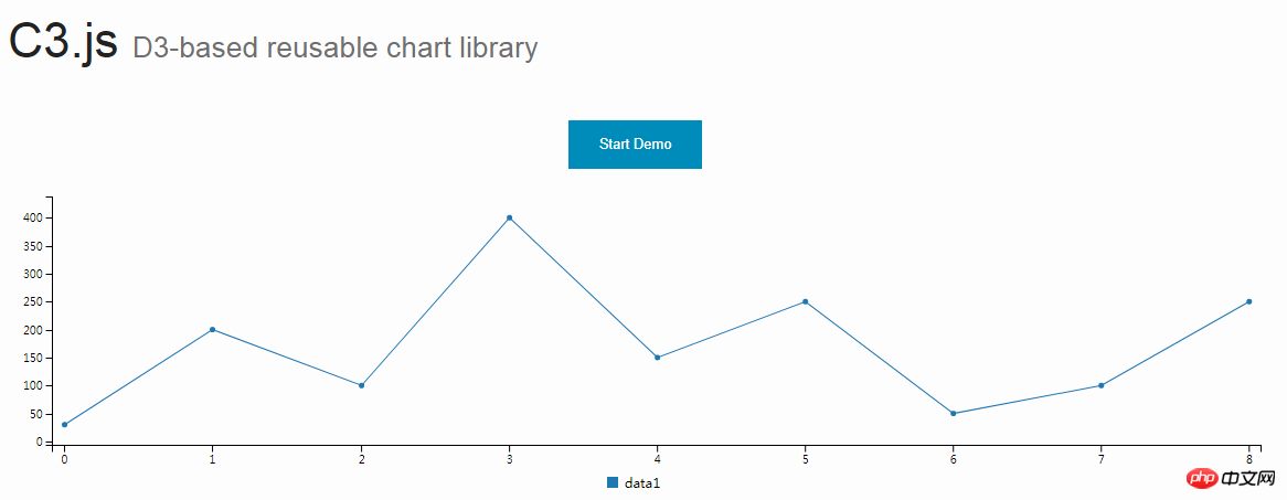
}C3.js
与 TauCharts 相同,C3.js 也是一个非常有效的基于 D3 的图表可视化库。另外,C3.js 允许用户创建可定制的具有个人风格的类。
C3.js 看起来是个比较难的库,但是一旦掌握了 C3.js 技巧,就能得心应手的使用了。
有了 C3.js 图表库,即使在第一次渲染之后,用户也可以通过创建回调来更新图表。C3.js 也允许用户为自己的 Web 应用程序创建可复用的图表,从而减少工作量。
使用 npm 安装 C3.js 图表库:
npm install c3
C3.js 绘制组合图的代码示例:
var chart = c3.generate({
 data: {
 columns: [
  ['data1', 30, 20, 50, 40, 60, 50],
  ['data2', 200, 130, 90, 240, 130, 220],
  ['data3', 300, 200, 160, 400, 250, 250],
  ['data4', 200, 130, 90, 240, 130, 220],
  ['data5', 130, 120, 150, 140, 160, 150],
  ['data6', 90, 70, 20, 50, 60, 120],
 ],
 type: 'bar',
 types: {
  data3: 'spline',
  data4: 'line',
  data6: 'area',
 },
 groups: [
  ['data1','data2']
 ]
 }
});TauCharts
TauCharts 是最灵活的 JavaScript 图表库之一。它是基于 D3 创建的,是一个以数据为中心的 JavaScript 图表库,可以改进数据可视化的效果。
TauCharts 十分灵活,访问其 API 也十分轻松。TauCharts 为用户提供了无缝映射和可视化的数据,使用 TauCharts 能够设计出十分美观的数据界面。同时,TauCharts 也和易于学习。
通过 npm 安装 TauCharts:
npm install taucharts
TauCharts 绘制水平线的代码示例:
var defData = [
 {"team": "d", "cycleTime": 1, "effort": 1, "count": 1, "priority": "low"}, {
  "team": "d",
  "cycleTime": 2,
  "effort": 2,
  "count": 5,
  "priority": "low"
 }, {"team": "d", "cycleTime": 3, "effort": 3, "count": 8, "priority": "medium"}, {
  "team": "d",
  "cycleTime": 4,
  "effort": 4,
  "count": 3,
  "priority": "high"
 }, {"team": "l", "cycleTime": 2, "effort": 1, "count": 1, "priority": "low"}, {
  "team": "l",
  "cycleTime": 3,
  "effort": 2,
  "count": 5,
  "priority": "low"
 }, {"team": "l", "cycleTime": 4, "effort": 3, "count": 8, "priority": "medium"}, {
  "team": "l",
  "cycleTime": 5,
  "effort": 4,
  "count": 3,
  "priority": "high"
 },
 {"team": "k", "cycleTime": 2, "effort": 4, "count": 1, "priority": "low"}, {
  "team": "k",
  "cycleTime": 3,
  "effort": 5,
  "count": 5,
  "priority": "low"
 }, {"team": "k", "cycleTime": 4, "effort": 6, "count": 8, "priority": "medium"}, {
  "team": "k",
  "cycleTime": 5,
  "effort": 8,
  "count": 3,
  "priority": "high"
 }];
var chart = new tauCharts.Chart({
  data: defData,
  type: 'horizontalBar',
  x: 'effort',
  y: 'team',
  color:'priority'
 });
chart.renderTo('#bar');Recharts

ReCharts 是一个使用 React 构建的,基于 D3 的图表库。
使用 ReCharts,用户可以在 React Web 应用程序中无缝地编写图表。
Recharts 非常轻巧,并使用 SVG 元素来创建很奇特的图表。
使用 npm 安装 Recharts:
npm install recharts
Recharts 没有冗长的文档,它很直接。当你遇到困难时,使用 Recharts 可以很容易找到解决方案。
Recharts 创建自定义内容树图的代码示例:
const {Treemap} = Recharts;
const data = [
{
name: 'axis',
children: [
{ name: 'Axes', size: 1302 },
{ name: 'Axis', size: 24593 },
{ name: 'AxisGridLine', size: 652 },
{ name: 'AxisLabel', size: 636 },
{ name: 'CartesianAxes', size: 6703 },
],
},
{
name: 'controls',
children: [
{ name: 'AnchorControl', size: 2138 },
{ name: 'ClickControl', size: 3824 },
{ name: 'Control', size: 1353 },
{ name: 'ControlList', size: 4665 },
{ name: 'DragControl', size: 2649 },
{ name: 'ExpandControl', size: 2832 },
{ name: 'HoverControl', size: 4896 },
{ name: 'IControl', size: 763 },
{ name: 'PanZoomControl', size: 5222 },
{ name: 'SelectionControl', size: 7862 },
{ name: 'TooltipControl', size: 8435 },
],
},
{
name: 'data',
children: [
{ name: 'Data', size: 20544 },
{ name: 'DataList', size: 19788 },
{ name: 'DataSprite', size: 10349 },
{ name: 'EdgeSprite', size: 3301 },
{ name: 'NodeSprite', size: 19382 },
{
name: 'render',
children: [
{ name: 'ArrowType', size: 698 },
{ name: 'EdgeRenderer', size: 5569 },
{ name: 'IRenderer', size: 353 },
{ name: 'ShapeRenderer', size: 2247 },
],
},
{ name: 'ScaleBinding', size: 11275 },
{ name: 'Tree', size: 7147 },
{ name: 'TreeBuilder', size: 9930 },
],
},
{
name: 'layout',
children: [
{ name: 'AxisLayout', size: 6725 },
{ name: 'BundledEdgeRouter', size: 3727 },
{ name: 'CircleLayout', size: 9317 },
{ name: 'CirclePackingLayout', size: 12003 },
{ name: 'DendrogramLayout', size: 4853 },
{ name: 'ForceDirectedLayout', size: 8411 },
{ name: 'IcicleTreeLayout', size: 4864 },
{ name: 'IndentedTreeLayout', size: 3174 },
{ name: 'Layout', size: 7881 },
{ name: 'NodeLinkTreeLayout', size: 12870 },
{ name: 'PieLayout', size: 2728 },
{ name: 'RadialTreeLayout', size: 12348 },
{ name: 'RandomLayout', size: 870 },
{ name: 'StackedAreaLayout', size: 9121 },
{ name: 'TreeMapLayout', size: 9191 },
],
},
{ name: 'Operator', size: 2490 },
{ name: 'OperatorList', size: 5248 },
{ name: 'OperatorSequence', size: 4190 },
{ name: 'OperatorSwitch', size: 2581 },
{ name: 'SortOperator', size: 2023 },
],
}
];
const COLORS = ['#8889DD', '#9597E4', '#8DC77B', '#A5D297', '#E2CF45', '#F8C12D'];
const CustomizedContent = React.createClass({
render() {
const { root, depth, x, y, width, height, index, payload, colors, rank, name } = this.props;
return (
<g>
<rect
x={x}
y={y}
width={width}
height={height}
style={{
fill: depth < 2 ? colors[Math.floor(index / root.children.length * 6)] : 'none',
stroke: '#fff',
strokeWidth: 2 / (depth + 1e-10),
strokeOpacity: 1 / (depth + 1e-10),
}}
/>
{
depth === 1 ?
<text
x={x + width / 2}
y={y + height / 2 + 7}
textAnchor="middle"
fill="#fff"
fontSize={14}
>
{name}
</text>
: null
}
{
depth === 1 ?
<text
x={x + 4}
y={y + 18}
fill="#fff"
fontSize={16}
fillOpacity={0.9}
>
{index + 1}
</text>
: null
}
</g>
);
}
});
const SimpleTreemap = React.createClass({
render () {
return (
<Treemap
width={400}
height={200}
data={data}
dataKey="size"
ratio={4/3}
stroke="#fff"
fill="#8884d8"
content={<CustomizedContent colors={COLORS}/>}
/>
);
}
})
ReactDOM.render(
<SimpleTreemap />,
document.getElementById('container')
);Flot
目前,jQuery 已经成为 Web 开发人员非常重要的工具。有了 Flot.js,前端设计也变得更加容易。
Flot.js 是 JavaScript 库中较为古老的图表库之一。尽管如此,Flot.js 也不会因为绘制折线图、饼图、条形图、面积图、甚至堆叠图表而降低其性能。
Flot.js 有一个很完善的文档。当用户遇到困难时,可以很容易地找到解决办法。Flot.js 也支持旧版本的浏览器。
可以选择不使用 npm 来安装 Flot.js,而是在 HTML5 中包含 jQuery 和 JavaScript 文件。
Flot.js 的基本用法代码示例:
$(function () {
 var d1 = [];
 for (var i = 0; i < 14; i += 0.5)
 d1.push([i, Math.sin(i)]);

 var d2 = [[0, 3], [4, 8], [8, 5], [9, 13]];

 // a null signifies separate line segments
 var d3 = [[0, 12], [7, 12], null, [7, 2.5], [12, 2.5]];

 $.plot($("#placeholder"), [ d1, d2, d3 ]);
});总结
以上介绍的 JavaScript 库都是高质量的图表库。但是在学习这些库的过程中,可能会因为学习曲线陡峭或是缺乏学习资料而遇到困难,一种很好的方案是将这些库结合起来使用。最后也欢迎大家补充更多的 JavaScript 图表库。
相关推荐:
xCharts-基于D3的JavaScript图表库代码详解(图)
ECharts-基于HTML5 Canvas的JavaScript图表库图文详解
The above is the detailed content of Detailed explanation of 9 JavaScript chart libraries. For more information, please follow other related articles on the PHP Chinese website!


![[Web front-end] Node.js quick start](https://img.php.cn/upload/course/000/000/067/662b5d34ba7c0227.png)


