I first heard about modal when Brother Bao interviewed me over the phone last month and asked me if I knew about front-end modal. I was confused about my new term, so I asked Brother Bao to remind me, and he told me that it was a pop-up box on the interface. what? Wouldn’t it be better to use alter? ?
Last week I was mainly looking at the front-end code. It was really ugly and I didn’t write many comments... This is bad... Can you write more comments? Please Already...
Today I basically understand the modal.
A modal box (Modal) is a child form covering the parent form. Typically, the purpose is to display content from a separate source that can have some interaction without leaving the parent form. Subforms provide information, interaction, and more.
For example, as shown below: As soon as you click "Start Demonstration Modal Box", a box will pop up. We call this box a modal box

After knowing what modal box is, how to write an html? Without further ado, let me first take a look at my HTML code:
So you copy the above code and open it in the browser, and you find that it is ugly and the pop-up box cannot be implemented. function? Why is this? It's most likely because you didn't import bootstrap's css, js

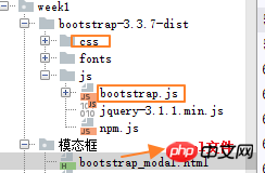
First I downloaded bootstrap from the bootstrap official website; then quoted bootstrap's css and js
If you import it correctly, you will definitely be able to see this interface in the browser.

Code explanation:
To use a modal window, you need to have some kind of trigger. You can use buttons or links. Here we are using buttons.
If you look at the above code carefully, you will find that in the
You need to pay attention to two points in the modal box:
The first is.modal, use To identify the content of
The second is.fadeclass. When the modal is toggled, it causes the content to fade in and out.
aria-labelledby="myModalLabel", this attribute refers to the title of the modal box.
Attributearia-hidden="true"Used to keep the modal window invisible until the trigger is fired (such as clicking on the relevant button) .
class="close", close is a CSS class used to style the close button of a modal window.
data-dismiss="modal", is a custom HTML5 data attribute. Here it is used to close the modal window.
class="modal-body", is a CSS class of Bootstrap CSS, used to set styles for the body of modal windows.
class="modal-footer", is a CSS class of Bootstrap CSS, used to set styles for the bottom of modal windows.
data-toggle="modal", HTML5 custom data attribute data-toggle is used to open a modal window.
Here are some useful methods that can be used with modal().
| Method | Description | Instance |
|---|---|---|
| Options:.modal(options) | Activate the content as a modal box. Accepts an optional options object. |
$('#identifier').modal({keyboard: false})
Copy after login
|
| Toggle:.modal('toggle') | Manually switch the modal box. |
$('#identifier').modal('toggle')
Copy after login
|
| Show:.modal('show') | Manually open the modal box. |
$('#identifier').modal('show')
Copy after login
|
| Hide:.modal('hide') | Manually hide the modal box. |
$('#identifier').modal('hide')
Copy after login
|
下表列出了模态框中要用到事件。这些事件可在函数中当钩子使用。
| 事件 | 描述 | 实例 |
|---|---|---|
| show.bs.modal | 在调用 show 方法后触发。 |
$('#identifier').on('show.bs.modal', function () { // 执行一些动作...})
Copy after login
|
| shown.bs.modal | 当模态框对用户可见时触发(将等待 CSS 过渡效果完成)。 |
$('#identifier').on('shown.bs.modal', function () { // 执行一些动作...})
Copy after login
|
| hide.bs.modal | 当调用 hide 实例方法时触发。 |
$('#identifier').on('hide.bs.modal', function () { // 执行一些动作...})
Copy after login
|
| hidden.bs.modal | 当模态框完全对用户隐藏时触发。 |
$('#identifier').on('hidden.bs.modal', function () { // 执行一些动作...})
Copy after login
|
参考资料:
我把modal的练习放到Github上了:模态框
The above is the detailed content of Technical explanation of bootstrap modal box. For more information, please follow other related articles on the PHP Chinese website!


