


この記事では、純粋な CSS を使用してブラッドホイールの目と輪廻の目の特殊効果を実現する方法を紹介します。一定の参考値があるので、困っている友人は参考にしていただければ幸いです。
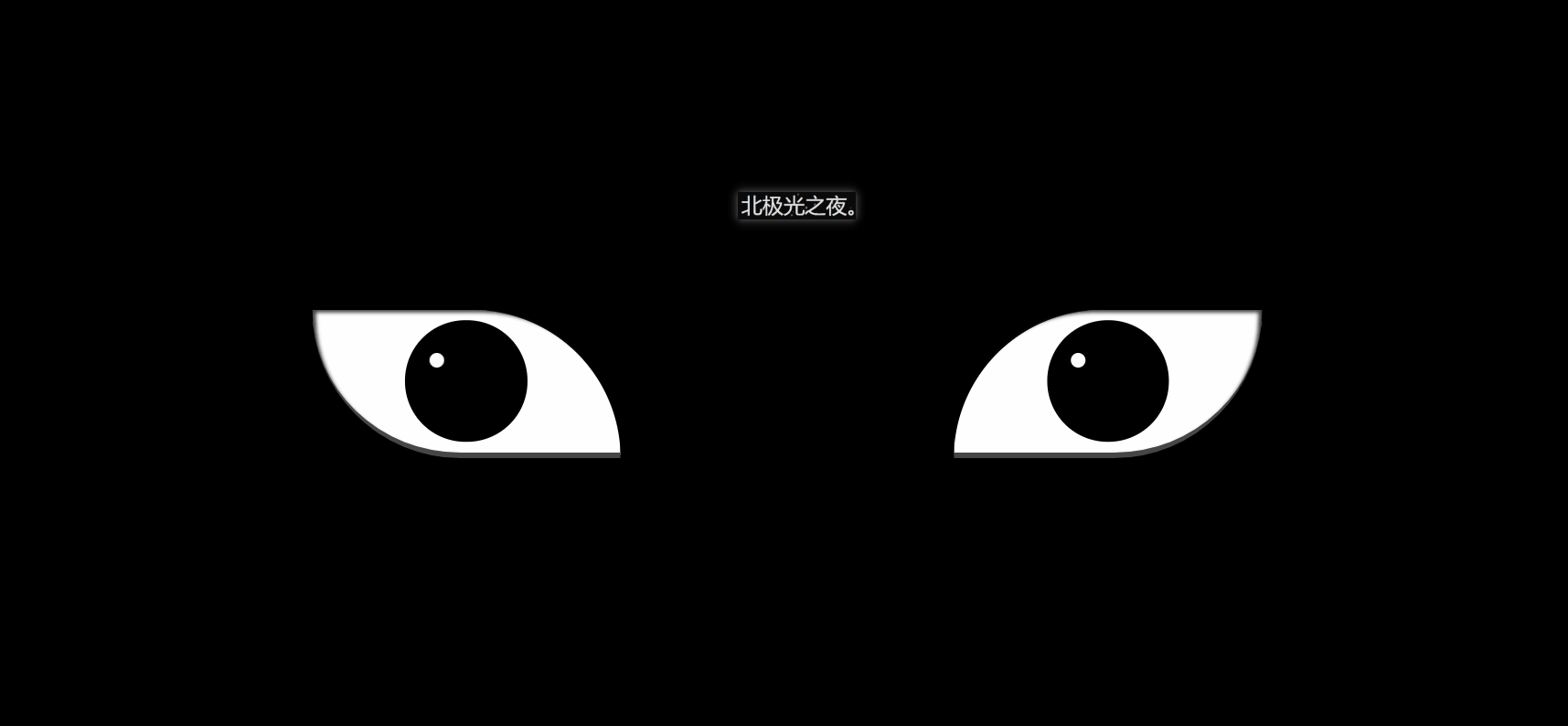
効果 (完全なコードは一番下にあります)
実際、実装は難しくありません。繰り返されるコードがたくさんあります。
1. まず基本的なタグを定義します:
2。左右の目を定義する 基本CSSスタイル:
.zuo , .you{ width: 250px; height: 120px; background-color: rgb(255, 255, 255); border-bottom: 5px solid rgb(70, 70, 70); overflow: hidden; position: relative; }
border-bottom: 5px Solid rgb(70, 70, 70); まぶたをグレーにします。
オーバーフロー: オーバーフローが非表示になりました。
position: 相対; 相対的な位置決め。
3. まず、ブラッド ホイールの目の基本スタイルを定義します:
.zuo{ transform: translateX(-135px); border-radius: 0 120px 0 120px; box-shadow: inset 3px 2px 3px rgba(17, 17, 17, 0.8); }
transform: translationX(-135px); 左にオフセットして、二つの目は離れています。
border-radius: 目の形を形成する 2 つの角の円弧を設定します。
bos-shadowL 目尻に少し影を与えます。
4. 眼球の幅と高さを設定します:
.zuo::after{ content: ''; position: absolute; top: 50%; left: 50%; transform: translate(-50%,-50%); width: 95px; height: 95px; border-radius: 50%; border: 2px solid #000; animation: colour 2s linear forwards; } @keyframes colour{ 0%,30%{ background-color: rgb(0, 0, 0); } 100%{ background-color: rgb(255, 4, 4); } }
5. 眼球の中央に黒い点を設定します。重要なのは位置とサイズです。次に、アニメーションを設定して、ゆっくりと大きくします:
.zuoZong{ position: absolute; top: 50%; left: 50%; transform: translate(-50%,-50%); width: 0px; height: 0px; border-radius: 50%; background-color: rgb(0, 0, 0); z-index: 1; animation: da 3s linear forwards; } @keyframes da{ 100%{ width: 15px; height: 15px; } }
6. 3 つの勾玉がある円を設定し、表示および回転するアニメーションを設定します。それ:
.zuoYu{ position: absolute; top: -25px; left: -25px; bottom: -25px; right: -25px; border-radius: 50%; border: 2px solid rgb(0, 0, 0); animation: zhuan 2s linear 2s forwards; opacity: 0; } @keyframes zhuan{ 100%{ opacity: 1; transform: rotate(720deg); } }
7. 3 つの勾玉を作成するには、まず円を作成し、次に二重疑似クラスを使用して円弧を作成します。この 2 つの組み合わせが勾玉です:
.zuoYu .yu{ position: absolute; width: 15px; height: 15px; border-radius: 50%; background-color: rgb(0, 0, 0); } .zuoYu .yu::after{ content: ''; position: absolute; top: -6px; left: -1px; width: 6px; height: 20px; border-radius: 50%; border-left: 6px solid rgb(0, 0, 0); }
境界半径: 50% ;
境界左: 6px ソリッド rgb(0, 0, 0);
まず疑似クラスを円とし、次に円弧を形成する境界線のみを設定し、親要素上に配置して勾玉を形成します。
8. 勾玉が中央から大きくなり、勾玉がある円に向かって回転するように勾玉のアニメーションを設定します:
.zuoYu .yu:nth-child(1){ animation: yu1 2s ease-in 2s forwards; } @keyframes yu1{ 0%{ opacity: 0; left: 50%; top: 50%; transform:translate(-50%,-50%) scale(0.1) ; } 100%{ left: 50%; top: -9%; transform: scale(1) rotate(80deg); } }
左: 50% ;
上: 50%; 真ん中。
不透明度: 透明。
スケール(0.1); 縮小します。
100%{…} を対応する位置に移動し、不透明になり通常のサイズに拡大します。
9. 同様に、他の 2 つの勾玉をアニメーション化します:
.zuoYu .yu:nth-child(2){ animation: yu2 2s ease-in 2s forwards; } @keyframes yu2{ 0%{ opacity: 0; left: 50%; top: 50%; transform: translate(-50%,-50%) scale(0.1) ; } 100%{ top: 60%; left: -9%; transform: scale(1) rotate(-60deg); } } .zuoYu .yu:nth-child(3){ animation: yu3 2s ease-in 2s forwards; } @keyframes yu3{ 0%{ opacity: 0; right: 50%; top: 50%; transform: translate(-50%,-50%) scale(0.1); } 100%{ top: 60%; right: -9%; transform: scale(1) rotate(180deg); } }
10. 両目に白色点を設定します。反射効果、ブラッド チャクラ アイは完成です:
.zuo::before,.you::before{ content: ''; position: absolute; left: 38%; top: 30%; width: 12px; height: 12px; border-radius: 50%; background-color: rgb(255, 255, 255); z-index: 10; }
position: 絶対;
left: 38%;
top: 30%; 対応する位置を配置します。
背景色: rgb(255, 255, 255); 白。
z-index: 10; 10 に設定すると、上部に表示されます。
11. Blood Wheel Eye と同じように、Samsara Eye の基本的な CSS スタイルを設定します:
.you{ transform: translateX(135px); border-radius: 120px 0 120px 0; box-shadow: inset -3px 2px 3px rgba(17, 17, 17, 0.8); }
12. 幅を設定します。眼球の高さと:
.you::after{ content: ''; position: absolute; top: 50%; left: 50%; transform: translate(-50%,-50%); width: 95px; height: 95px; border-radius: 50%; border: 2px solid #000; animation: youcolor 2s linear forwards; } @keyframes youcolor{ 0%,30%{ background-color: rgb(0, 0, 0); } 100%{ background-color: rgb(144, 130, 183); } }
position: 絶対; 絶対位置
上: 50%;
左: 50%;
変換: 変換(-50 %,-50%); 中央揃え。
アニメーション: アニメーションを紫色になるように設定します。 forward: 最後のフレームのプロパティを継承します。
背景色: rgb(0, 0, 0); 黒
背景色: rgb(144, 130, 183); 紫。
13. 血車の目に似た、眼球の中央に黒い点を設定します:
.dian{ position: absolute; top: 50%; left: 50%; background-color: #000; transform: translate(-50%,-50%); border-radius: 50%; z-index: 10; animation: youda 3s linear forwards; } @keyframes youda{ 0%{ height: 0px; width: 0px; } 100%{ height: 15px; width: 15px; } }
14. 設定します。輪廻の目の各円を分割し、それが大きくなるようにアニメーションを設定します:
.youYu{ position: absolute; top: 50%; left: 50%; transform: translate(-50%,-50%); } .quan{ position: absolute; border-radius: 50%; border: 2px solid #000; z-index: calc(1 - var(--r)); animation: zhi 2s ease-out 2s forwards; } @keyframes zhi{ 0%{ top: calc(var(--r) * 1px); left: calc(var(--r) * 1px); right: calc(var(--r) * 1px); bottom: calc(var(--r) * 1px); } 100%{ top: calc(var(--r) * -35px); left: calc(var(--r) * -35px); right: calc(var(--r) * -35px); bottom: calc(var(--r) * -35px); background-color: rgb(187, 177, 214); } }
z-index: calc(1 - var(–r)); 最初の円が になるように計算します。最上層に表示されます。
アニメーション: 輪廻転生の輪が徐々に大きくなり、同時に紫色になるアニメーションを設定します。
Document
(学習ビデオ共有:css ビデオ チュートリアル)
以上が純CSSで血車目+転生目の特殊効果を実装する方法(詳細コード解説)の詳細内容です。詳細については、PHP 中国語 Web サイトの他の関連記事を参照してください。


![[Web フロントエンド] Node.js クイック スタート](https://img.php.cn/upload/course/000/000/067/662b5d34ba7c0227.png)


