


図に示すようなローディング効果を実現します: 
htmlコード:
提交订单中<span class="ani_dot">...</span>
cssコード:
.ani_dot {
    font-family: simsun;
}
:root .ani_dot { /* 这里使用Hack是因为IE6~IE8浏览器下, vertical-align解析不规范,值为bottom或其他会改变按钮的实际高度*/
    display: inline-block;
    width: 1.5em;
    vertical-align: bottom;
    overflow: hidden;
}
@-webkit-keyframes dot {
    0% { width: 0; margin-right: 1.5em; }
    33% { width: .5em; margin-right: 1em; }
    66% { width: 1em; margin-right: .5em; }
    100% { width: 1.5em; margin-right: 0;}
}
.ani_dot {
    -webkit-animation: dot 3s infinite step-start;
}

@keyframes dot {
    0% { width: 0; margin-right: 1.5em; }
    33% { width: .5em; margin-right: 1em; }
    66% { width: 1em; margin-right: .5em; }
    100% { width: 1.5em; margin-right: 0;}
}
.ani_dot {
    animation: dot 3s infinite step-start;
} 図に示す結果が表示されます。
注:
1. IE10+ およびその他のブラウザでは、ドット ドット アニメーションが表示されなくなりますが、IE6 ~ IE9 では通常のドット ドット テキストが表示されます。
2. アニメーションアニメーションは連続的ですが、ここではフレームごと、カードごとに実行し、効果はそれほど連続的ではありません。step-startを使用します。step-start。
3.上面代码还用到了css3的选择器:root。:root为IE9+以及其他现代浏览器Hack, IE6-7甚至IE8下,inline-block水平元素的vertical-align:bottom解析与inline水平是有差异的,会导致高度撑开,因此,display: inline-block要hack处理。
由于上面用到了animation动画,这里详细介绍下这个animation的参数。
CSS动画(Animations)简单说就是在一段固定的动画时间内暗中在某一频率内改变其CSS某个或某些值,从而达到视觉上的转换动画效果。Animations的很多方面都是可以控制的,包括动画运行时间,开始值和结束值,还有动画的暂停和延迟其开始时间等。
<single-animation> = <single-animation-name> || <time> || <single-animation-timing-function> || <time> || <single-animation-iteration-count> || <single-animation-direction> || <single-animation-fill-mode> || <single-animation-play-state> <' animation-name '>:检索或设置对象所应用的动画名称<' animation-duration '>:检索或设置对象动画的持续时间<' animation-timing-function '>:检索或设置对象动画的过渡类型<' animation-delay '>:检索或设置对象动画延迟的时间<' animation-iteration-count '>:检索或设置对象动画的循环次数<' animation-direction '>:检索或设置对象动画在循环中是否反向运动<' animation-fill-mode '>:检索或设置对象动画时间之外的状态<' animation-play-state '>:检索或设置对象动画的状态。w3c正考虑是否将该属性移除,因为动画的状态可以通过其它的方式实现,比如重设样式
所有动画属性的简写属性,除了 animation-play-state 属性。
规定 @keyframes 动画的名称。就是@keyframes后面跟着的动画名称,本demo本文中名为dot,意思为“点”。
规定动画完成一个周期所花费的秒或毫秒。默认是 0。
规定动画的速度曲线。默认是 "ease"。
常见的动画速度参数:
linear:线性过渡。等同于贝塞尔曲线(0.0, 0.0, 1.0, 1.0)
ease:平滑过渡。等同于贝塞尔曲线(0.25, 0.1, 0.25, 1.0)
ease-in:由慢到快。等同于贝塞尔曲线(0.42, 0, 1.0, 1.0)
ease-out:由快到慢。等同于贝塞尔曲线(0, 0, 0.58, 1.0)
ease-in-out:由慢到快再到慢。等同于贝塞尔曲线(0.42, 0, 0.58, 1.0)
step-start:等同于 steps(1, start)
step-end:等同于 steps(1, end)
steps(
]?):接受两个参数的步进函数。第一个参数必须为正整数,指定函数的步数。第二个参数取值可以是start或end,指定每一步的值发生变化的时间点。第二个参数是可选的,默认值为end。
cubic-bezier(
规定动画何时开始。默认是 0。也即是指动画延时执行时间。
规定动画被播放的次数。默认是 1。当然,我们可以设置2次,3次,依次递推。还有个无线循环关键字infinite,也即是反复循环播放动画。
规定动画是否在下一周期逆向地播放。默认是 "normal"。当然还有下列值:
reverse:反方向运行
alternate:动画先正常运行再反方向运行,并持续交替运行
alternate-reverse:动画先反运行再正方向运行,并持续交替运行
规定对象动画时间之外的状态。
none:默认值。不设置对象动画之外的状态
forwards:设置对象状态为动画结束时的状态
backwards:设置对象状态为动画开始时的状态
both:设置对象状态为动画结束或开始的状态,动画开始之前是"from"或"0%"关键帧;动画完成之后是"to"或"100%"关键帧状态。
规定动画是否正在运行或暂停。默认是 "running"。还有个值paused3. 上記のコードでは、css3 セレクター :root も使用しています。 :root は、IE9 以降およびその他の最新のブラウザー用のハックであり、IE6 ~ 7、さらには IE8 では、inline-block の水平要素のvertical-align:bottom 解像度がインラインの水平要素の解像度と異なるため、高さが拡張されます。表示: インライン - ブロックをハッキングする必要があります。
p{
    width:100px;
    height:100px;
    background:red;
    position:relative;
    animation:mymove 5s infinite;
    -moz-animation:mymove 5s infinite; /*Firefox*/
    -webkit-animation:mymove 5s infinite; /*Safari and Chrome*/
}
@keyframes mymove{
    from {left:0px;}
    to {left:200px;}
}
@-moz-keyframes mymove { /*Firefox*/
    from {left:0px;}
    to {left:200px;}
}
@-webkit-keyframes mymove{ /*Safari and Chrome*/
    from {left:0px;}
    to {left:200px;}
}infinite もあります。これは、アニメーションがループで繰り返し再生されることを意味します。 🎜reverse: 逆方向に実行します🎜alternate</ code>: アニメーションは最初に通常通りに実行され、次に逆方向に実行され、交互に実行され続けます🎜</li><li>🎜<code>alternate-reverse: 最初にアニメーションが実行されます。逆方向に実行してから順方向に実行し、交互に実行し続けます🎜 none: デフォルト値。アニメーションの外側でオブジェクトの状態を設定しないでください 🎜forwards: オブジェクトの状態をアニメーションの終了時の状態に設定します🎜backwards</code code>: オブジェクトの状態をアニメーション開始時の状態に設定します🎜</li><li>🎜<code>both: オブジェクトの状態をアニメーション開始時の状態に設定しますアニメーションが終了または開始する前は「from」または「0%」キーフレーム、アニメーションが完了した後は「to」または「100%」キーフレームの状態です。 🎜"running" です。値 paused もあります: 一時停止。 🎜from to:p{
width:100px;
height:100px;
background:red;
position:relative;
animation:mymove 5s infinite;
-moz-animation:mymove 5s infinite; /*Firefox*/
-webkit-animation:mymove 5s infinite; /*Safari and Chrome*/
}
@keyframes mymove{
from {left:0px;}
to {left:200px;}
}
@-moz-keyframes mymove { /*Firefox*/
from {left:0px;}
to {left:200px;}
}
@-webkit-keyframes mymove{ /*Safari and Chrome*/
from {left:0px;}
to {left:200px;}
}@keyframes myfirst{
0% {background: red; left:0px; top:0px;}
25% {background: yellow; left:200px; top:0px;}
50% {background: blue; left:200px; top:200px;}
75% {background: green; left:0px; top:200px;}
100% {background: red; left:0px; top:0px;}
}
@-moz-keyframes myfirst{ /* Firefox */
0% {background: red; left:0px; top:0px;}
25% {background: yellow; left:200px; top:0px;}
50% {background: blue; left:200px; top:200px;}
75% {background: green; left:0px; top:200px;}
100% {background: red; left:0px; top:0px;}
}
@-webkit-keyframes myfirst{ /* Safari 和 Chrome */
0% {background: red; left:0px; top:0px;}
25% {background: yellow; left:200px; top:0px;}
50% {background: blue; left:200px; top:200px;}
75% {background: green; left:0px; top:200px;}
100% {background: red; left:0px; top:0px;}
}
@-o-keyframes myfirst {/* Opera */
0% {background: red; left:0px; top:0px;}
25% {background: yellow; left:200px; top:0px;}
50% {background: blue; left:200px; top:200px;}
75% {background: green; left:0px; top:200px;}
100% {background: red; left:0px; top:0px;}
}只有webkit内核的浏览器才能看到相关3D动画效果。
实现效果如图所示: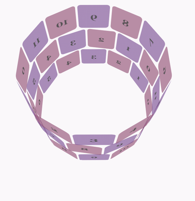
css代码:
body {
        font-family: 'Lucida Grande', Verdana, Arial;
        font-size: 12px;
      }

      #stage {
        margin: 150px auto;
        width: 600px;
        height: 400px;
        -webkit-perspective: 800;
      }

      #rotate {
        margin: 0 auto;
        width: 600px;
        height: 400px;
        -webkit-transform-style: preserve-3d;
        -webkit-animation-name: x-spin;
        -webkit-animation-duration: 7s;
        -webkit-animation-iteration-count: infinite;
        -webkit-animation-timing-function: linear;
      }

      .ring {
        margin: 0 auto;
        height: 110px;
        width: 600px;
        -webkit-transform-style: preserve-3d;
        -webkit-animation-iteration-count: infinite;
        -webkit-animation-timing-function: linear;
      }

      .ring > :nth-child(odd) {
        background-color: #995C7F;
      }

      .ring > :nth-child(even) {
        background-color: #835A99;
      }

      .poster {
        position: absolute;
        left: 250px;
        width: 100px;
        height: 100px;
        opacity: 0.7;
        color: rgba(0,0,0,0.9);
        -webkit-border-radius: 10px;
      }

      .poster > p {
        font-family: 'Georgia', serif;
        font-size: 36px;
        font-weight: bold;
        text-align: center;
        margin-top: 28px;
      }

      #ring-1 {
        -webkit-animation-name: y-spin;
        -webkit-animation-duration: 5s;
      }

      #ring-2 {
        -webkit-animation-name: back-y-spin;
        -webkit-animation-duration: 4s;
      }

      #ring-3 {
        -webkit-animation-name: y-spin;
        -webkit-animation-duration: 3s;
      }

      @-webkit-keyframes x-spin {
        0%    { -webkit-transform: rotateX(0deg); }
        50%   { -webkit-transform: rotateX(180deg); }
        100%  { -webkit-transform: rotateX(360deg); }
      }

      @-webkit-keyframes y-spin {
        0%    { -webkit-transform: rotateY(0deg); }
        50%   { -webkit-transform: rotateY(180deg); }
        100%  { -webkit-transform: rotateY(360deg); }
      }

      @-webkit-keyframes back-y-spin {
        0%    { -webkit-transform: rotateY(360deg); }
        50%   { -webkit-transform: rotateY(180deg); }
        100%  { -webkit-transform: rotateY(0deg); }
}html代码:
<p id="stage">
  <p id="rotate">
    <p id="ring-1" class="ring"></p>
    <p id="ring-2" class="ring"></p>
    <p id="ring-3" class="ring"></p>
  </p>
</p>js代码:
const POSTERS_PER_ROW = 12;
const RING_RADIUS = 200;
function setup_posters (row){
var posterAngle = 360 / POSTERS_PER_ROW;
for (var i = 0; i < POSTERS_PER_ROW; i ++) {
var poster = document.createElement('p');
poster.className = 'poster';
var transform = 'rotateY(' + (posterAngle * i) + 'deg) translateZ(' + RING_RADIUS + 'px)';
poster.style.webkitTransform = transform;
var content = poster.appendChild(document.createElement('p'));
content.textContent = i;
row.appendChild(poster);
}
}
function init (){
setup_posters(document.getElementById('ring-1'));
setup_posters(document.getElementById('ring-2'));
setup_posters(document.getElementById('ring-3'));
}
window.addEventListener('load', init, false);以上がCSS3 animate による「...」読み込みアニメーション効果の実装方法について (1)の詳細内容です。詳細については、PHP 中国語 Web サイトの他の関連記事を参照してください。


![[Web フロントエンド] Node.js クイック スタート](https://img.php.cn/upload/course/000/000/067/662b5d34ba7c0227.png)


