


Rendering:

Knowledge points:
1, perspective, review of transform
2, css3 backgroud Realize the grid background, that is, the small grid on the face
3, @-webkit-keyframes Realize animation
HTML:
<body>


<p class="stage">
    <p class="cube">
        <p class="font"></p>
        <p class="back"></p>
        <p class="left"></p>
        <p class="right"></p>
        <p class="top"></p>
        <p class="bottom"></p>
    </p>

</p>


</body>
Already shown in the previous 3D product display I have already mentioned how to make a cube, and there are numbers on it. Theoretically, it is more complicated than this, although it is not that cool~ I won’t go into details here.
CSS:
 html
        {
            background: -webkit-radial-gradient(center, ellipse, #430d6d 0%, #000000 100%);
            background: radial-gradient(ellipse at center, #430d6d 0%, #000000 100%);
            height: 100%;
        }

        .stage
        {
            -webkit-perspective: 1000px;
            width: 20em;
            height: 20em;
            left: 50%;
            top: 50%;
            margin-left: -10em;
            margin-top: -10em;
            position: absolute;
        }

        .cube
        {
            position: absolute;
            width: 100%;
            height: 100%;
            -webkit-transform-style: preserve-3d;
            -webkit-transform: rotateX(-20deg) rotateY(-20deg);
        }

        .cube *
        {
            background: -webkit-linear-gradient(left, rgba(54, 226, 248, 0.5) 0px, rgba(54, 226, 248, 0.5) 3px, rgba(0, 0, 0, 0) 0px),
            -webkit-linear-gradient(top, rgba(54, 226, 248, 0.5) 0px, rgba(54, 226, 248, 0.5) 3px, rgba(0, 0, 0, 0) 0px);
            -webkit-background-size: 2.5em 2.5em;

            background-color: rgba(0, 0, 0, 0.5);
            position: absolute;
            width: 100%;
            height: 100%;
            border: 2px solid rgba(54, 226, 248, 0.5);
            -webkit-box-shadow: 0 0 5em rgba(0, 128, 0, 0.4);

        }

        .font
        {
            -webkit-transform: translateZ(10em);
        }

        .back
        {
            -webkit-transform: rotateX(180deg) translateZ(10em);
        }

        .left
        {
            -webkit-transform: rotateY(-90deg) translateZ(10em);
        }

        .right
        {
            -webkit-transform: rotateY(90deg) translateZ(10em);
        }

        .top
        {
            -webkit-transform: rotateX(90deg) translateZ(10em);
        }

        .bottom
        {
            -webkit-transform: rotateX(-90deg) translateZ(10em);
        }
Similarly: stage serves as the stage, cube sets the effect of the sub-element to 3d, then each face is rotated and translateZ is set to form a cube.
Set the backgroud for each surface and set the small grid code:
     background: -webkit-linear-gradient(
                left,
                rgba(54, 226, 248, 0.5) 0px,
                rgba(54, 226, 248, 0.5) 3px,
                rgba(0, 0, 0, 0) 0px),
                        -webkit-linear-gradient(
                top,
                rgba(54, 226, 248, 0.5) 0px,
                rgba(54, 226, 248, 0.5) 3px,
                rgba(0, 0, 0, 0) 0px);

-webkit-background-size: 2.5em 2.5em;Background settings, 3 pixel strips from left to right, from top to bottom Go to the 3 pixel bar below; then set the background size to 2.5em 2.5em, and then repeat the background, the effect is as follows (I added a border):

#The complete effect now:
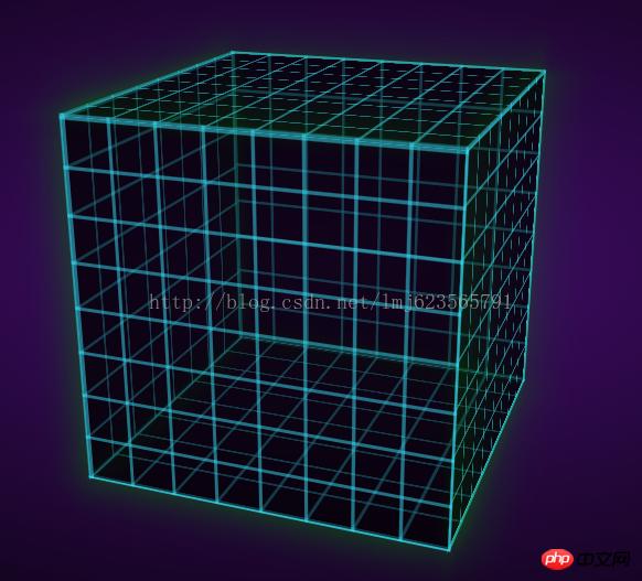
You can see that the cube has been formed, just add animation at the end, no need I think the animation is very complicated, but it is actually very simple~
Define an animation frame:
 @-webkit-keyframes spin
        {
            from
            {
                -webkit-transform: translateZ(-10em) rotateX(0) rotateY(0deg);
                transform: translateZ(-10em) rotateX(0) rotateY(0deg);
            }

            to
            {
                -webkit-transform: translateZ(-10em) rotateX(360deg) rotateY(360deg);
                transform: translateZ(-10em) rotateX(360deg) rotateY(360deg);
            }
        }
The name is spin, and it starts with translateZ(-10em) rotateX(0) rotateY(0deg); At the end: translateZ(-10em) rotateX(360deg) rotateY(360deg); That is, rotate 360 degrees around the x and y axes at the same time.
Finally add this animation attribute to our cube:
  .cube
        {
            -webkit-animation: 6s spin linear infinite;
            position: absolute;
            width: 100%;
            height: 100%;
            -webkit-transform-style: preserve-3d;
            -webkit-transform: rotateX(-20deg) rotateY(-20deg);
        }
Set the time to animation time 6s, animation spin, speed to uniform linear, infinite loop infinite;
For more detailed parameter settings, you can refer to w3cSchool~ In the future, I will also write a separate blog introducing the properties of CSS3~
Okay, the final effect is complete~
For The original website looks slightly different:
Because it adds an extra radial gradient to each face, then we add:
    .cube *:before
        {
            display: block;
            background: -webkit-radial-gradient(center, ellipse, rgba(0, 0, 0, 0) 30%, rgba(0, 128, 0, 0.2) 100%);
            background: radial-gradient(ellipse at center, rgba(0, 0, 0, 0) 30%, rgba(0, 128, 0, 0.2) 100%);
            content: '';
            height: 100%;
            width: 100%;
            position: absolute;
}The above is the detailed content of Classic case of HTML5/CSS3 3D cube rotation animation. For more information, please follow other related articles on the PHP Chinese website!


![[Web front-end] Node.js quick start](https://img.php.cn/upload/course/000/000/067/662b5d34ba7c0227.png)


