


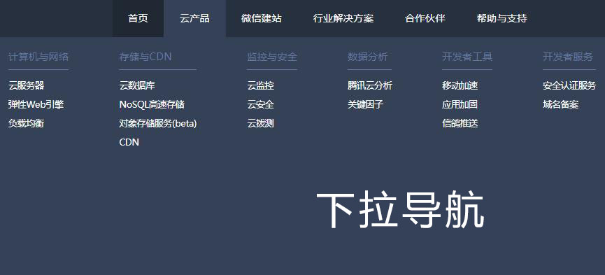
jQuery mobile navigation drop-down menu code

The jQuery mobile navigation drop-down menu code is a multi-level drop-down menu code that supports unlimited submenu mode expansion and contraction code.
All resources on this site are contributed by netizens or reprinted by major download sites. Please check the integrity of the software yourself! All resources on this site are for learning reference only. Please do not use them for commercial purposes. Otherwise, you will be responsible for all consequences! If there is any infringement, please contact us to delete it. Contact information: admin@php.cn

 Solve the problem that Bootstrap NavWalker navigation fails in the mobile drop-down menu
10 Dec 2025
This article aims to solve the problem of the navigation menu created in WordPress using Bootstrap NavWalker. The drop-down menu displays normally on the desktop but fails on the mobile side. By adding specific CSS classes, you can effectively solve the problem that the mobile drop-down menu cannot be expanded and ensure that the navigation can be used normally on various devices.
 Implement responsive navigation bar and drop-down menu: perfect adaptation between desktop and mobile
28 Feb 2026
This tutorial will guide you on how to build a fully functional responsive navigation bar that provides an intuitive drop-down menu on desktop and elegantly transforms into a hamburger menu on small screen devices. We'll combine HTML structure, CSS styling, and JavaScript interactions to ensure that the navigation system provides a smooth and consistent user experience across different viewports.
 Solve the problem that the Bootstrap NavWalker navigation drop-down menu fails on the mobile side
19 Dec 2025
This article aims to solve the problem that when using Bootstrap NavWalker to create a navigation menu in WordPress, the drop-down menu displays normally on the desktop but fails on the mobile side. By adding specific CSS classes, this problem can be effectively fixed to ensure that the drop-down menu works properly on various devices and improves the user experience.
 How to implement jQuery mobile drop-down menu to automatically close other submenus
03 Mar 2026
This article introduces how to use jQuery to implement the interactive logic of "click to expand the current item and automatically collapse other expanded items" for the mobile drop-down menu, preventing multiple submenus from opening at the same time and improving the user experience.
 Optimize mobile navigation: realize the automatic closing function of clicking menu items
27 Nov 2025
This tutorial aims to solve the user experience problem of the mobile navigation menu not automatically closing after clicking any menu item. We will optimize the JavaScript event listening mechanism, bind the click event to the entire navigation menu container, and use CSS styles to dynamically switch the display state of the menu, so that the navigation menu can be automatically closed after clicking on a menu item, switch button or menu area, improving the smoothness and intuitiveness of user interaction.
 JavaScript event processing: automatically close the dynamic menu after clicking the navigation link
26 Nov 2025
This tutorial aims to solve common hamburger menu interaction problems in web development. When the user clicks the hamburger button to open the navigation menu, and then clicks any of the navigation links, the menu usually does not close automatically. This article will introduce in detail how to add event listeners to navigation links through JavaScript so that they can automatically remove the display state of the menu after being clicked, thereby optimizing the user experience and ensuring the smoothness and intuitiveness of the navigation process.
 JavaScript implements automatic closing of responsive navigation menu
02 Dec 2025
This article will guide you on how to implement the function of automatically closing the menu after clicking an internal link in a responsive navigation menu. By adding a unified event listener to the navigation item, when the user selects any navigation link, the system will remove the display style of the menu, thus improving the user experience and avoiding the problem of the menu blocking content or needing to be closed manually.
 JavaScript implements automatic closing of mobile menu after clicking navigation link
21 Nov 2025
This tutorial will guide how to use JavaScript to automatically close the full-screen overlay menu after clicking the navigation link in the hamburger menu in responsive web design. We will optimize the user experience by adding unified class names for navigation links and listening for click events, and removing CSS classes that control menu visibility.
 How to create a vertical navigation menu in HTML? (Sidebar UI)
13 Jan 2026
The vertical navigation menu should use a semantic structure and cooperate with CSS Flexbox or block-level layout to achieve vertical stacking to ensure accessibility, SEO friendliness and keyboard navigation support.


Popular tool

Black left navigation management panel ui special effects
Native js css3 is used to create a black and practical left-hand category navigation management panel with icon text vertical navigation menu ui layout. Suitable for: functional and backend management UI website templates.

jQuery left drop-down navigation menu background frame template
jQuery creates a vertical drop-down navigation bar on the left and an embedded iframe navigation menu background page template.

js-realize expandable hidden navigation menu button special effects
Simple and practical expandable hidden navigation menu button js special effects code download. The feature of this menu is that the menu can be expanded when the button is clicked. When expanded, it has flexible animation effects, which is quite cool. Menu items are small icons. Of course, you can also use icons combined with text. Since the hidden/expanded method is relatively space-saving, this menu can be applied to mobile devices.

Interactive liquid navigation tab bar
A super popular HTML+CSS interactive liquid navigation tab bar with a very beautiful and concise design