Site Web http://zm.163.com/
Comment obtenir cet effet
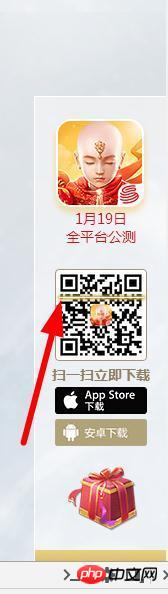
est une simple animation CSS3
.light_pc {
        width: 93px;
        height: 9px;
        position: absolute;
        top: 0;
        left: 50%;
        margin-left: -46px;
        background: url(https://zm.res.netease.com/pc/fab/20161226201931/img/light_pc_f3d5dee.png?_sprite) no-repeat;
        -moz-animation: light_pc 4s linear 0s infinite;
        -webkit-animation: light_pc 4s linear 0s infinite;
        -o-animation: light_pc 4s linear 0s infinite;
        -ms-animation: light_pc 4s linear 0s infinite;
        animation: light_pc 4s linear 0s infinite
    }

    @-webkit-keyframes light_pc {
        0% {
            top: 0
        }
        50% {
            top: 83px
        }
        100% {
            top: 0
        }
    }

    @-moz-keyframes light_pc {
        0% {
            top: 0
        }
        50% {
            top: 83px
        }
        100% {
            top: 0
        }
    }

    @-ms-keyframes light_pc {
        0% {
            top: 0
        }
        50% {
            top: 83px
        }
        100% {
            top: 0
        }
    }

    @-o-keyframes light_pc {
        0% {
            top: 0
        }
        50% {
            top: 83px
        }
        100% {
            top: 0
        }
    }

    @keyframes light_pc {
        0% {
            top: 0
        }
        50% {
            top: 83px
        }
        100% {
            top: 0
        }
    }
Affichez les éléments et apprenez-en plus sur l'animation CSS
Il y a un p à l'extérieur de l'image du code QR qui correspond à la hauteur de l'imageUtiliser : avant pour faire une ligne horizontaleÉcrire un mouvement d'animation CSS3
Je publierai également mon animation
  demo {
  transform: translate3d(0, 0, 0);
  animation: bounce 0.8s infinite ease-out;
}
@-webkit-keyframes bounce {
  50% {
    transform: translate3d(0, -0.2rem, 0);
  }
}


![[Web front-end] Démarrage rapide de Node.js](https://img.php.cn/upload/course/000/000/067/662b5d34ba7c0227.png)


est une simple animation CSS3
Affichez les éléments et apprenez-en plus sur l'animation CSS
Il y a un p à l'extérieur de l'image du code QR qui correspond à la hauteur de l'image
Utiliser : avant
pour faire une ligne horizontale
Écrire un mouvement d'animation CSS3
Je publierai également mon animation