


这篇文章主要介绍了关于如何使用CSS3制作彩色进度条样式,有着一定的参考价值,现在分享给大家,有需要的朋友可以参考一下
用CSS3的border-radius、box-shadow、transition、-moz-linear-gradient、-webkit-gradient等样式就可以完成一个时尚进度条,这里我们来看几个CSS3制作彩色进度条样式的代码示例分享:
一、制作静态的紫色条纹进度条
html代码:
css代码:
body { background-color:#333; } .progress-bar { background-color:#222; border-radius:3px; width:300px; height:24px; padding:5px; margin:50px; border-bottom:1px solid #444; box-shadow:inset 0 0 2px 0 #000; } .progress-bar span { display:inline-block; width:140px; height:24px; border-radius:2px; box-shadow:0 1px 0 rgba(255, 255, 255, 0.5) inset; -moz-box-shadow:0 1px 0 rgba(255, 255, 255, 0.5) inset; -webkit-box-shadow:rgba(255,255,255,0.5) 0 1px 0 inset; } .purple span{ background-color:#F09; background-image:-moz-linear-gradient(45deg, rgba(255, 255, 255, 0.3) 25%, transparent 25%, transparent 50%, rgba(255, 255, 255, 0.3) 50%, rgba(255, 255, 255, 0.3) 75%, transparent 75%); background-image:-webkit-gradient(linear,0 100%,100% 0,color-stop(25%,rgba(255,255,255,0.3)),color-stop(25%,transparent),color-stop(50%,transparent),color-stop(50%,rgba(255,255,255,0.3)),color-stop(75%,rgba(255,255,255,0.3)),color-stop(75%,transparent)); background-size:16px 16px; }
最终效果如下图所示: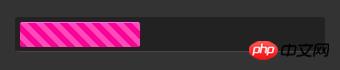
二、制作静态的蓝色进度条
html代码:
css代码:
.orange span{ background-image:-webkit-gradient(linear,0% 0%,0% 100%,from(#fecd22),to(#fd9415)); background-image:-moz-linear-gradient(-90deg,#fecd22,#fd9415); }
最终效果如下图所示: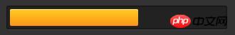
三、制作静态的绿色进度条
html代码:
css代码:
.green span{ background-color:#00ff24; box-shadow:rgba(255,255,255,0.7)0 5px 5px inser,rgba(255,255,255,0.7)0 -5px 5px inset; -webkit-box-shadow:rgba(255, 255, 255, 0.7) 0 5px 5px inset, rgba(255, 255, 255, 0.7) 0 -5px 5px inset; -moz-box-shadow:rgba(255, 255, 255, 0.7) 0 5px 5px inset, rgba(255, 255, 255, 0.7) 0 -5px 5px inset; }
最终效果如下图所示: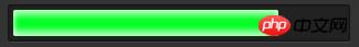
四、为紫色条纹添加动态效果
css代码:
.purple span:hover{ -webkit-animation:animate-stripes 3s linear infinite; -moz-animation:3s linear 0s normal none infinite animate-stripes; } @-webkit-keyframes animate-stripes { 0% {background-position: 0 0;} 100% {background-position: 60px 0;} } @-moz-keyframes animate-stripes { 0% {background-position: 0 0;} 100% {background-position: 60px 0;} }
鼠标放上去之后,动态效果会出现。
以上就是本文的全部内容,希望对大家的学习有所帮助,更多相关内容请关注PHP中文网!
相关推荐:
Ce qui précède est le contenu détaillé de. pour plus d'informations, suivez d'autres articles connexes sur le site Web de PHP en chinois!
 tutoriel CSS3
 Quelles sont les propriétés du dégradé CSS3 ?
 Site de trading Bitcoin
 Le rôle de la balise applet en HTML
 Que faire si la visionneuse de photos Windows manque de mémoire
 La différence entre php et js
 Comment mettre à niveau le système Hongmeng sur le téléphone mobile Honor
 Comment utiliser le code source d'une page Web PHP


![[Web front-end] Démarrage rapide de Node.js](https://img.php.cn/upload/course/000/000/067/662b5d34ba7c0227.png)


