


Obtenez l'effet de chargement comme indiqué dans l'image : 
code html :
提交订单中<span class="ani_dot">...</span>
Code CSS :
.ani_dot {
    font-family: simsun;
}
:root .ani_dot { /* 这里使用Hack是因为IE6~IE8浏览器下, vertical-align解析不规范,值为bottom或其他会改变按钮的实际高度*/
    display: inline-block;
    width: 1.5em;
    vertical-align: bottom;
    overflow: hidden;
}
@-webkit-keyframes dot {
    0% { width: 0; margin-right: 1.5em; }
    33% { width: .5em; margin-right: 1em; }
    66% { width: 1em; margin-right: .5em; }
    100% { width: 1.5em; margin-right: 0;}
}
.ani_dot {
    -webkit-animation: dot 3s infinite step-start;
}

@keyframes dot {
    0% { width: 0; margin-right: 1.5em; }
    33% { width: .5em; margin-right: 1em; }
    66% { width: 1em; margin-right: .5em; }
    100% { width: 1.5em; margin-right: 0;}
}
.ani_dot {
    animation: dot 3s infinite step-start;
}Le résultat tel qu'indiqué dans l'image apparaît.
Remarque :
1 Dans IE10+ et d'autres navigateurs, l'animation point-point disparaît, tandis que IE6-IE9 sont des points-points ordinaires. texte.
2. L'animation animée est continue, mais ici nous la faisons image par image, carte par carte. L'effet n'est pas si continu, alors utilisezstep-start.
3. Le code ci-dessus utilise également le sélecteur css3:root. :root est un hack pour IE9+ et d'autres navigateurs modernes. Sous IE6-7 et même IE8, la résolution vertical-align:bottom des éléments horizontaux en ligne est différente de celle des éléments horizontaux en ligne, ce qui entraînera une expansion en hauteur. display: inline- Le bloc doit être piraté.
Étant donné que l'animation d'animation a été utilisée ci-dessus, voici une introduction détaillée aux paramètres de cette animation.
L'animation CSS (Animations) consiste simplement à modifier secrètement une ou plusieurs de ses valeurs CSS à une certaine fréquence dans un temps d'animation fixe, obtenant ainsi des effets d'animation de transformation visuelle. De nombreux aspects des animations peuvent être contrôlés, notamment la durée d'exécution de l'animation, les valeurs de début et de fin, ainsi que les pauses d'animation et les heures de début différées.
<single-animation> = <single-animation-name> || <time> || <single-animation-timing-function> || <time> || <single-animation-iteration-count> || <single-animation-direction> || <single-animation-fill-mode> || <single-animation-play-state> <' animation-name '>:检索或设置对象所应用的动画名称<' animation-duration '>:检索或设置对象动画的持续时间<' animation-timing-function '>:检索或设置对象动画的过渡类型<' animation-delay '>:检索或设置对象动画延迟的时间<' animation-iteration-count '>:检索或设置对象动画的循环次数<' animation-direction '>:检索或设置对象动画在循环中是否反向运动<' animation-fill-mode '>:检索或设置对象动画时间之外的状态<' animation-play-state '>:检索或设置对象动画的状态。w3c正考虑是否将该属性移除,因为动画的状态可以通过其它的方式实现,比如重设样式
Propriété abrégée pour toutes les propriétés d'animation, à l'exception de la propriété animation-play-state.
Spécifie le nom de l'animation @keyframes. C'est le nom de l'animation suivi de @keyframes. Cette démo est appelée dot dans cet article, ce qui signifie « point ».
Spécifie les secondes ou millisecondes nécessaires à l'animation pour terminer un cycle. La valeur par défaut est 0.
Spécifie la courbe de vitesse de l'animation. La valeur par défaut est « facilité ».
Paramètres courants de vitesse d'animation :
linéaire : transition linéaire. Equivalent à la courbe de Bézier (0.0, 0.0, 1.0, 1.0)
facilité : transition en douceur. Equivalent à la courbe de Bézier (0,25, 0,1, 0,25, 1,0)
facilité : de lent à rapide. Equivalent à la courbe de Bézier (0,42, 0, 1,0, 1,0)
allègement : de rapide à lent. Equivalent à la courbe de Bézier (0, 0, 0,58, 1,0)
facilité d'entrée-sortie : de lent à rapide puis à ralentir. Équivalent à la courbe de Bézier (0,42, 0, 0,58, 1,0)
step-start : Équivalent aux étapes (1, start)
étape -end : équivalent à steps(1, end)
steps(
]?) : accepte la fonction d'étape à deux paramètres. Le premier paramètre doit être un entier positif précisant le nombre d'étapes de la fonction. La valeur du deuxième paramètre peut être start ou end, spécifiant le moment où la valeur de chaque étape change. Le deuxième paramètre est facultatif et la valeur par défaut est end.
cubic-bezier(
précise quand l'animation démarre. La valeur par défaut est 0. C’est-à-dire qu’il fait référence au temps d’exécution retardé de l’animation.
Spécifie le nombre de fois que l'animation est jouée. La valeur par défaut est 1. Bien sûr, nous pouvons le régler 2 fois, 3 fois, etc. Il existe également un mot-clé de boucle sans fil infinite, ce qui signifie que l'animation est jouée de manière répétée en boucle.
Spécifie si l'animation est jouée à l'envers lors du cycle suivant. La valeur par défaut est "normale". Bien sûr, il y a aussi les valeurs suivantes :
reverse : Courir dans le sens inverse
alternate : L'animation tourne normalement d'abord, puis s'exécute dans le sens inverse. Et continue à s'exécuter en alternance
alternate-reverse : L'animation s'exécute d'abord dans le sens inverse, puis s'exécute dans le sens avant, et continue à exécuter en alternance
Spécifie l'état de l'objet en dehors du temps d'animation.
none : Valeur par défaut. Ne pas définir l'état de l'objet en dehors de l'animation
forwards : Définir l'état de l'objet sur l'état à la fin de l'animation
backwards : Définir l'état de l'objet est l'état au début de l'animation
both : Définir l'état de l'objet sur l'état à la fin ou au début de l'animation. animation.Avant le début de l'animation, il s'agit de l'image clé « de » ou « 0 % » ; une fois l'animation terminée, elle est dans l'état d'image clé « à » ou « 100 % ».
Spécifie si l'animation est en cours d'exécution ou en pause. La valeur par défaut est "running". Il y a aussi une valeur paused : pause.
from to:p{
width:100px;
height:100px;
background:red;
position:relative;
animation:mymove 5s infinite;
-moz-animation:mymove 5s infinite; /*Firefox*/
-webkit-animation:mymove 5s infinite; /*Safari and Chrome*/
}
@keyframes mymove{
from {left:0px;}
to {left:200px;}
}
@-moz-keyframes mymove { /*Firefox*/
from {left:0px;}
to {left:200px;}
}
@-webkit-keyframes mymove{ /*Safari and Chrome*/
from {left:0px;}
to {left:200px;}
}@keyframes myfirst{
0% {background: red; left:0px; top:0px;}
25% {background: yellow; left:200px; top:0px;}
50% {background: blue; left:200px; top:200px;}
75% {background: green; left:0px; top:200px;}
100% {background: red; left:0px; top:0px;}
}
@-moz-keyframes myfirst{ /* Firefox */
0% {background: red; left:0px; top:0px;}
25% {background: yellow; left:200px; top:0px;}
50% {background: blue; left:200px; top:200px;}
75% {background: green; left:0px; top:200px;}
100% {background: red; left:0px; top:0px;}
}
@-webkit-keyframes myfirst{ /* Safari 和 Chrome */
0% {background: red; left:0px; top:0px;}
25% {background: yellow; left:200px; top:0px;}
50% {background: blue; left:200px; top:200px;}
75% {background: green; left:0px; top:200px;}
100% {background: red; left:0px; top:0px;}
}
@-o-keyframes myfirst {/* Opera */
0% {background: red; left:0px; top:0px;}
25% {background: yellow; left:200px; top:0px;}
50% {background: blue; left:200px; top:200px;}
75% {background: green; left:0px; top:200px;}
100% {background: red; left:0px; top:0px;}
}只有webkit内核的浏览器才能看到相关3D动画效果。
实现效果如图所示: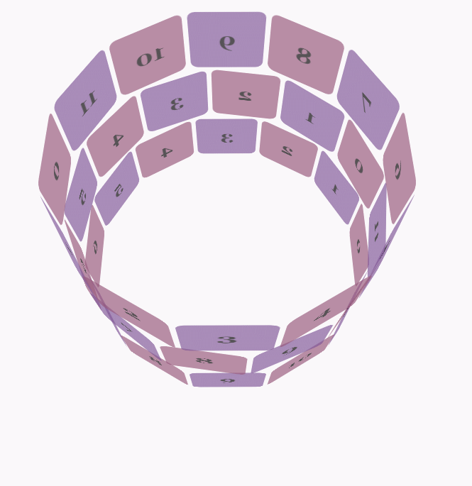
css代码:
body {
        font-family: 'Lucida Grande', Verdana, Arial;
        font-size: 12px;
      }

      #stage {
        margin: 150px auto;
        width: 600px;
        height: 400px;
        -webkit-perspective: 800;
      }

      #rotate {
        margin: 0 auto;
        width: 600px;
        height: 400px;
        -webkit-transform-style: preserve-3d;
        -webkit-animation-name: x-spin;
        -webkit-animation-duration: 7s;
        -webkit-animation-iteration-count: infinite;
        -webkit-animation-timing-function: linear;
      }

      .ring {
        margin: 0 auto;
        height: 110px;
        width: 600px;
        -webkit-transform-style: preserve-3d;
        -webkit-animation-iteration-count: infinite;
        -webkit-animation-timing-function: linear;
      }

      .ring > :nth-child(odd) {
        background-color: #995C7F;
      }

      .ring > :nth-child(even) {
        background-color: #835A99;
      }

      .poster {
        position: absolute;
        left: 250px;
        width: 100px;
        height: 100px;
        opacity: 0.7;
        color: rgba(0,0,0,0.9);
        -webkit-border-radius: 10px;
      }

      .poster > p {
        font-family: 'Georgia', serif;
        font-size: 36px;
        font-weight: bold;
        text-align: center;
        margin-top: 28px;
      }

      #ring-1 {
        -webkit-animation-name: y-spin;
        -webkit-animation-duration: 5s;
      }

      #ring-2 {
        -webkit-animation-name: back-y-spin;
        -webkit-animation-duration: 4s;
      }

      #ring-3 {
        -webkit-animation-name: y-spin;
        -webkit-animation-duration: 3s;
      }

      @-webkit-keyframes x-spin {
        0%    { -webkit-transform: rotateX(0deg); }
        50%   { -webkit-transform: rotateX(180deg); }
        100%  { -webkit-transform: rotateX(360deg); }
      }

      @-webkit-keyframes y-spin {
        0%    { -webkit-transform: rotateY(0deg); }
        50%   { -webkit-transform: rotateY(180deg); }
        100%  { -webkit-transform: rotateY(360deg); }
      }

      @-webkit-keyframes back-y-spin {
        0%    { -webkit-transform: rotateY(360deg); }
        50%   { -webkit-transform: rotateY(180deg); }
        100%  { -webkit-transform: rotateY(0deg); }
}html代码:
<p id="stage">
  <p id="rotate">
    <p id="ring-1" class="ring"></p>
    <p id="ring-2" class="ring"></p>
    <p id="ring-3" class="ring"></p>
  </p>
</p>js代码:
const POSTERS_PER_ROW = 12;
const RING_RADIUS = 200;
function setup_posters (row){
var posterAngle = 360 / POSTERS_PER_ROW;
for (var i = 0; i < POSTERS_PER_ROW; i ++) {
var poster = document.createElement('p');
poster.className = 'poster';
var transform = 'rotateY(' + (posterAngle * i) + 'deg) translateZ(' + RING_RADIUS + 'px)';
poster.style.webkitTransform = transform;
var content = poster.appendChild(document.createElement('p'));
content.textContent = i;
row.appendChild(poster);
}
}
function init (){
setup_posters(document.getElementById('ring-1'));
setup_posters(document.getElementById('ring-2'));
setup_posters(document.getElementById('ring-3'));
}
window.addEventListener('load', init, false);Ce qui précède est le contenu détaillé de. pour plus d'informations, suivez d'autres articles connexes sur le site Web de PHP en chinois!
 tutoriel CSS3
 Quelles sont les propriétés du dégradé CSS3 ?
 Qu'est-ce qu'un fichier TmP
 Explication détaillée de l'événement onbeforeunload
 emplacement.assign
 Introduction à l'emplacement d'ouverture d'exécution de Windows 10
 La différence entre la balise d'article et la balise de section
 La différence entre mysql et sql_server


![[Web front-end] Démarrage rapide de Node.js](https://img.php.cn/upload/course/000/000/067/662b5d34ba7c0227.png)


