
php editor Xinyi will introduce to you how to add a graphic column chart and a line chart in Excel 2016. Column charts and line charts are commonly used chart types in Excel, and they can visually display data trends and comparison results. Through the detailed steps and diagrams in this article, you can easily learn to make these two charts in Excel 2016 to improve the effect of data display and visualization.
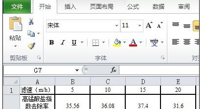
1. Create a new excel2016 and import the data used.
Using the data in the figure, the first row of data is used as the X-axis data, and the last two rows of data are used as the Y-axis data.
2. First draw the data into a scatter plot.
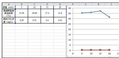
Select the data and select [Scatter Plot] in the [Insert] column. When drawing a scatter plot, select [Scatter Plot with Straight Lines and Data Markers] as shown in the figure.

3. Data analysis.
As can be seen from the figure, the magnitude difference between the two sets of Y-axis data is large, and it is obviously inappropriate to display it under one Y-axis. Therefore, two Y-axes need to be used.
4. Change the coordinate axis of another set of numerical data.
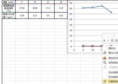
Select the red data (the data to be operated on), right-click, and click [Set Data Series Format].
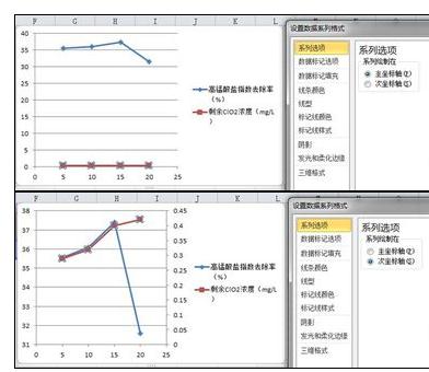
5. Click [Secondary Axis].
A dialog box will appear, click [Secondary Axis], then the second Y-axis will appear on the right side of the chart, and the selected data will be based on the second Y-axis.
6. Change the chart type.
Select the red data (data to be operated), click the [Change Chart Type] icon in the upper left corner, and then select [Clustered Column Chart] in [Column Chart]. At this point, the diagram we need is almost complete.
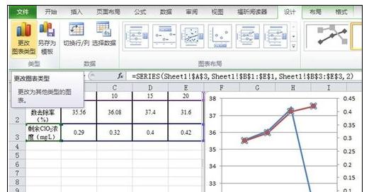
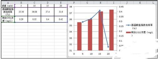
#7. When the coordinate data is inappropriate, the format of the coordinate axis needs to be changed.
The following figure is an example of changing the second Y axis. Click to select the second Y-axis data, then right-click and select [Format Axis].
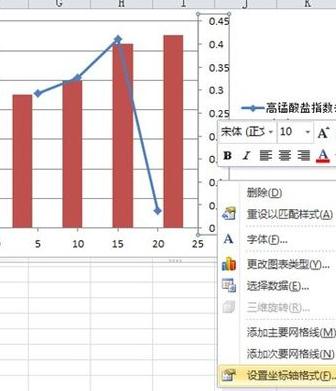
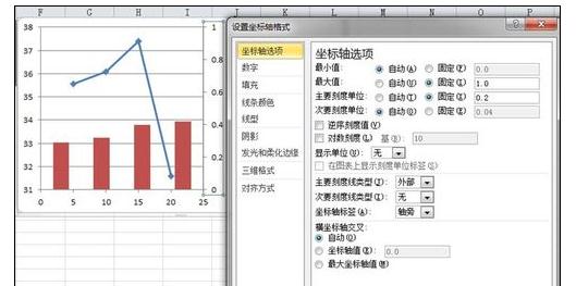
8. Setting of coordinate axis options.
In this example, the [maximum value] is fixed to 1, the [minimum value] is fixed to 0, the [major scale unit] is fixed to 0.2, and the [minor scale unit] only needs to be larger than the [major scale unit] 】As small as possible.
The above is the detailed content of How to add a graphic method for drawing column charts and line charts in excel2016. For more information, please follow other related articles on the PHP Chinese website!


