
In recent years, the steps to adjust the decimal point of the Excel icon axis scale to be consistent have attracted much attention. PHP editor Zimo carefully compiled a detailed operation guide to provide a concise and easy-to-understand solution for the majority of Excel users. Through the guidance of this article, readers will be able to easily deal with the consistent setting of decimal points for chart coordinate axis scales in Excel, improve work efficiency, and more easily complete data analysis and chart display work.
1. To give a simple example, draw a line chart on a set of data.
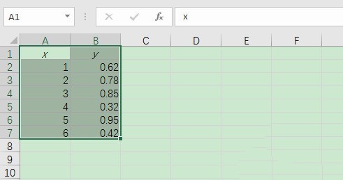
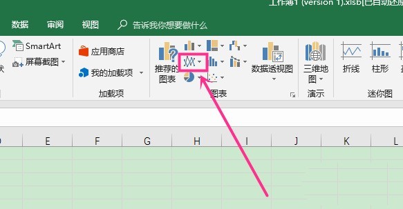
2. Click the Insert tool on the menu above Excel to insert a line chart.
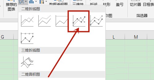
3. Select the style of the line chart, such as one with marked points.
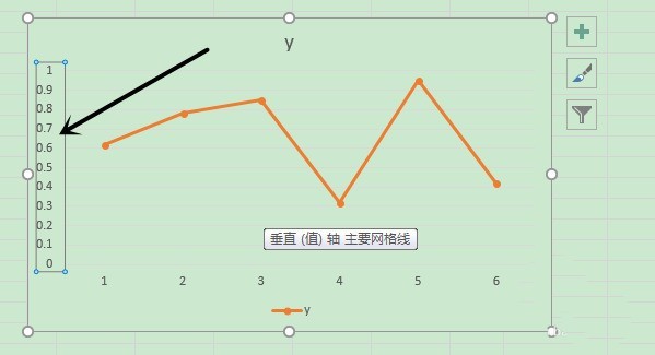
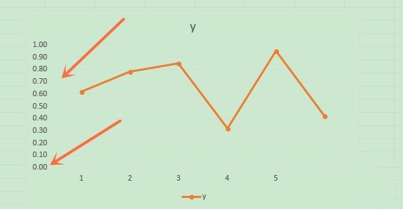
4. As shown in the figure, the ordinate of the icon has different decimal places. Double-click the ordinate.
5. Adjust the numerical settings in the setting axis format that appears on the right.
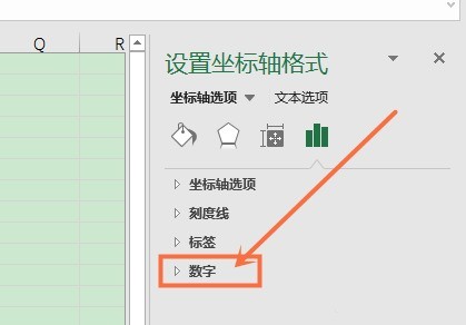
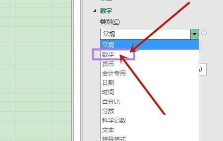
#6. In the number category, select the number format as -number to adjust the format of the ordinate and unify it.
The above is the detailed content of Steps to adjust the decimal point of Excel icon coordinate axis scale to be consistent. For more information, please follow other related articles on the PHP Chinese website!
 How to use aspose
 Introduction to crawler tools
 What are the methods to implement operator overloading in Go language?
 How to set ppt widescreen
 What are the data backup software?
 The difference and connection between c language and c++
 Introduction to virtualization software
 Where is the PR fade in and fade out effect?


