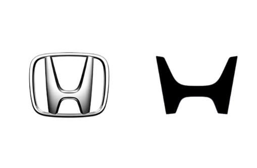
Honda showed off a series of eye-catching new electric vehicles at CES 2024, all equipped with updated "H" badges.
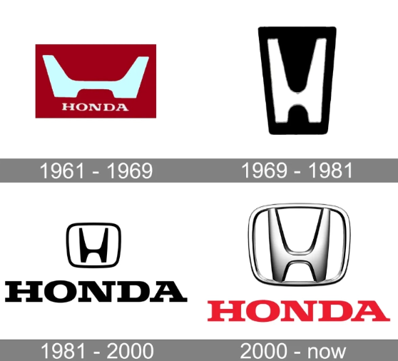
Honda officials recently announced a major adjustment to the brand logo, abandoning the previous quasi-materialistic metal texture design and adopting a flatter and simpler symbol form. The design of the new logo is inspired by the Honda brand’s original logo from 1961, which is a surprising decision.

It is understood that since 1981, Honda’s “H” logo has been carrying the brand’s history and glory. However, in order to adapt to the rapid development of the electric vehicle market, Honda decided to redesign the "H" logo to show the brand's determination to innovate and transform. The new logo not only represents Honda’s corporate spirit of self-breakthrough and transcendence, but also symbolizes Honda’s commitment to expanding the infinite possibilities of mobility. The two outstretched hands symbolize Honda's commitment to meeting the needs of electric vehicle users. This new "H" logo will be widely used on Honda's upcoming next-generation electric vehicle product line, including the highly anticipated Honda 0 Series models.


Looking back at the evolution of the Honda Logo, one can’t help but lament the reincarnation of fashion. The official drew inspiration from the original Logo design and reshaped the classic with a more concise and modern approach. The public's evaluation of this new logo is mixed, but it will undoubtedly become a symbol of Honda's new era of electric vehicles.
The above is the detailed content of Back to basics! Honda redesigns logo and launches new electric vehicle series. For more information, please follow other related articles on the PHP Chinese website!


