


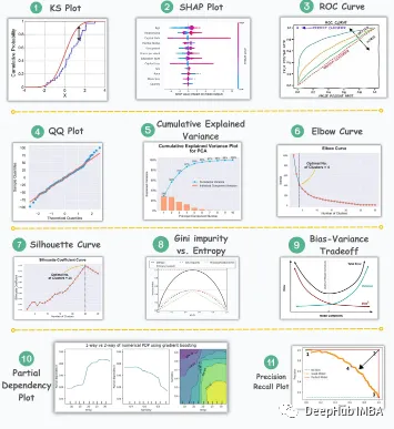
Visualization is a powerful tool for communicating complex data patterns and relationships in an intuitive and understandable way. They play a vital role in data analysis, providing insights that are often difficult to discern from raw data or traditional numerical representations.
Visualization is essential for understanding complex data patterns and relationships, and we’ll introduce 11 of the most important and must-know charts that help reveal information in your data, making Complex data is more understandable and meaningful.
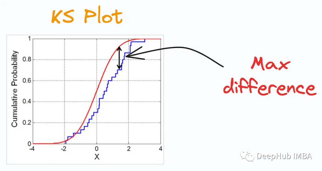
KS Plot is used Evaluate distribution differences. The core idea is to measure the maximum distance between the cumulative distribution functions (CDF) of two distributions. The smaller the maximum distance, the more likely they belong to the same distribution. So it is mainly interpreted as a "statistical test" to determine the difference in distributions, rather than a "plot".
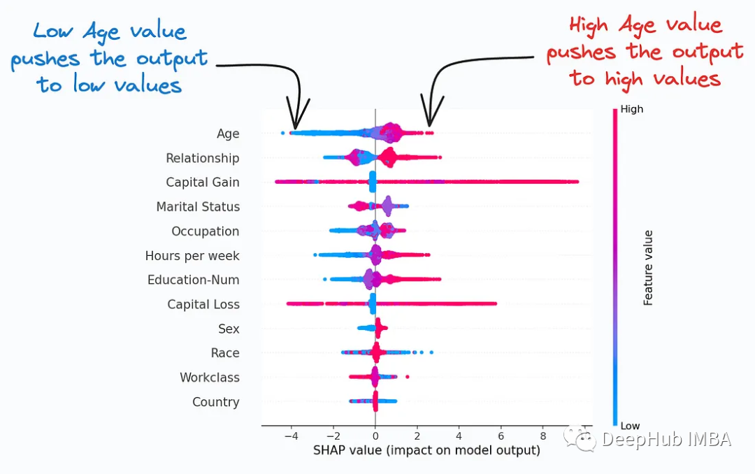
##SHAP Plot considers the interactions/dependencies between features To summarize the importance of features to model predictions. Useful when determining how different values (low or high) of a feature affect the overall output.
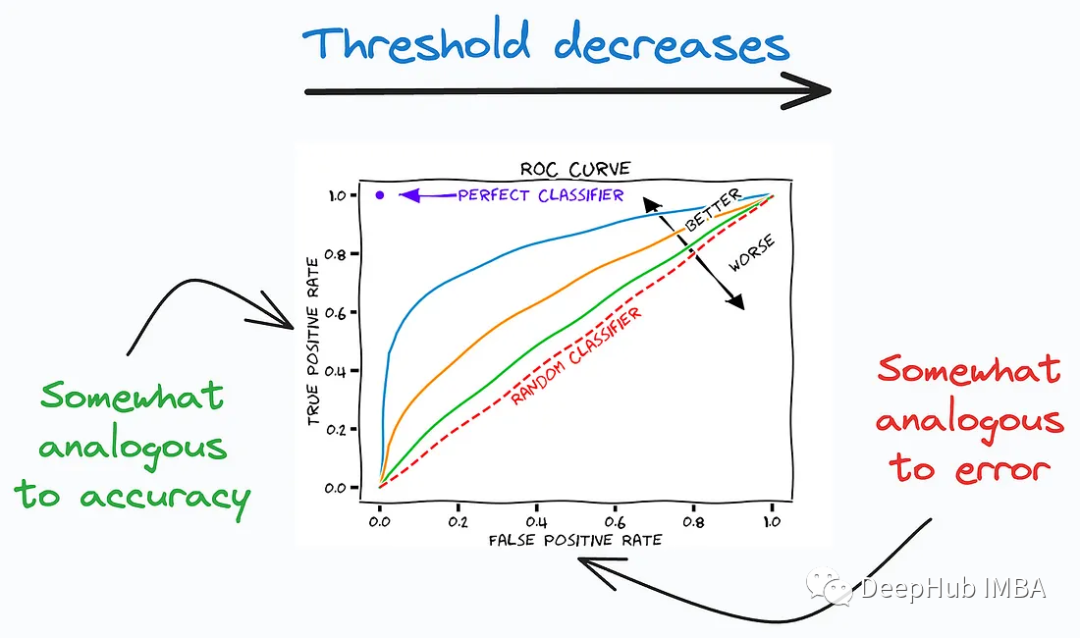
The ROC curve is a commonly used tool, particularly useful for evaluating the performance of medical diagnostic tests, machine learning classifiers, risk models, and more. By analyzing ROC curves and calculating AUC, you can better understand the performance of your classifier, select appropriate thresholds, and compare performance between different models.
4. Precision-Recall Curve
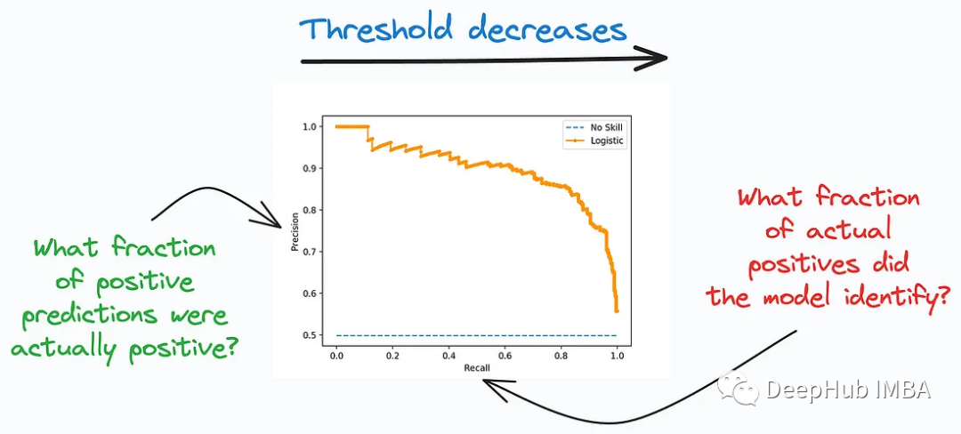 ##Precision-Recall Curve It is another important tool for evaluating the performance of classification models, especially for problems with imbalanced class distribution, where the number of positive and negative class samples differs greatly. This curve focuses on the model’s prediction accuracy in the positive category and its ability to find all true positive examples. It describes the trade-off between precision and recall between different classification thresholds.
5. QQ Plot
##QQ Plot (Quantile-Quantile Plot, quantile-point Quantile plot) is a data visualization tool used to compare whether the quantile distributions of two data sets are similar. It is often used to check whether a data set conforms to a specific theoretical distribution, such as the normal distribution.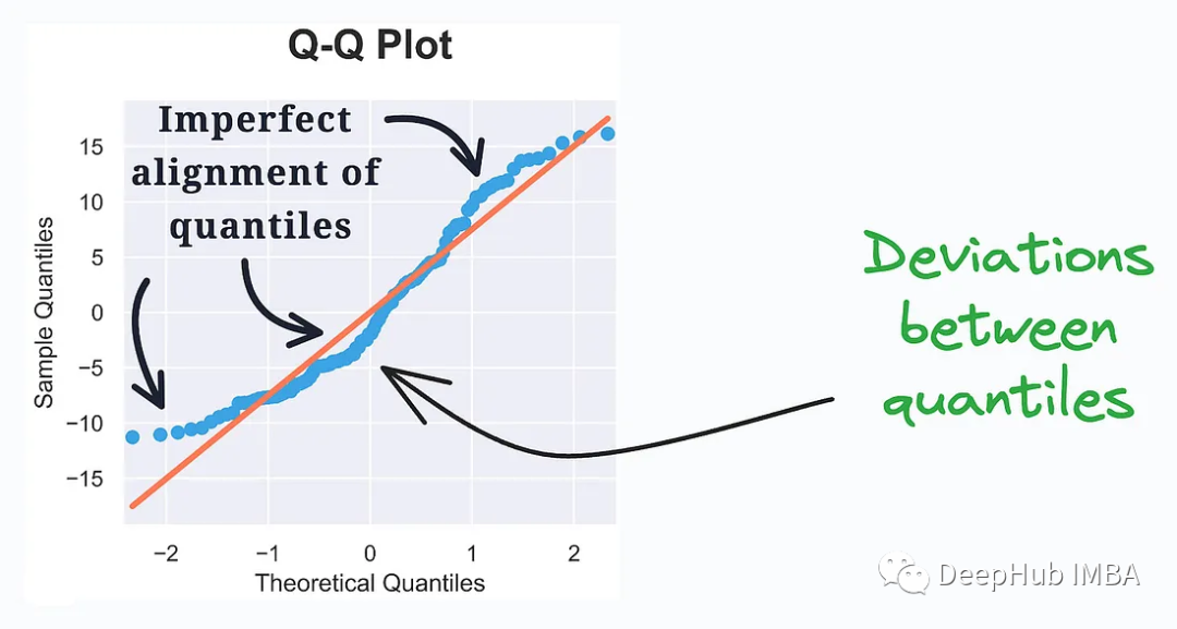
It evaluates the distribution similarity between observed data and the theoretical distribution. Quantiles of the two distributions are plotted. Deviation from a straight line represents a departure from the assumed distribution.
QQ Plot is an intuitive tool that can be used to examine the distribution of data, especially in statistical modeling and data analysis. By observing the position of the points on the QQ Plot, you can understand whether the data conforms to a certain theoretical distribution, or whether there are outliers or deviations.
6. Cumulative Explained Variance Plot
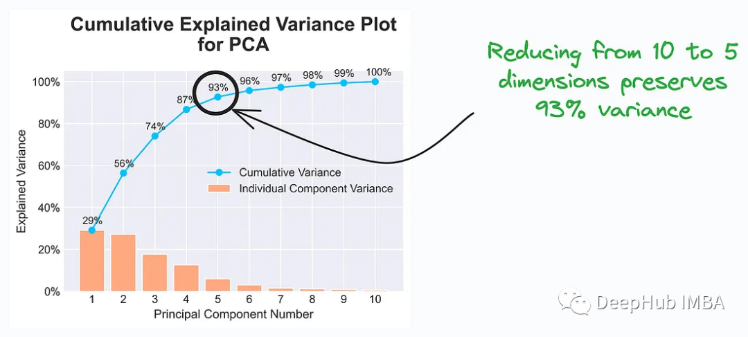
Data scientists and analysts will choose the appropriate number of principal components based on the information in the Cumulative Explained Variance Plot so that the characteristics of the data can still be effectively represented after dimensionality reduction. This helps reduce data dimensions, improve model training efficiency, and retain enough information to support successful task completion.
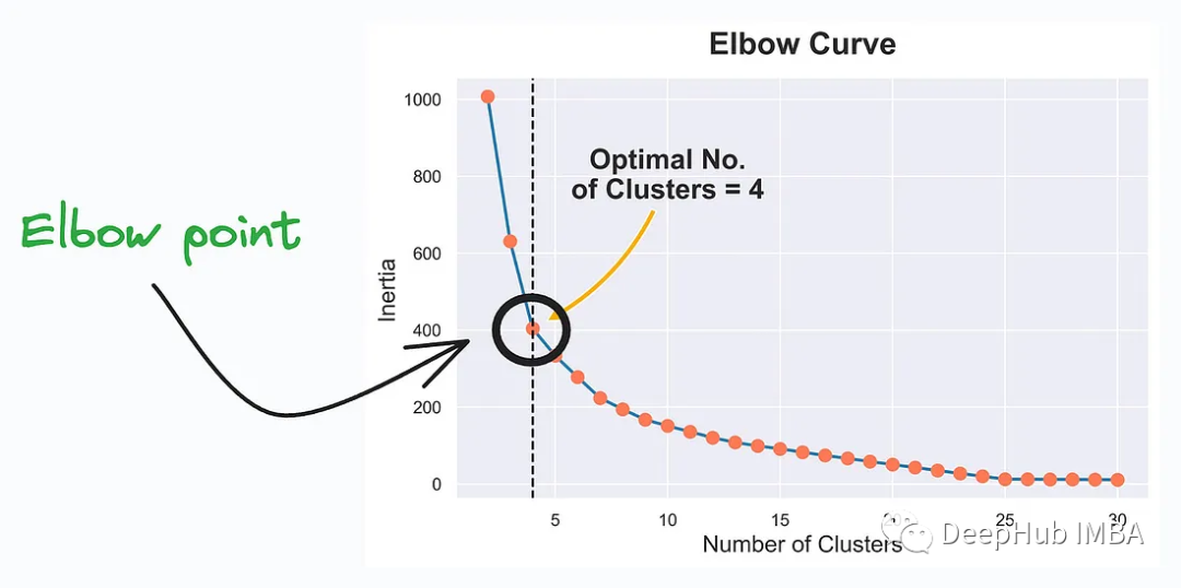
Elbow Curve (elbow curve) is a method used to help determine K-Means clustering Visualization tool for the optimal number of clusters (number of clusters) in . K-Means is a commonly used unsupervised learning algorithm used to classify data points into different clusters or groups. Elbow Curve helps find the right number of clusters to best represent the structure of your data.
Elbow Curve is a commonly used tool to help select the optimal number of clusters in K-Means clustering. The point at the elbow represents the ideal number of clusters. This better captures the underlying structure and patterns of the data.
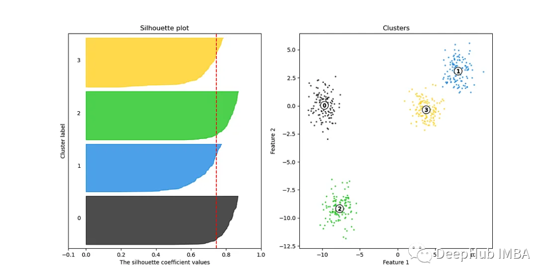
##Silhouette Curve (contour coefficient curve) is a kind of A visualization tool for clustering quality, often used to help choose the optimal number of clusters. Silhouette coefficient is a measure of the similarity of data points within clusters and the separation of data points between clusters in clustering.
Silhouette Curve is a powerful tool used to help select the optimal number of clusters to ensure that the clustering model can effectively capture the intrinsic structure and patterns of the data. Elbow curves are often ineffective when there are many clusters. Silhouette Curve is a better choice.
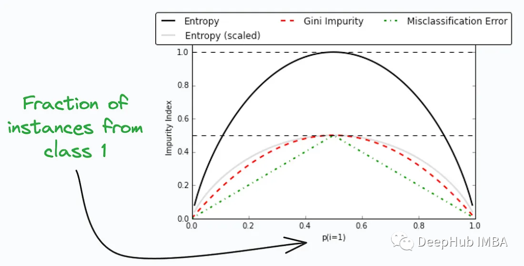
Gini Impurity (Gini Impurity) and Entropy ( Entropy) are two metrics commonly used in machine learning algorithms such as decision trees and random forests to assess the impurity of data and select the best splitting properties. They are both used to measure the amount of clutter in a data set to help decision trees choose how to divide the data.
They are used to measure the impurity or disorder of nodes or splits in a decision tree. The figure above compares Gini impurity and entropy at different splits, which can provide insights into the trade-offs between these measures.
Both are valid indicators for node splitting selection in machine learning algorithms such as decision trees, but which one to choose depends on the specific problem and data characteristics.
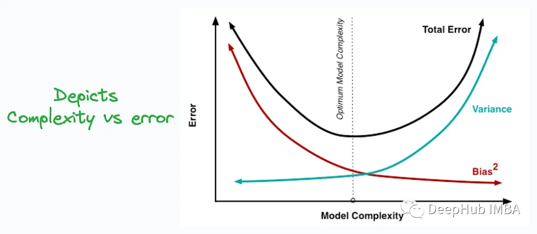
There is a trade-off between bias and variance. When training a machine learning model, increasing model complexity typically decreases bias but increases variance, while decreasing model complexity decreases variance but increases bias. Therefore, there is a trade-off point where the model is both capable of capturing patterns in the data (reducing bias) and showing stable predictions across different data (reducing variance).
Understanding the bias-variance trade-off helps machine learning practitioners better build and tune models to achieve better performance and generalization capabilities. It highlights the relationship between model complexity and data set size, and how to avoid underfitting and overfitting.
11. Partial Dependency Plots:
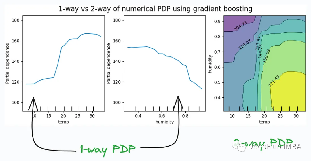
Partial Dependency Plots are often used with interpretive tools and techniques, such as SHAP values, LIME, etc., to help explain the predictions of black-box machine learning models. They provide a visualization that makes it easier for data scientists and analysts to understand the relationships between a model's decisions and features.
Summary
The above is the detailed content of 11 Advanced Visualizations for Data Analysis and Machine Learning. For more information, please follow other related articles on the PHP Chinese website!


![[Web front-end] Node.js quick start](https://img.php.cn/upload/course/000/000/067/662b5d34ba7c0227.png)


