


Google’s Accelerated Mobile Pages (AMP) program has recently helped make websites faster. With good technology and a strong content delivery network, Google directly makes AMP-enhanced websites faster. However, AMP also works indirectly by encouraging us to look at the optimizations and best practices that AMP contains. Even if you don't plan to make your site AMP-compatible, it's useful to understand AMP as a to-do list for optimizing non-AMP sites.
One of the optimizations on this list is a technique called "lazy loading," which we saw in action in our recent article on using AMP's
Lazy loading allows visitors to start interacting with content faster, and enhanced loading speeds can improve your search engine rankings. The more images you have on the page, the bigger the speed boost you'll get.

In this tutorial, we will learn how to deploy lazy loading on a non-AMP website using a script called Layzr.js. We'll replicate the functionality of AMP's <amp-img></amp-img> element as much as possible, but we'll also use some features specific to Layzr.
let us start!
As part of the article "The AMP Project: Will It Make Your Website Faster?" I created a basic layout with five images. To enable you to compare using AMP versus deploying lazy loading yourself, we'll recreate the same five image layouts. I'll show you how to run various loading speed tests later in this tutorial.
In the source files that come with this tutorial, you'll find the AMP version of the layout, as well as the full version you'll make here. Both are included to help you decide which method is best for you.
As we step through it all, I recommend that you test your work using the Chrome Developer Tools (F12) and open the Network tab with Disabled checked Cache and set the limit to regular 3G. This simulates an average mobile connection, shows you a graph of each image loaded in real time, and will help you get a clear picture of how lazy loading is performing.

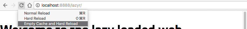
When refreshing the page to test, press and hold the Reload button, which will bring up a drop-down menu showing different options. Choose Clear Cache and Hard Reload to completely simulate a visitor arriving at your site for the first time.
Let’s start with the basics. First, create a folder to house your project and create a file inside it called index.html.
Open it for editing and add the following code:
<!doctype html>
<html lang="en">
  <head>
    <meta charset="utf-8">
    <title>Layzr.js Lazy Loading</title>
    <meta name="viewport" content="width=device-width,minimum-scale=1,initial-scale=1">
    <style>
    body {
      margin: 0;
    }
    img {
      display: block;
      margin: 0 auto;
    }
    </style>
  </head>
  <body>
    <h1>Welcome to the lazy loaded web</h1>


  </body>
</html>
With the code above, we just get an HTML shell and include some CSS to make sure there aren't any unexpected gaps around the page's body and images.
We also include margin: 0 auto; so that the image we add later will be centered.
layzr.js script has two CDN origins for you to load easily - we'll be using the one from Cloudfare.
Add this code to your html, just before the closing </body> tag.
<script src="https://cdnjs.cloudflare.com/ajax/libs/layzr.js/2.0.2/layzr.min.js"></script>
If you don't want to load the script from a CDN, you can download the script and follow the short instructions at: https://github.com/callmecavs/layzr.js#download
Now that we have Layzr loaded, we need to make it execute when the page loads. To do this, add this code after the script tag you just inserted in the previous section:
<script>
const instance = Layzr()

document.addEventListener('DOMContentLoaded', function(event){
  instance.update().check().handlers(true)
})
</script>
This code first creates an instance to contain Layzr, then after loading the DOM content of the page, it uses that instance to activate Layzr's functionality.
So far, your overall code should now look like this:
Layzr.js Lazy Loading
Welcome to the lazy loaded web
<script src="https://cdnjs.cloudflare.com/ajax/libs/layzr.js/2.0.2/layzr.min.js"></script>
<script>
const instance = Layzr()
document.addEventListener('DOMContentLoaded', function(event){
instance.update().check().handlers(true)
})
</script>
</body>
Layzr is loaded and ready, we can start adding some images to let it work its magic. You can use any image you want, but if you'd like to use the exact code example you see in the following steps, you can download the source files that accompany this tutorial. Inside you will find an images folder that you can copy and paste into your own project.
要在使用 Layzr 时添加图像,您将使用常规 img 元素,但不使用 src 属性,而是使用 data-normal 像这样:
<img data-normal="images/vulture.jpg" alt="Who needs AMP? Simplify the process of lazy loading responsive images with Layzr.js">
为了使任何延迟加载脚本正常工作,它需要知道网站上所有图像的高度,以便决定需要加载哪些图像(因为它们位于视口中或靠近视口),以及哪些图像需要加载。应该等待。
然而,棘手的部分是图像在完全加载到页面中之前实际上没有任何高度。这意味着,如果我们希望延迟加载发挥作用,我们需要一种方法在加载图像之前为页面提供有关图像高度的信息。
我们将介绍两种方法来实现这一目标,一种用于固定尺寸图像,另一种用于响应式图像。通过固定大小来赋予图像高度是最简单的方法,因为您只需要添加 height 和 width 属性。
<img data-normal="images/vulture.jpg" alt="Who needs AMP? Simplify the process of lazy loading responsive images with Layzr.js" style="max-width:90%" style="max-width:90%">
现在继续,使用 data-normal 属性在脚本标记上方添加 img 元素,并包括 height 和width,用于您要加载的每个图像。
<img data-normal="images/vulture.jpg" alt="Who needs AMP? Simplify the process of lazy loading responsive images with Layzr.js" style="max-width:90%" style="max-width:90%">
![Beach]()
![Bear]()
![Sky]()
![Bike]()
这种固定大小的方法将允许延迟加载工作,但它会阻止图像响应,这并不理想。稍后我们将介绍如何赋予图像高度和响应能力。
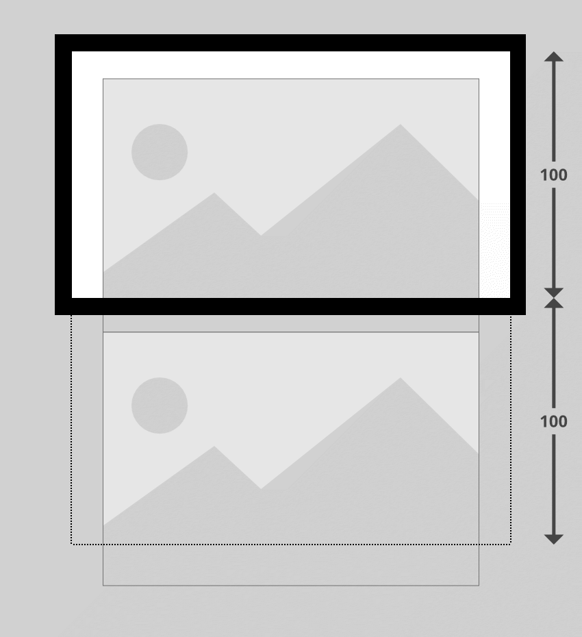
默认情况下,Layzr 只会引入加载时可见的图像。不过,如果也预加载了下一行(位于视口之外)的图像,则访问者可以获得更流畅的体验。
通过在实例化脚本时设置名为 threshold 的选项来执行此操作。它的工作方式是您将提供一个表示视口高度百分比的值。如果您将值设置为 100,则表示视口高度的 100%,例如1200 像素。在这种情况下,视口 1200 像素范围内的所有屏幕外内容也会被加载。
例如,如果您有两张大图像,其中一张被推到视口之外,并且您的阈值设置为 100,则两张图像都会加载:
要设置阈值,请在代码中替换此行:
const instance = Layzr()
...这样:
const instance = Layzr({
  threshold: 100
})
您可以将此值更改为最适合您创建的网站的值。有趣的是,AMP 的延迟加载阈值似乎大致相当于 200。
Layzr 的一大优点是它可以非常直接地为高分辨率设备添加图像。您所需要做的就是包含属性 data-retina。例如:
<img data-normal="images/vulture.jpg" data-retina="images/vulture@2x.jpg" alt="Who needs AMP? Simplify the process of lazy loading responsive images with Layzr.js" style="max-width:90%" style="max-width:90%">
更新 HTML 中的所有 img 元素以包含视网膜图像,如下所示:
<img data-normal="images/vulture.jpg" data-retina="images/vulture@2x.jpg" alt="Who needs AMP? Simplify the process of lazy loading responsive images with Layzr.js" style="max-width:90%" style="max-width:90%">
![Beach]()
![Bear]()
![Sky]()
![Bike]()
使延迟加载的图像响应起来可能是一个棘手的问题。正如我们之前提到的,为了确定何时加载图像,Layzr 首先需要知道它们的高度。由于响应式图像的尺寸一直在变化,因此它们的高度是不可预测的。
除此之外,我们还希望在页面布局中添加一些内容来防止回流。重排是指当图像完成加载并从没有大小到突然占用布局中的空间,导致其周围的所有内容移动时发生的情况。对于试图关注您的内容却让内容在他们的页面上跳转的访问者来说,这可能会非常令人沮丧。
我们可以通过在页面中为每张图片提供正确尺寸的响应式占位符来解决这两个问题。占位符将确保页面布局不需要重排,并且还将为 Layzr 提供可使用的高度。我们的方法将基于 Thierry Koblentz 撰写的这篇关于“创建视频内在比率”的“A List Apart”文章中的巧妙技术。
唯一的条件是您需要提前知道发布的每个图像的宽高比,因为 CSS 会根据指定的宽高比调整图像的大小。
我们要做的第一件事是在我们的第一个图像周围添加一个 div 包装器 - 这个 div 将成为我们的占位符。我们将使用 CSS 调整 div 本身的大小,然后设置其中的图像以水平和垂直填充它。
我们将为 div 提供一个类名,表示它将包含的图像的宽高比。在我们的示例中,第一张图像的宽度为 960 像素,高度为 640 像素,所以让我们弄清楚它的长宽比是多少。
640(我们的高度)是 960(我们的宽度)的三分之二,这意味着每 2 个单位的高度,图像就有 3 个单位的宽度。宽高比通常表示为 width:height,如众所周知的 16:9。我们的第一个示例图像的比例是 3:2。
为了表示此宽高比,我们将为包装器 div 指定类名称 ratio_3_2。
<img data-normal="images/vulture.jpg" data-retina="images/vulture@2x.jpg" alt="Who needs AMP? Simplify the process of lazy loading responsive images with Layzr.js" style="max-width:90%" style="max-width:90%">
现在我们将添加 CSS 以使这一切正常工作。
在 index.html 文件头中现有的 <style></style> 标记之间,添加以下代码:
    div[class^="ratio_"]{
      position: relative;
      width: 100%;
    }
此选择器将选取我们的 ratio_3_2 类,但它也会选取以 ratio_ 开头的任何其他类。这意味着我们可以稍后创建更多类来适应不同的宽高比。
在这种样式中,我们确保包装器始终拉伸到其父宽度的 100%。我们还将其设置为 position:relative;,因为这会将图像绝对定位在其中 - 稍后您就会明白原因。
现在我们将仅添加特定于我们的 ratio_3_2 类的代码:
    .ratio_3_2 {
      /*padding-top: calc( 100% * (2 / 3) );*/
      padding-top: 66.666667%;
    }
padding-top 值允许我们将包装 div 保持在我们想要的宽高比。无论 div 的宽度是多少,此填充都会将高度保持在该宽度的 66.666667%(三分之二),从而保持 3:2 的宽高比。
要确定此处放置的百分比,请计算以宽度百分比表示的纵横比的高度。您可以通过计算来做到这一点:
100% *(高度/宽度)
对于我们的 3:2 比例来说:100% * (2 / 3) = 66.666667%
您可以提前计算所需宽高比的正确百分比,或者如果您愿意,也可以使用 CSS calc() 函数,如上例中注释所示:
padding-top: calc( 100% * (2 / 3) );
无论视口宽度如何,我们的纵横比包装器现在都将保持所需的尺寸。所以现在我们要做的就是让其中包含的图像填充包装器,从而继承它的尺寸。
我们将通过绝对定位嵌套在 ratio_ 类包装器 div 内的任何图像来实现此目的,将其放置在包装器的左上角,然后拉伸其高度和宽度均为 100%,如下所示:
    div[class^="ratio_"] > img {
      position: absolute;
      top: 0;
      left: 0;
      width: 100%;
      height: 100%;
    }
检查您的第一张图像,您现在应该看到它拉伸到视口的宽度,但在调整大小时会缩小以适应,并始终保持其纵横比。
您可能拥有各种不同长宽比的图像,并且您希望能够适应它们。在本教程中我们使用的示例图像中,前三个图像的纵横比为 3:2,但第四个和第五个图像的纵横比为 16:9。
为了解决这个问题,请添加一个根据宽高比命名的新类,即 ratio_16_9,以及相应的 padding-top 值:
    .ratio_16_9 {
      /*padding-top: calc( 100% * (9 / 16) );*/
      padding-top: 56.25%;
    }
继续在所有其余图像周围添加宽高比 div 包装器,根据每个图像的大小使用适当的类。您还可以从图像中删除 height 和 width 属性,因为它们现在都将被我们的 CSS 覆盖。
    <div class="ratio_3_2">
      <img data-normal="images/vulture.jpg" data-retina="images/vulture@2x.jpg" alt="Who needs AMP? Simplify the process of lazy loading responsive images with Layzr.js">
    </div>

    <div class="ratio_3_2">
      <img data-normal="images/beach.jpg" data-retina="images/beach@2x.jpg" alt="Beach">
    </div>

    <div class="ratio_3_2">
      <img data-normal="images/bear.jpg" data-retina="images/bear@2x.jpg" alt="Bear">
    </div>

    <div class="ratio_16_9">
      <img data-normal="images/sky.jpg" data-retina="images/sky@2x.jpg" alt="Sky">
    </div>

    <div class="ratio_16_9">
      <img data-normal="images/bike.jpg" data-retina="images/bike@2x.jpg" alt="Bike">
    </div>
重新加载浏览器预览并调整视口大小:您现在应该发现所有图像都有响应,同时保留其延迟加载功能,没有回流。
Layzr 还支持 srcset 属性。在支持 srcset 的浏览器中,它将优先于 data-normal 和 data-retina
但是,不应使用直接的 srcset 属性,而是应该在其前面加上 data- ,就像我们迄今为止使用的其他属性一样。
将第一张图像的代码更新为:
<img
  data-normal="images/vulture.jpg"
  data-retina="images/vulture@2x.jpg"
  alt="Who needs AMP? Simplify the process of lazy loading responsive images with Layzr.js"
  data-srcset="images/vulture_sml.jpg 320w, images/vulture_med.jpg 640w, images/vulture.jpg 960w">
要查看此效果,请转到浏览器预览,将视口缩小到 320 像素宽以下,重新加载并观看网络面板。您应该首先看到图像加载的最小版本。然后增加视口的大小,您应该会看到中型和大型版本随您加载。
源文件中提供的图像文件夹包括每个图像的小、中、大版本。更新您的代码以在 data-srcset 属性中使用所有这些内容,如下所示:
    <div class="ratio_3_2">
      <img data-normal="images/vulture.jpg" data-retina="images/vulture@2x.jpg" alt="Who needs AMP? Simplify the process of lazy loading responsive images with Layzr.js" data-srcset="images/vulture_sml.jpg 320w, images/vulture_med.jpg 640w, images/vulture.jpg 960w">
    </div>

    <div class="ratio_3_2">
      <img data-normal="images/beach.jpg" data-retina="images/beach@2x.jpg" alt="Beach" data-srcset="images/beach_sml.jpg 320w, images/beach_med.jpg 640w, images/beach.jpg 960w">
    </div>

    <div class="ratio_3_2">
      <img data-normal="images/bear.jpg" data-retina="images/bear@2x.jpg" alt="Bear" data-srcset="images/bear_sml.jpg 320w, images/bear_med.jpg 640w, images/bear.jpg 960w">
    </div>

    <div class="ratio_16_9">
      <img data-normal="images/sky.jpg" data-retina="images/sky@2x.jpg" alt="Sky" data-srcset="images/sky_sml.jpg 320w, images/sky_med.jpg 640w, images/sky.jpg 960w">
    </div>

    <div class="ratio_16_9">
      <img data-normal="images/bike.jpg" data-retina="images/bike@2x.jpg" alt="Bike" data-srcset="images/bike_sml.jpg 320w, images/bike_med.jpg 640w, images/bike.jpg 960w">
    </div>
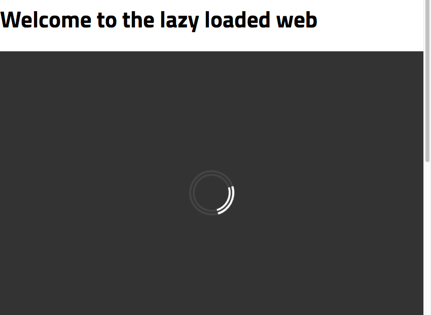
我们快完成了,但为了创建最后一层润色,我们将添加一个加载动画。这将有助于向访问者传达布局的哪些部分充当图像占位符,以及这些图像正在加载的过程。
我们将使用纯 CSS 加载器,这是 Alan Shortis 编写的这款出色笔的略微修改版本:https://codepen.io/alanshortis/pen/eJLVXr
为了避免需要任何额外的标记,我们将把加载动画包含在附加到每个宽高比包装器的 :after psuedo 元素中。将以下内容添加到您的 CSS 中:
    div[class^="ratio_"]:after {
      content: '';
      display: block;
      width: 3rem;
      height: 3rem;
      border-radius: 50%;
      border: .5rem double #444;
      border-left: .5rem double white;
      position: absolute;
      top: calc(50% - 2rem);
      left: calc(50% - 2rem);
      animation: spin 0.75s infinite linear;
    }
    @keyframes spin {
      0% {
        transform: rotate(0deg);
      }
      100% {
        transform: rotate(360deg);
      }
    }
上面的代码创建了一个小圆形加载器图标,将其居中,并使其每 0.75 秒旋转 360 度。
我们还将在长宽比包装器中添加深灰色背景颜色,以便轻松将它们与布局的其余部分区分开来。添加此 background-color: #333; 行,如下所示:
    div[class^="ratio_"]{
      position: relative;
      width: 100%;
      background-color: #333;
    }
最后,我们只需要确保我们的加载程序不会将自身定位在图像的顶部。为此,我们将行 z-index: 1; 添加到我们的图像中,将它们移动到加载器顶部的一层:
    div[class^="ratio_"] > img {
      position: absolute;
      top: 0;
      left: 0;
      width: 100%;
      height: 100%;
      z-index: 1;
    }
现在刷新您的页面,您应该会看到正在运行的加载动画。
完成上述所有操作后,您的代码现在应如下所示:
Layzr.js Lazy Loading
Welcome to the lazy loaded web
<div class="ratio_3_2">
<img data-normal="images/vulture.jpg" data-retina="images/vulture@2x.jpg" alt="Who needs AMP? Simplify the process of lazy loading responsive images with Layzr.js" data-srcset="images/vulture_sml.jpg 320w, images/vulture_med.jpg 640w, images/vulture.jpg 960w">
</div>
<div class="ratio_3_2">
<img data-normal="images/beach.jpg" data-retina="images/beach@2x.jpg" alt="Beach" data-srcset="images/beach_sml.jpg 320w, images/beach_med.jpg 640w, images/beach.jpg 960w">
</div>
<div class="ratio_3_2">
<img data-normal="images/bear.jpg" data-retina="images/bear@2x.jpg" alt="Bear" data-srcset="images/bear_sml.jpg 320w, images/bear_med.jpg 640w, images/bear.jpg 960w">
</div>
<div class="ratio_16_9">
<img data-normal="images/sky.jpg" data-retina="images/sky@2x.jpg" alt="Sky" data-srcset="images/sky_sml.jpg 320w, images/sky_med.jpg 640w, images/sky.jpg 960w">
</div>
<div class="ratio_16_9">
<img data-normal="images/bike.jpg" data-retina="images/bike@2x.jpg" alt="Bike" data-srcset="images/bike_sml.jpg 320w, images/bike_med.jpg 640w, images/bike.jpg 960w">
</div>
<script src="https://cdnjs.cloudflare.com/ajax/libs/layzr.js/2.0.2/layzr.min.js"></script>
<script>
const instance = Layzr()
document.addEventListener('DOMContentLoaded', function(event){
instance.update().check().handlers(true)
})
</script>
</body>
您现在已经完全手动实现了延迟加载,并且功能与 AMP 尽可能接近。
AMP 会自动执行一些操作,例如处理响应式图像的宽高比保留,但另一方面,您自己执行操作可以实现额外的控制,例如指定您自己的加载阈值。
希望通过此过程可以帮助您决定更喜欢哪种方法。
感谢 Michael Cavalea 提供的出色剧本!要了解有关 Layzr.js 的更多信息,请访问:https://github.com/callmecavs/layzr.js
The above is the detailed content of Who needs AMP? Simplify the process of lazy loading responsive images with Layzr.js. For more information, please follow other related articles on the PHP Chinese website!


![[Web front-end] Node.js quick start](https://img.php.cn/upload/course/000/000/067/662b5d34ba7c0227.png)


